Here is the shoot of a lifetime delivered right to you by our old buddy Artie DiRectoor.
A lifestyle shoot for a medical and health system based in your town needs an advertorial, and you – lucky devil – are tagged for the shooter.
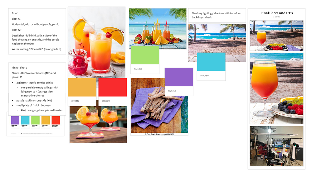
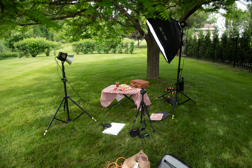
Specifics: Layout is simple horizontal, and the theme is a picnic… with or without people.
The operative tagline for this ad is “Life Can Be A Picnic when You Are Healthy”)
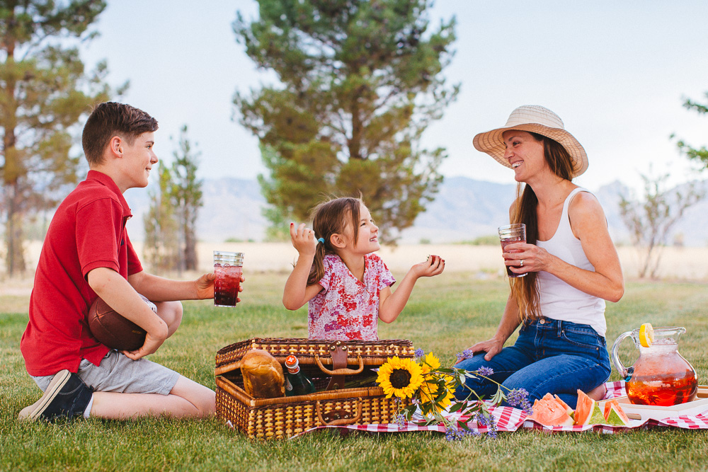
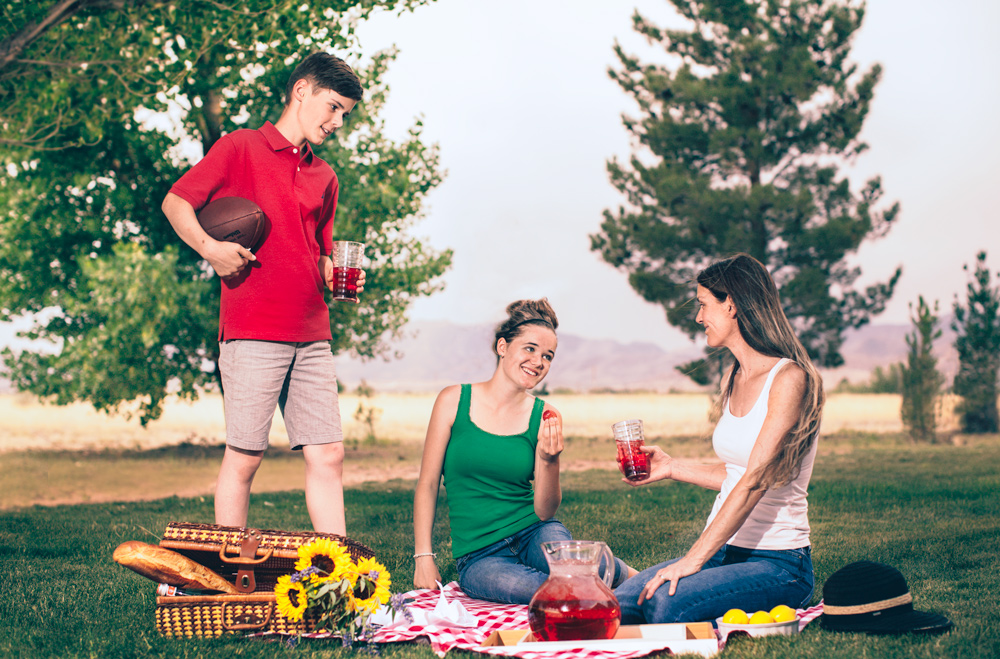
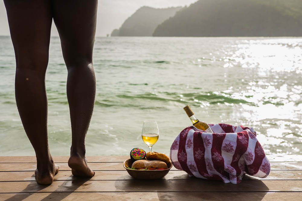
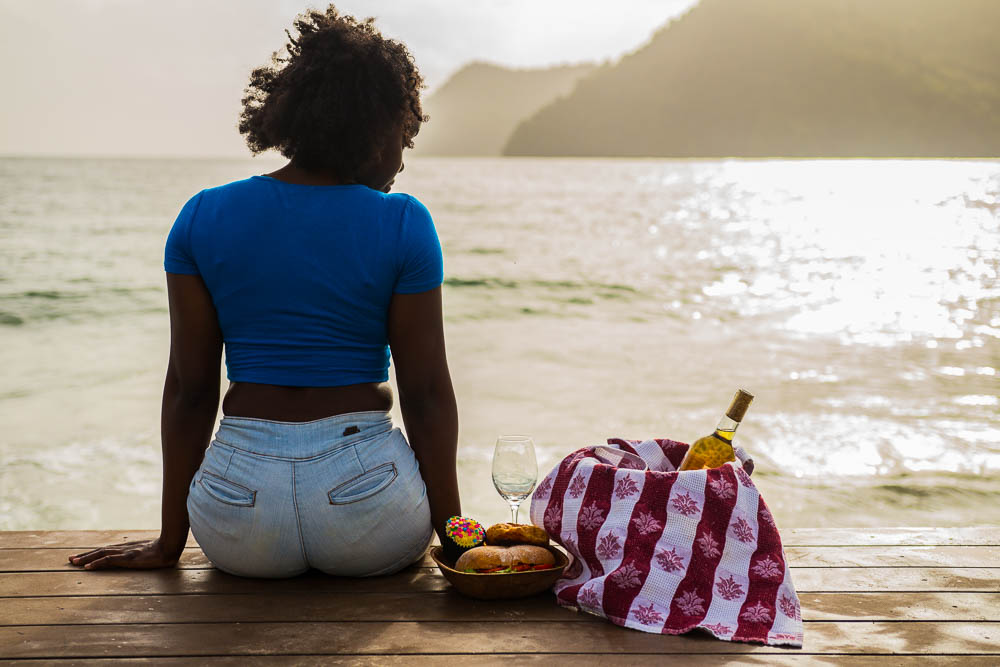
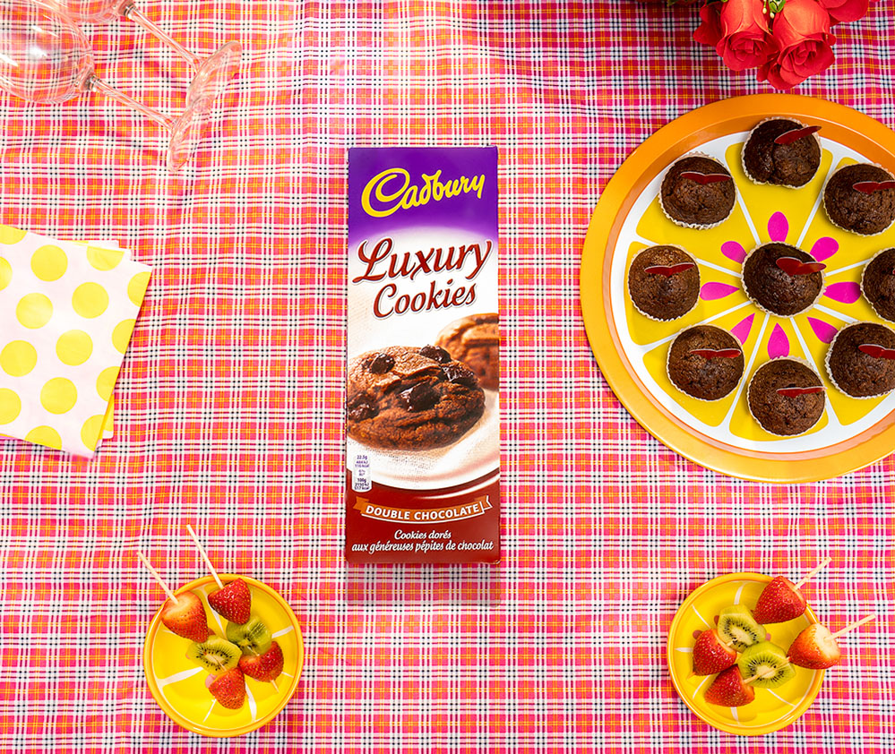
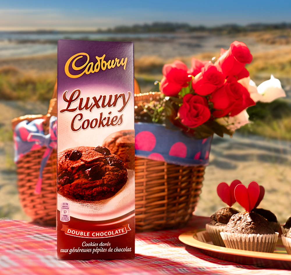
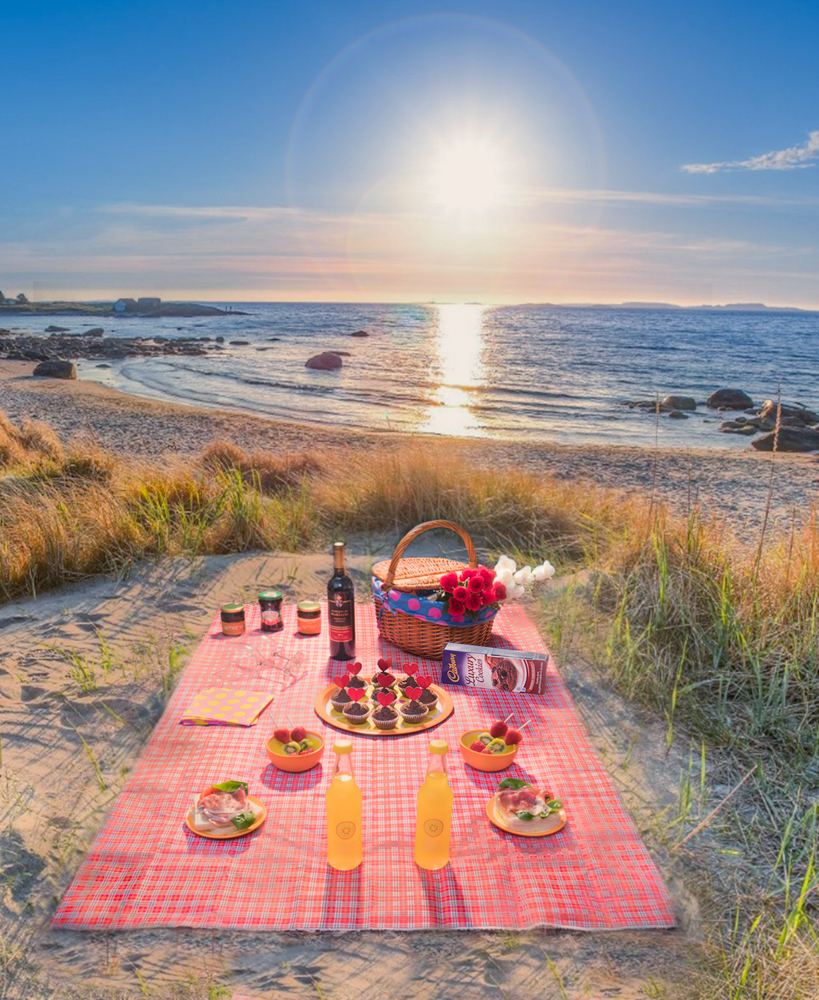
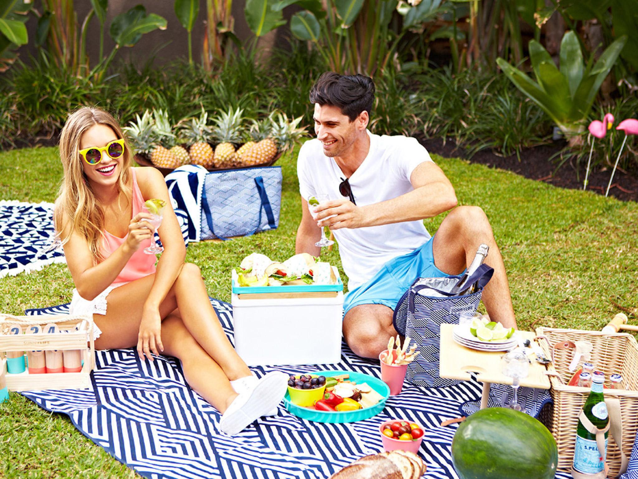
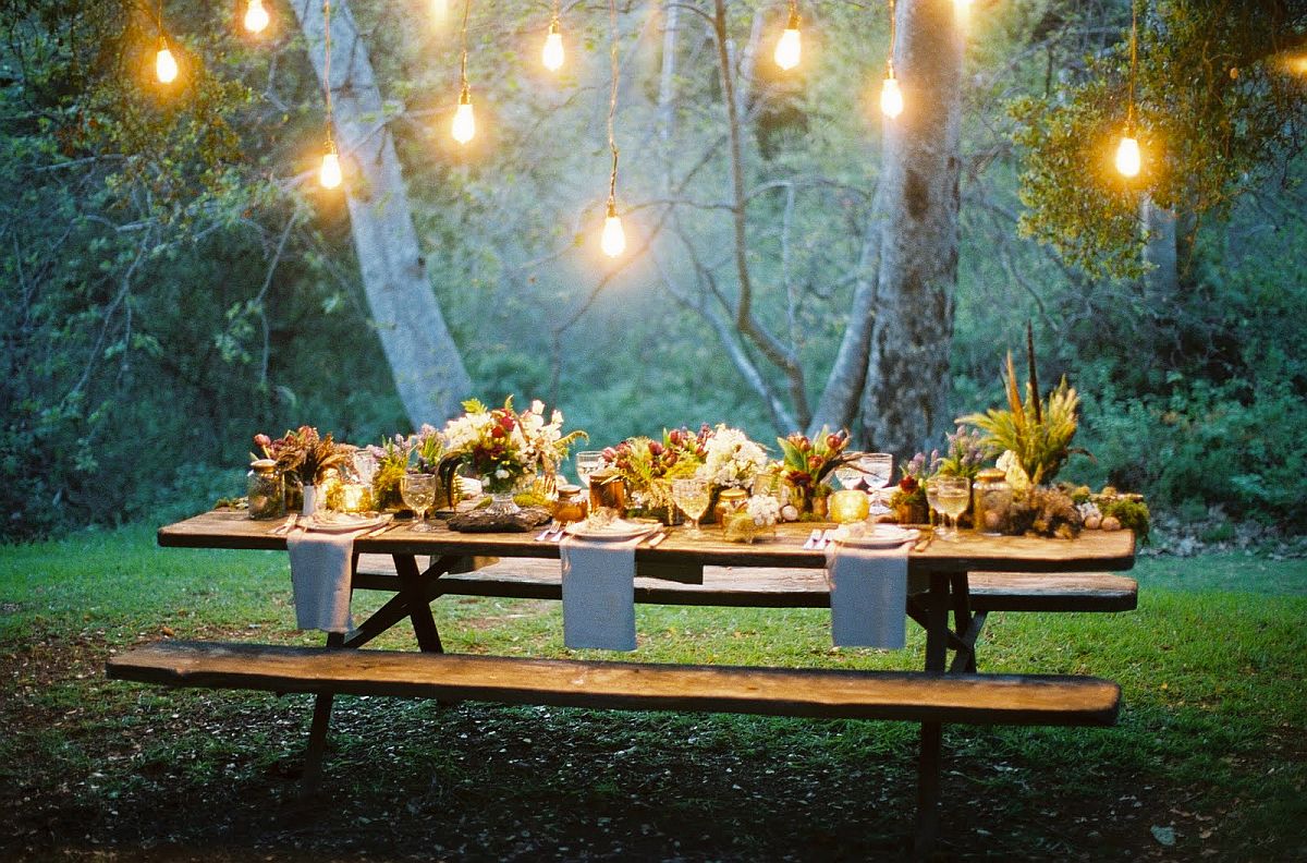
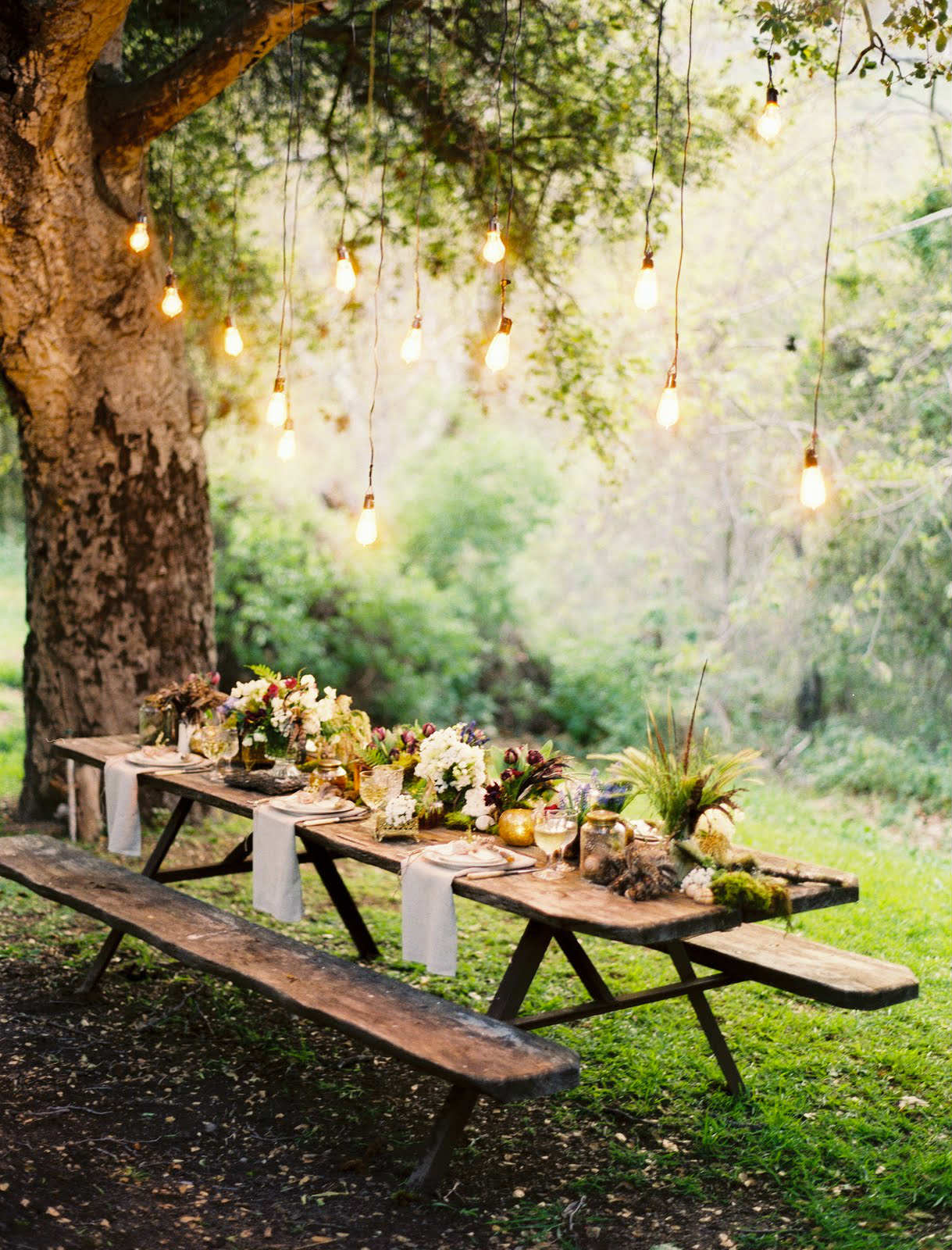
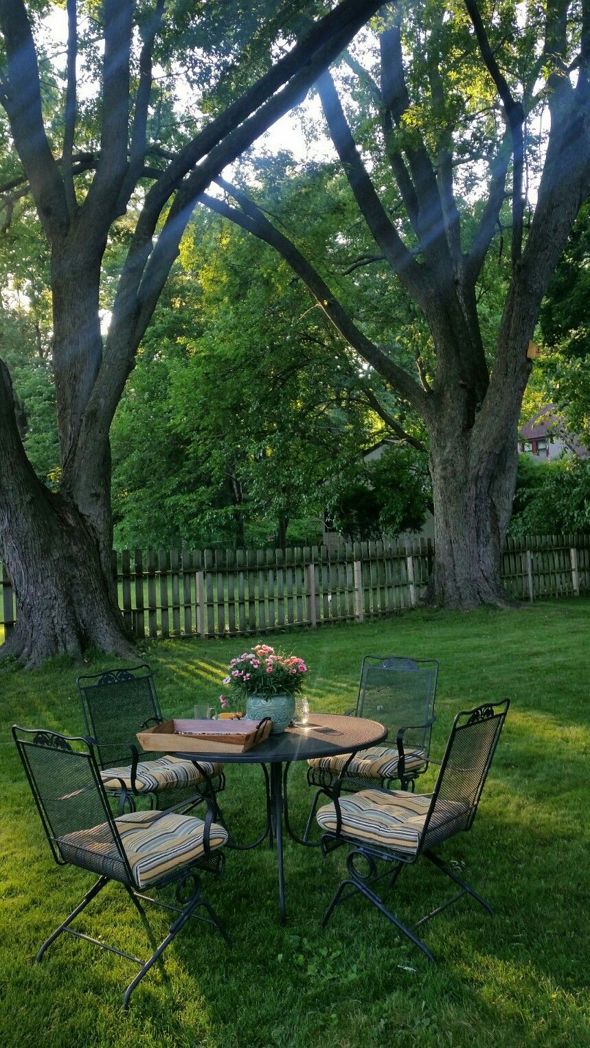
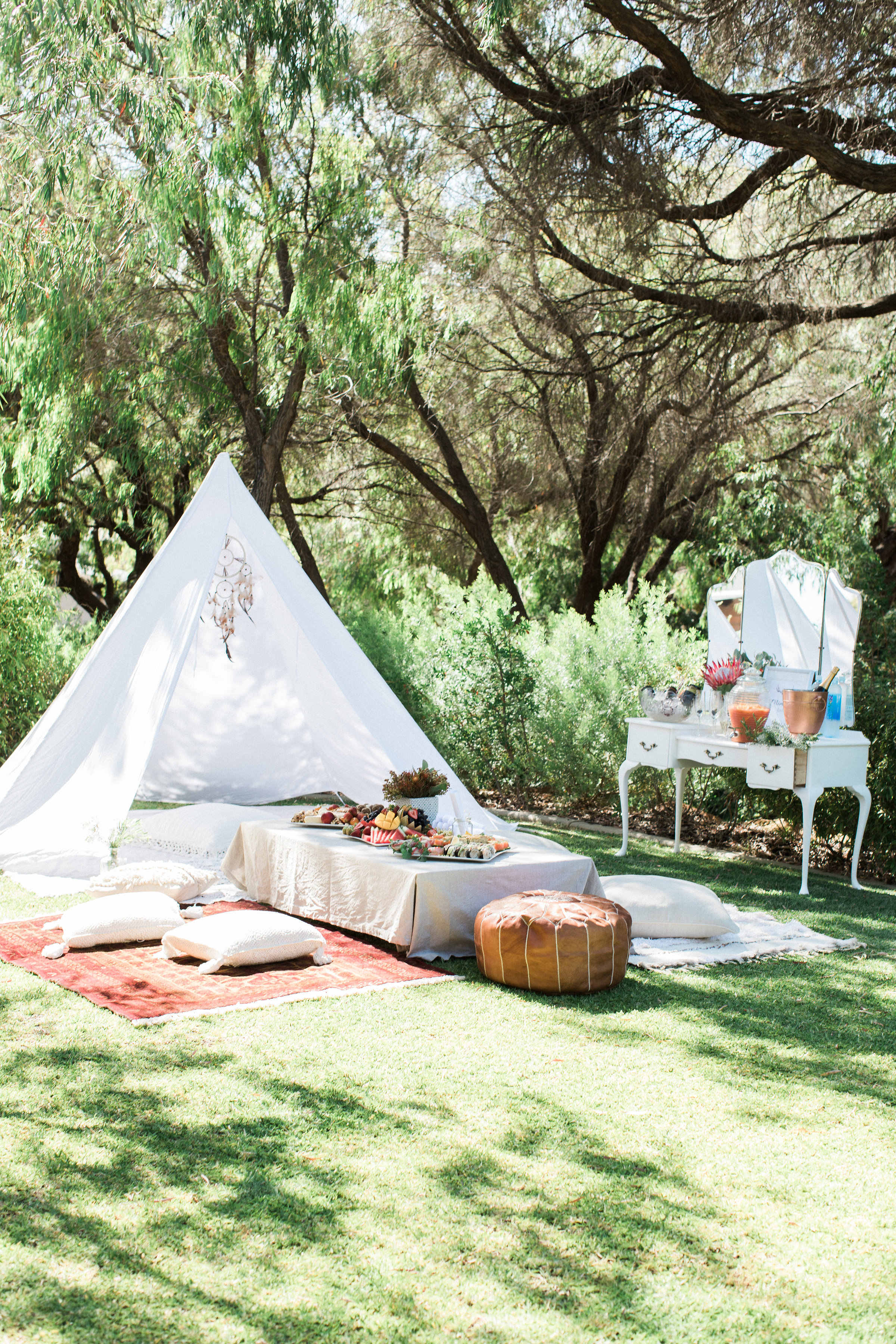
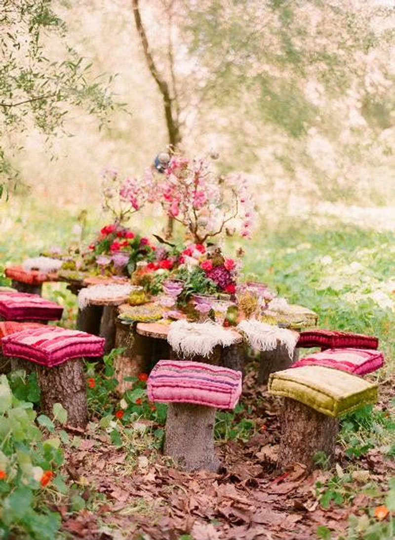
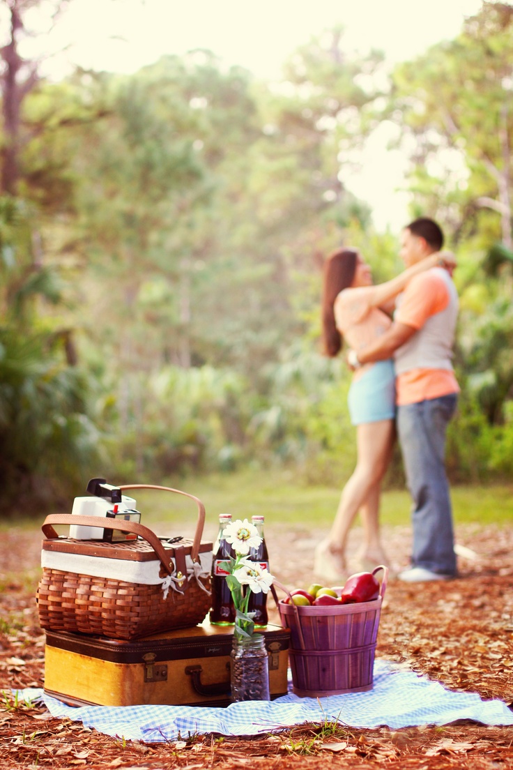
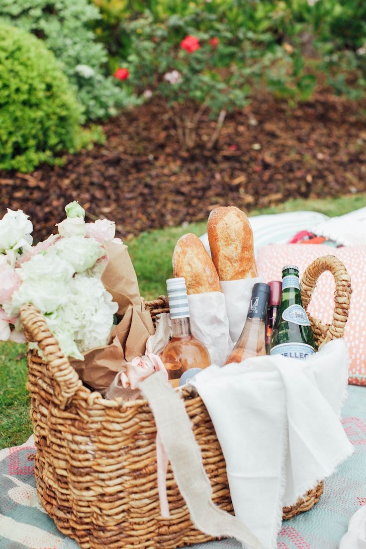
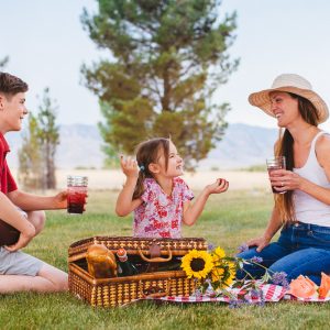
Here is a set of picnic shots that will help you get the idea… and also to see how picnics are portrayed. Notice there are no black picnic blankets… that is pretty much all about the red and white checkered pattern. How that started I don’t know. But shared context is valuable when we look to make shots like this.
So what makes a good picnic shot?
In this case, styling. And no, you do not have to spend a bunch of money on pillows and such. Just take some time and find some cool stuff to style the picnic in a fun and fanciful way.
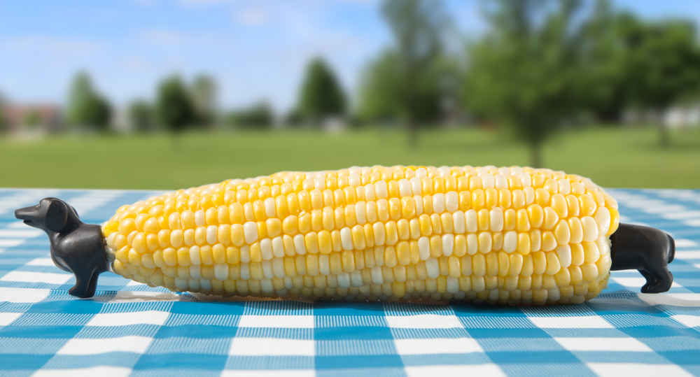
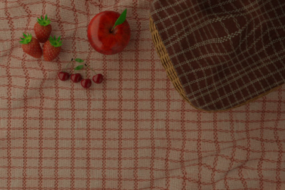
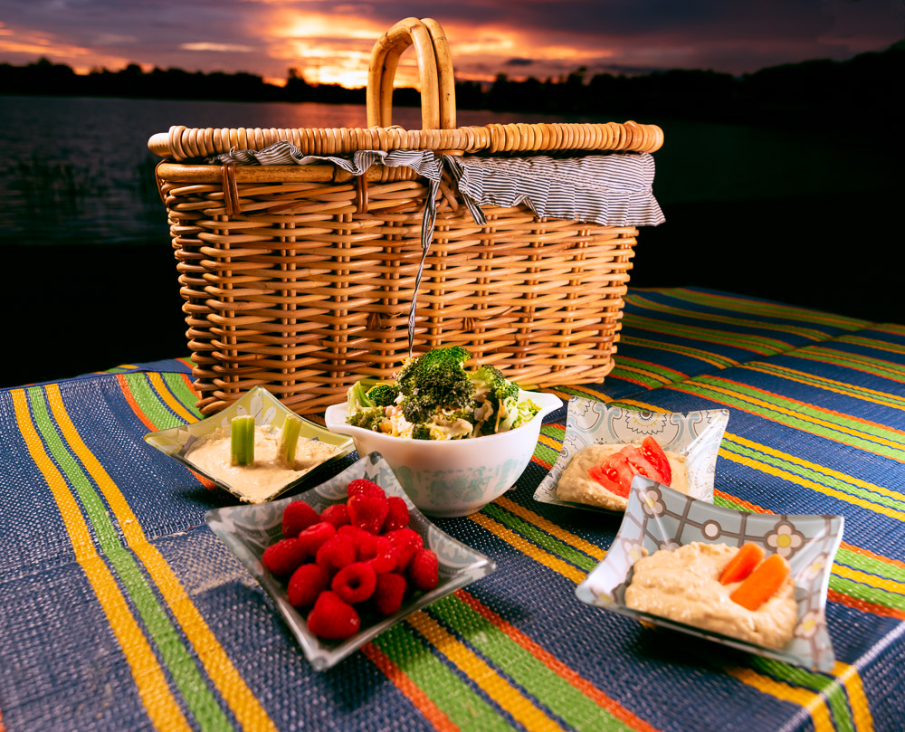
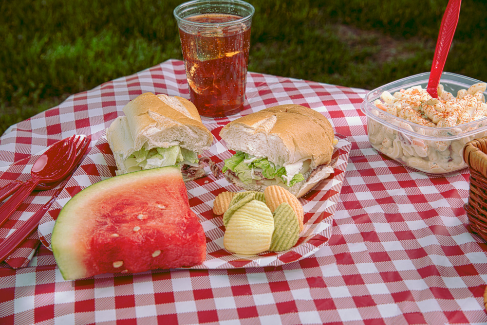
A good location (park/lake/creek), a blanket, some sort of picnic basket (or not) and picnic food. Perhaps the food is in Tupperware, perhaps it is wrapped in foil or some sort of wrap. Perhaps there are some small tubs of potato salad, regular salad… whatever.
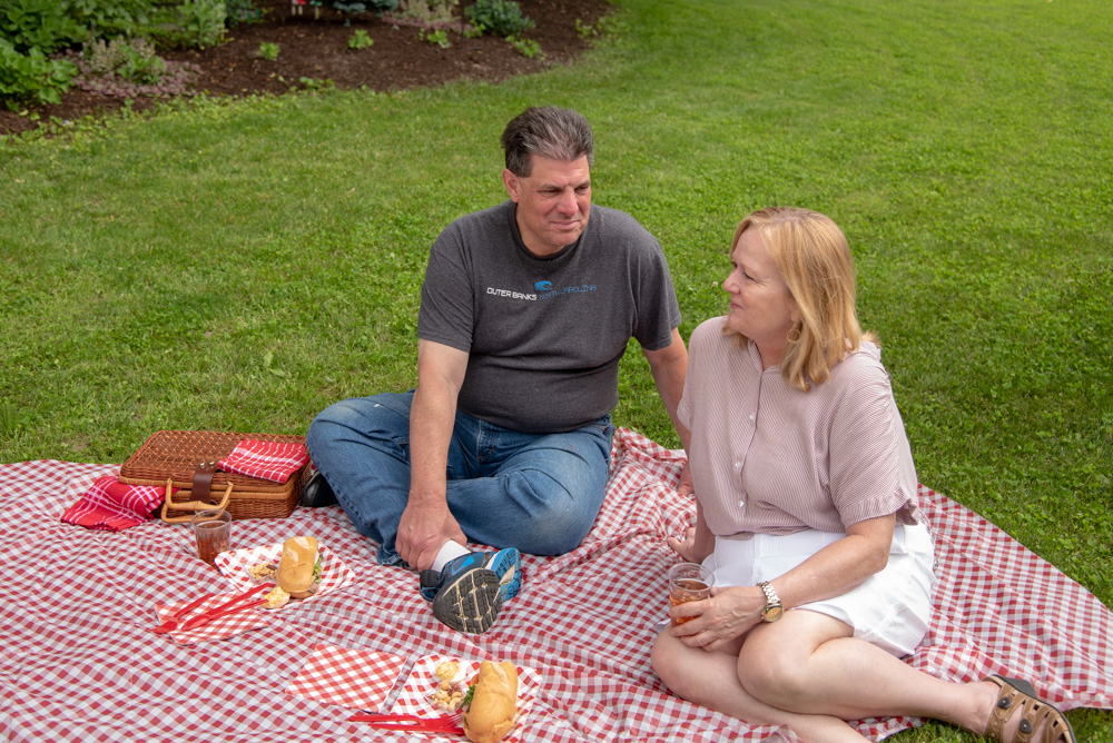
But most importantly, the feeling is one of celebration and tranquility. If you want to include people, they should be involved with each other, not looking at the camera. Laughter is good, smiles are good, angst is not.
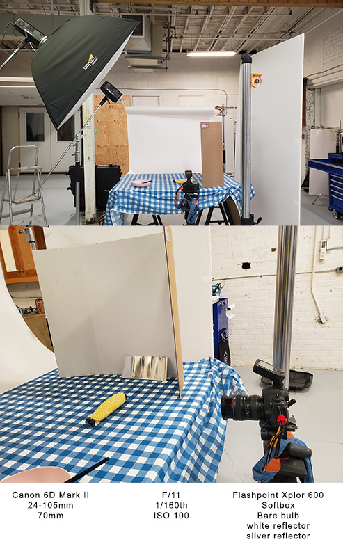
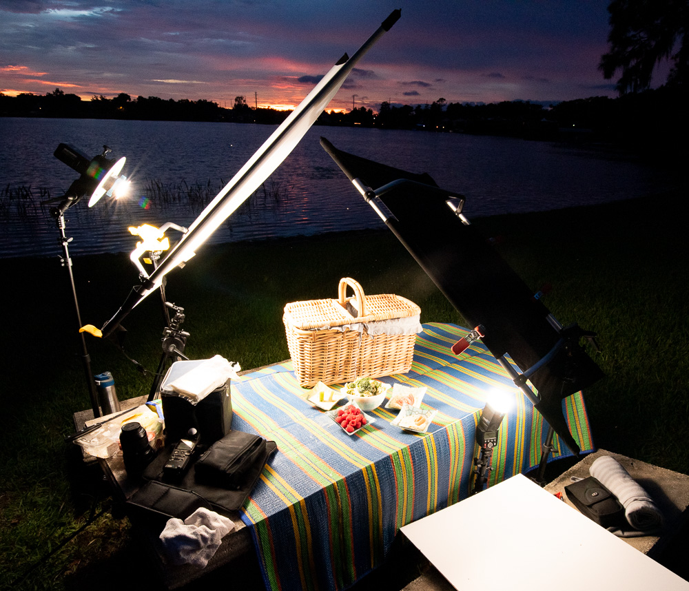
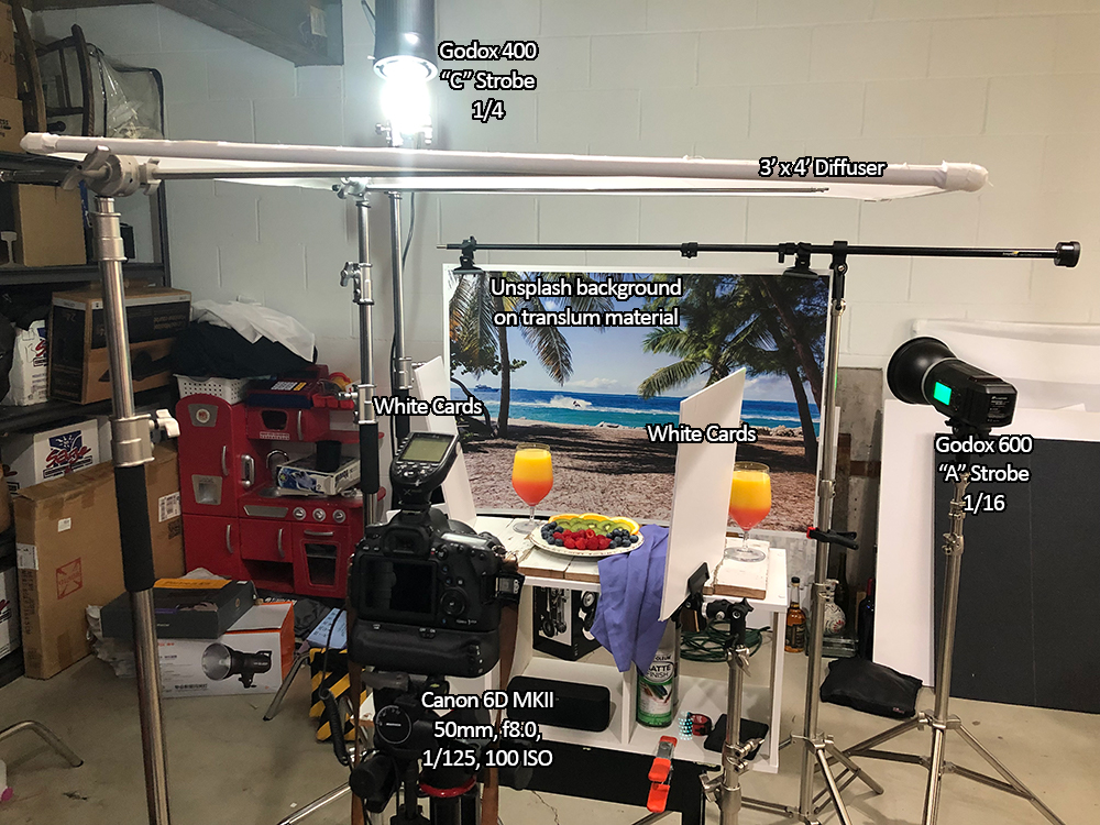
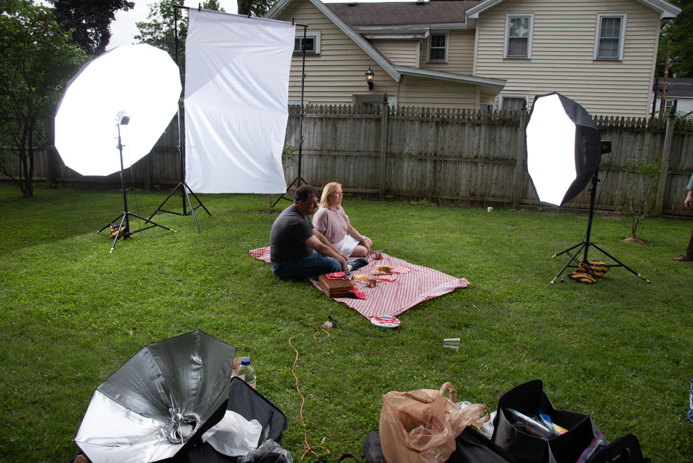
Lighting should be backlit, or through a scrim and make sure there is fill on the front of the folks’ faces if they show. Lighting is going to be absolutely the strongest thing you can use to make this shot special. The location has to rock, as do the props, but the lighting must take us to this moment – this place. It has to transform us to a perfect picnic on a perfect day.
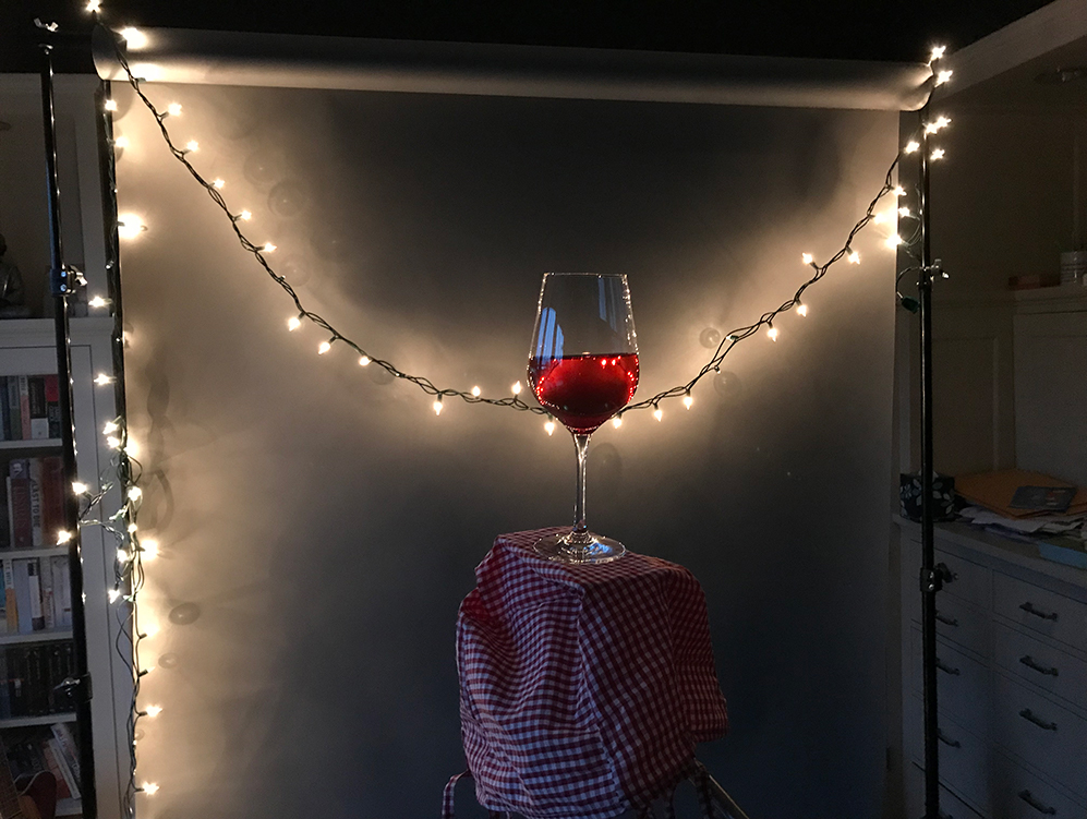
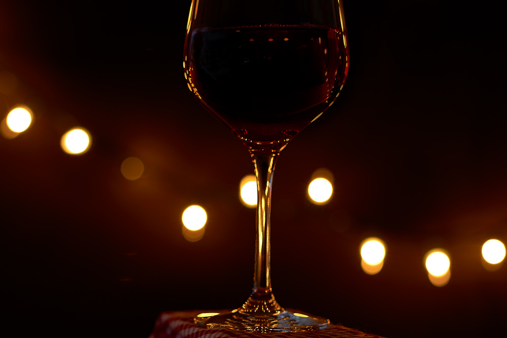
The second shot – product only type of shot – should reinforce the good life aspect, and can be a more detailed shot of the people/picnic shot… but the lighting will probably change to reflect that very close shooting.
I want you to try something in post processing on these shots: The technique is called Color Grading, and I want you to work with it on these images.
Below are several approaches you can use. I generally use the Phlearn approach (first one) but on some images, the very simple ‘curves only’ can work great (last one).
We want the image to be warm, inviting, and as cinematic as possible.
Part of this assignment is to get a color graded image.
Here is a link to another Color Grading video.
And here we have some images that show how color grading works.
Another video tutorial with a bit of a different approach.
And one last approach. This one uses curves only for a simple approach.
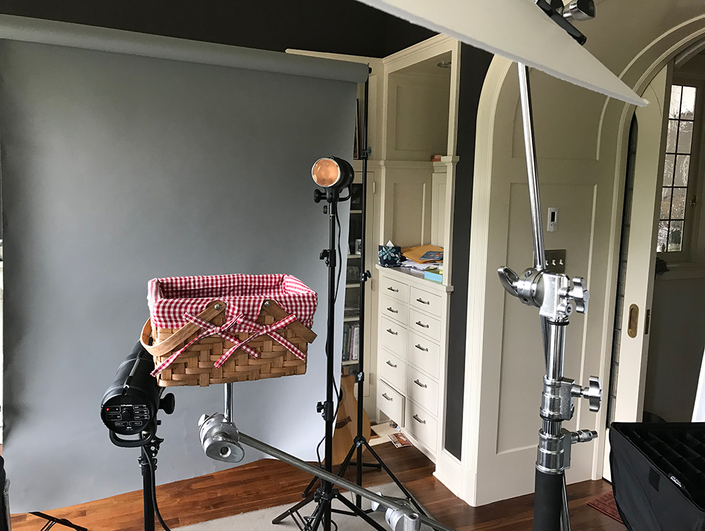
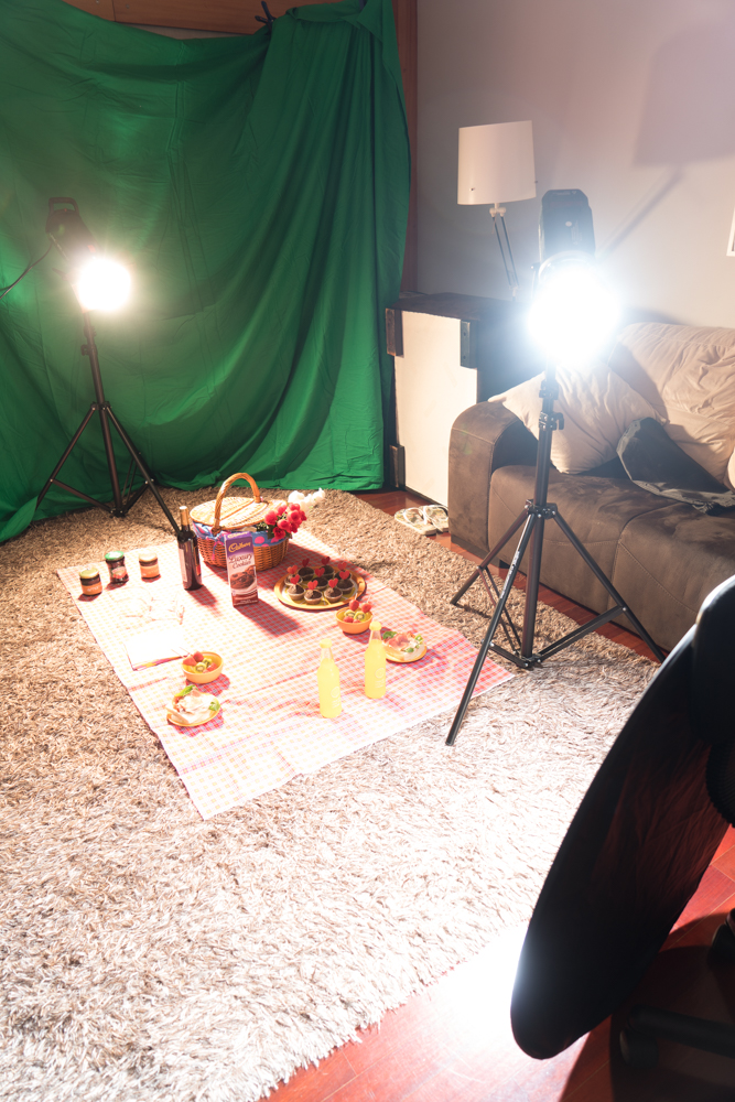
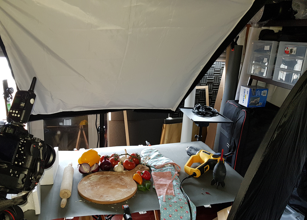
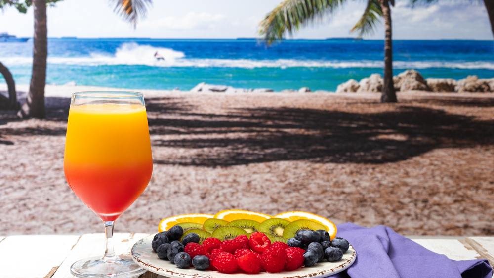
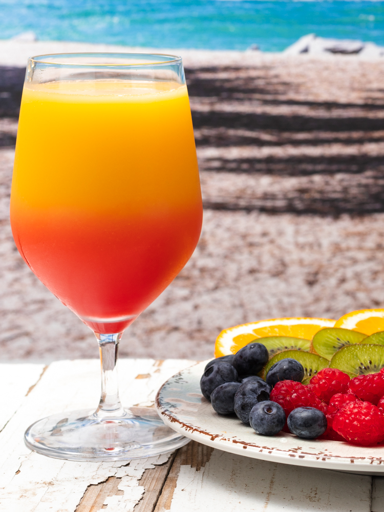
SOME SHOTS TO SET THE TONE.
Video


Previous Student Work
-
- stef@topazphoto.com