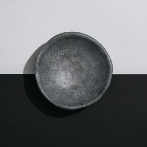
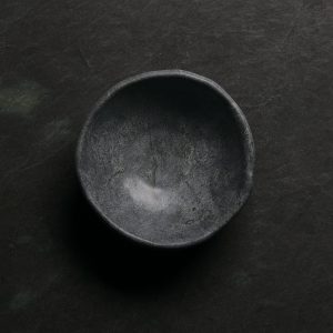
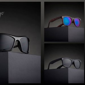
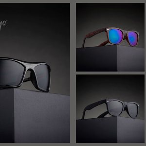
We need three shots for this catalog page, and they are either the same item or three similar items… all cost the same amount, so they are related in that way.
Here is the layout. If you are not able to do the images in the layout, I will do that for you BUT your images must be in by the morning of the critique. Please no last-minute entries, thanks.
So… what did your creative tests reveal? Now that you see the catalog page, you have an idea of the complexity of the work… one tall shot and two nearly square, but horizontal shots. Will you have to make any changes to your creative approach? If not, get to it. If you do, use the FB group for feedback. The client will allow a color change to the square at the top. This is usually where they “tab” the product category, but the layout is not that detailed yet.
PSD FILE: Catalog Layout.psd
Great luck… make them look really professional, gang.
Catalog Page:
