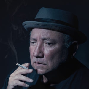
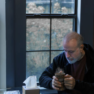
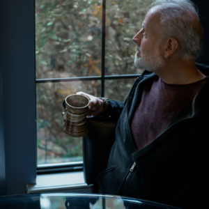
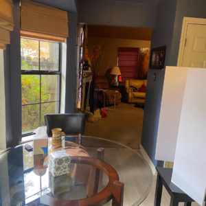
SUMMER 2021: 47: ASSIGNMENT FORTY SEVEN: PORTRAITS FOR HEALTHCARE BROCHURE
ASSIGNMENT DUE NOVEMBER 30, 2021ASSIGNMENT: PORTRAITS FOR A HEALTHCARE BROCHURE
Assignment: A healthcare business wants to create a new brochure for their “Mental Health Traveling Medical Stations” and need a cover and interior photograph ASAP.
Specifics:
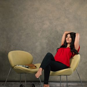
The main image is vertical, and in color, although the AD wants the colors to be muted and not overly bright. Grey, neutrals would work best if the wardrobe features into the image. The second image may be either portrait or landscape, just make it work well with the vertical cover image.
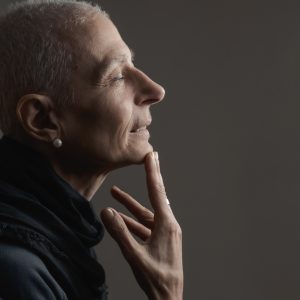
The subject should not be engaged with the viewer, but instead, have a pensive or introspective demeanor in the photograph. They are NOT to look ‘mentally disturbed’ or unnatural in any way. They are to look like they are deep in thought.
This is for people who may be in a mild depression or otherwise unhappy but not clinically designated, nor are they to look like they are depressed. The patient clientele is a more upper-middle class type.
The brochure will have a logo and a headline on it, but the AD will await your image to decide where to put it. Do not put any type or other things over your image.
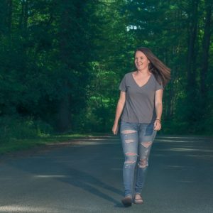
The second image is one that inspires hope and so a different body position, or a tilt of the face, or even an added light can show that the loneliness may be coming to an end. There is light on the horizon sort of thing. Bring on the “we will help you feel better’ look.
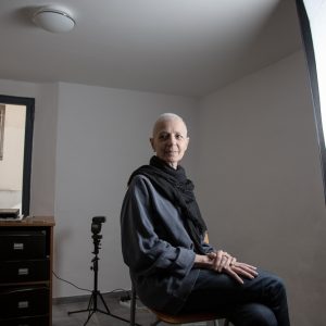
The images can be created in a studio or on location, but they must be taken together. If you do the cover shot in the studio, then the inside shot must be in the studio as well.
Ideas:
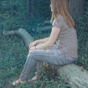
Have the subject looking away, or out a window. Perhaps sitting alone in a park or location setting may spark the mood. Post processing can help give the image more punch. Blue tones can help us explore the deeper meanings, and vibrant colors will not work.
Think about having the people walking away from you, or staring off into the distance. This is a great assignment to try out some lighting ideas as well. How can you convey loneliness with lighting?
How about composition? From tight to wide, the composition will be very important to convey the idea of the image. Think about loneliness, or ‘thinking you are alone” when creating these images. And to make it a bit more of a twisty, you have to remain somewhat positive in the approach. Yes, loneliness is not happy, but this is not a ‘tragic’ situation, but one in transition.
COLOR PALLET FOR THE BROCHURE:
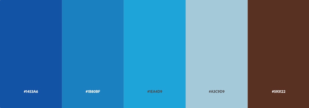
THESE ARE THE COLORS THE DESIGNER IS USING FOR THE BROCHURE
It would be awesome if you could introduce at least one of these tones into the image. As you can see the blues dominate.
However, here is a second color pallet that could be used as a photographic pallet since it is warmer and could be very complimentary to the blue dominated one above;
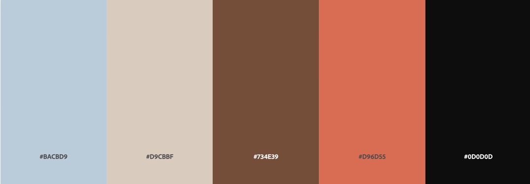
Working with these softer, warmer colors may make the brochure seem to be more contrasty, while the cooler dominated may make the piece more cohesive.
It is up to you, there is no right or wrong answer here – this is a stylistic approach.
Possible headlines:
“Working Through Issues Doesn’t Mean Doing It Alone”
“Pain Can Take A Toll, But You Are Not Alone”
Subjects can be any age, of course, but the most important thing to consider is the mood of the photograph. The mood is more important than anything, and keep in mind that while it may appear melancholy, it is not tragic or maudlin. If anything, it may read as neutral.
The Art Director has included this for you to view. And this one.
REMEMBER: DO NOT PUT ANY TYPE OR TEXT ON THE IMAGES. LEAVE A BIT OF CROP ROOM, PLEASE.
EMERGENCY ALERT
Morning Class Time Change
Wednesday, October 7, 2020
Spring Class: 6 AM
2020 Class: 8 AM
IMPORTANT:
This is the business book. It has been revamped and edited a couple of times. I will be putting it at Blurb this week if you want to pick up an 8×10 paperback version.
For now, This week’s assignment is to go through the first three chapters, answer the questions, do the work. We will discuss them next week.
PLEASE DO UP THROUGH WORKSHEET #2.
The Book 8×10: Please feel free to print the book, or wait until it is loaded at Blurb. (Estimated price about $8.50). Use a piece of paper to answer the questions.
NOTE: WE WILL FINISH THIS BOOK BEFORE WE FINISH THIS COURSE… AND IT MAY TAKE A FEW EXTRA CLASSES, BUT THIS IS IMPORTANT.
DECEMBER 2021


