THE ASSIGNMENT
In this assignment, you will have to very carefully follow the brief(s) for the shoot.
The client is a small PR firm in your area, and they are handling the promotion of a regional classical music string quartet. The quartet is made up of University string instrument teachers.
This is the first CD they have made and they are being looked at by a major label for possible signing.
Your job is to create an image for the cover/back that will do two things:
Show something regarding a string quartet and say a little something about the music.
{Before we continue… no one cares if you do or do not like the music. So please do not give that a consideration. You are a commercial photographer. You make pictures for a living – you are not a music critic. We do not have that luxury… to decide what we like or what we don’t like. We love our clients, and we work hard to provide them with what THEY need.}
So this is the assignment music:
George Crumb is the composer (website)
Crumb won the Pulitzer for his composition “Echoes of Time and the River” in 1968. He is regarded as one of the USA’s greatest composers. His music is iconic, anachronistic, and quite tribal in sound.
The piece of music is “Black Angels”
Here is a recording of the piece with the score.
You may find it very interesting. (Please check your volume as the initial part of the electric quartet is notated to be played at “As Loud as Possible”… and with some big Marshal amps that can be quite loud.)
Black Angels is primarily written for (in Crumb’s words) “electric string quartet.” Though generally played by amplified acoustic instruments, the work is occasionally performed on specially constructed electronic string instruments. The music uses the extremes of the instruments’ registers as well as extended techniques such as bowing on the fingerboard above the fingers and tapping the strings with thimbles. At certain points in the music, the players are even required to make sounds with their mouths and to speak.
Each of the string players is also assigned a set of instruments to play throughout the piece. Some of the equipment requires specific preparation, such as the crystal glasses, which are tuned with different amounts of water.
You are not required to like the music.
You may choose to never listen to it again. But as commercial photographers we have do deal with things from many different genres – some we may not like nor be interested in. We still must do a killer image for our clients.
Google is your friend… Notice how many CD covers are there. Notice how not all of them have string quartets on the covers… or even musical instruments.
You are to provide the following:
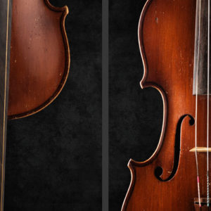
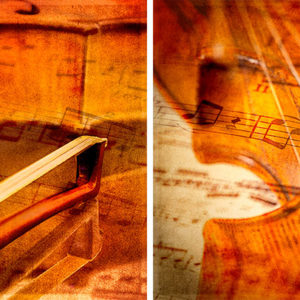
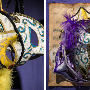
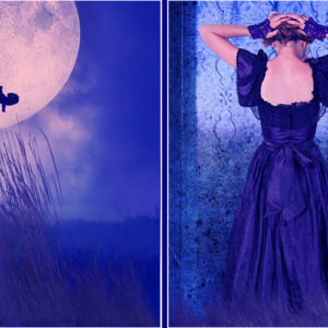
Cover image – square format.
Back side image – square format.
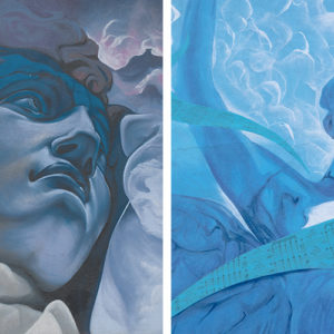
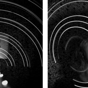
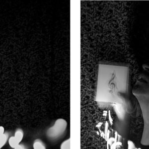
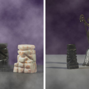
Back image will contain the same elements as the front image. That means that it will be a variation of the cover. Something different that relates to the cover because of what you do with the props, subject, lighting, composition… all the elements of the image you create.
Assemble them in Photoshop like this:
The images are to be 500 pixels square.
Here are two methods of creating the design presentation. Use the one that works best for you.
IN PHOTOSHOP:
Create a canvas that is 500 pixels tall by 1010 pixels wide.
Drag and drop your two images onto the new canvas, leaving the ten extra pixels between them.
IN LIGHTROOM:
Create a Collage in Lightroom.
The composite is to be 1010 pixels wide and 500 pixels tall. 10 pixels separate the two images. White is the separation color.
Do not “Design” the cover… no type or logos or such… just make the imagery for this assignment, please.
We are often given specific information and units and we are expected to deliver. If you are not sure how to do this, we will have to work you through the methods. Please follow the directions.
If you do not know how to make this two image piece, please ask on Facebook and we will get you the details.
THIS IS A CONCEPT CD COVER ASSIGNMENT
You are not expected to put together a string quartet, although if there is a University or College in your area it wouldn’t be hard to find a quartet who would be super excited to be photographed and have something cool for promotion. Of course, this would be a trade-out – they show up, and you give them a few shots for publicity.
So what you have to work with are the elements of the CD.
- The idea of a quartet.
- The dissonance and volume of the piece.
- Modern art.
- The title; “Black Angels”.
- Mythology surrounding angels.
- Mythology surrounding classical music: and the disconnect thereof.
- Art, pure art.
You can have people or art or a mix or simply the idea of a quartet that ties in mythology… it is a very challenging assignment.
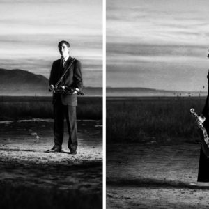
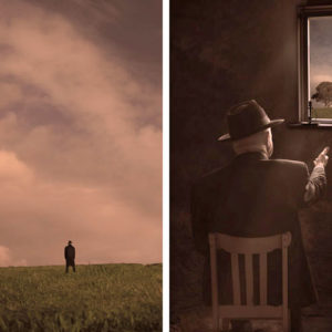
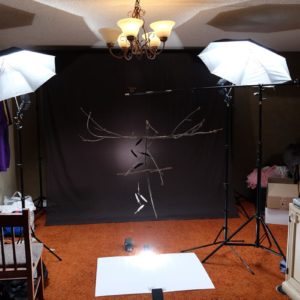
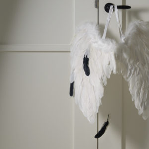
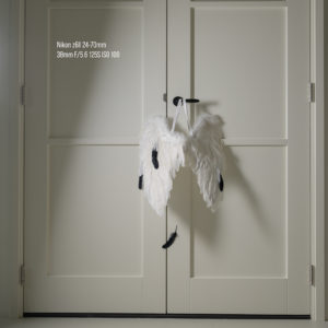
Some inspiration:
IMPORTANT VIDEOS
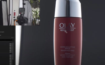
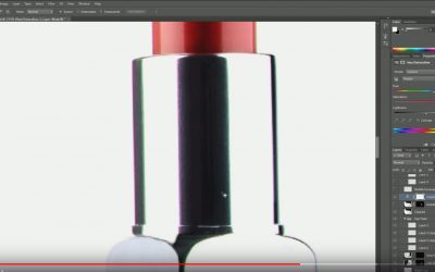
SHOOTING REFLECTIVE PRODUCT
I would say that doing a better job of lighting the label or getting a frame with the label lit would be another way of doing this, but take a look at how this photographer does the post on a relatively easy product shot. Attention to detail is one of the most...

PHOTOGRAPHIC INFO
INSERT VIDEO HERE
PHOTOSHOP INFO
INSERT VIDEO HERE
PHOTOGRAPHING COSMETICS: ONE STYLE
Short tutorial on one photographer's style of working with cosmetics. https://www.youtube.com/watch?v=wjeEI2EVge4
MAKING SELECTIONS IN PHOTOSHOP (THIS IS COOL)
A very smart tutorial on using sliders to help make selections smoother. https://www.youtube.com/watch?v=oHfGDfbXdT4
WHO KNEW A SHINY BOWL COULD BE SO DIFFICULT?
But they are. This is a well thought out video on how intricate you must be with your lighting to show a simple silver bowl https://www.youtube.com/watch?v=-M_H9Sah2UY
SHINY OBJECTS: SPHERES
Well done tutorial on lighting metal and round objects. https://www.youtube.com/watch?v=-M_H9Sah2UY
SHINYS OBJECTS WITH SIMPLEST LIGHTING TOOLS
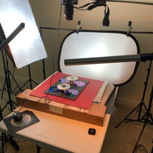
I am a big fan of using reflected boards for lighting shiny surfaces. This is a very nice tutorial on how to use boards and small lights to delicately carve a soft light. https://www.youtube.com/watch?v=CfQoftGuiOU
PHOTOGRAPHING SHINY OBJECTS
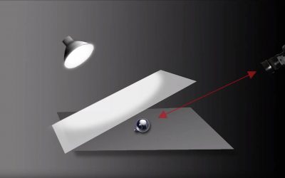
This is a nice little tutorial showing angle of incidence / angle of reflection and how to use that law of physics in designing your light. https://www.youtube.com/watch?v=C8HNBcu3Hig
COLOR GRADING IN LIGHTROOM
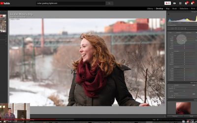
Another easy to follow tutorial on color grading only this time using Lightroom. This is a great way to work a color pallet into your style. https://www.youtube.com/watch?v=BWKQkjLo_lo
COLOR GRADING USING PHOTOSHOP LUTS
Another fun way to work with the color in your images. https://www.youtube.com/watch?v=nqHYdcXKD4c
Still Life Tips (CL Class)
Here are some ideas for creating light modifiers and what they do. https://www.youtube.com/watch?v=7Hwu6g7L6vE&t=1129s
Color Grading: A Simple Method
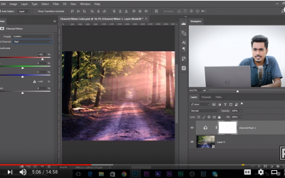
Sometimes the color we get is not the color we want. Color can help 'sell' the concept. It can lead us emotionally. And it can make the most mundane seem more mysterious. Here is how you can color grade in Photoshop. https://www.youtube.com/watch?v=NhLXYGXaPe0
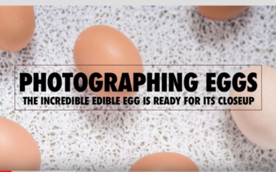
Photographing Eggs
A breakdown of some egg shots we did in class a while ago. https://www.youtube.com/watch?v=EBi5DGFxuww
ARC OF BEAUTY
One of the most powerful tools we have is the direction of the light. This video walks you through the 'Arc of Beauty" and some of it's applications. https://www.youtube.com/watch?v=wQ3cU6w3w6s&t=7s


