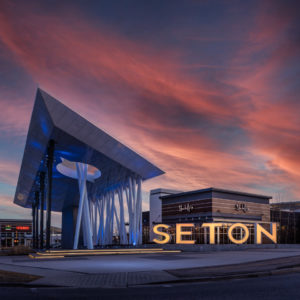
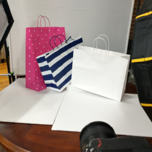
You have been called upon to create a poster for the local Chamber of Commerce, or whatever they call it where you live. A co-op of businesses that help drive interest in the community.
The ‘Chamber’ needs your help.
And an image… a really good image.
The gig is a poster – large and vertical. It has to ‘read’ from quite a distance, so small subtle nuances may be lost. Or may not be… your gig is to get all the info into the shot that you can… just make sure that the small details are not NECESSARY to tell the story.
The Story:
“The Shopping Season”
A mix of ‘great weather’ and ‘great shopping’ in your town.
Maybe it’s great or maybe it sucks… or maybe it is way better than some other town.
You can approach it any of those ways:
1. Chamber of Commerce wants to lure folks to your town because of all the great weather you have. As the seasons are changing, they want to entice folks to get out and see the downtown, shop and dine more, and make the area more vibrant.
2. There is a new shopping district, mall area, walking mall, shopping park, restaurant row… whatever you have in your town. They want to get the word out and drive more people to the new area.
Your subject matter could be a farmer’s market or a new street remake. You may have to go to the next town over for a suitable shot.
Whatever it is, the image must be simple in design since it must ‘read’ from very far away. Tiny details get lost. Big gestures get attention.
Specifics:
Vertical.
Color. (Bright if possible)
Your vision is fine… do YOUR shot.
It is important to make this shot grab the attention of folks coming into your area of town. They are only printing 25 of these very large posters, so make the image as dynamic as possible.
MAKE this shot, do not do a drive-by shot of a market, please.
Bring a talent. Add props. TELL A STORY.
Do your research and present something that moves us to go DO something this weekend.
OPTION
FOR THOSE OF YOU WHO LIKE TO SHOOT TO A LAYOUT…
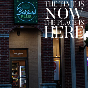
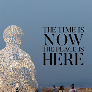
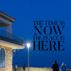
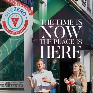
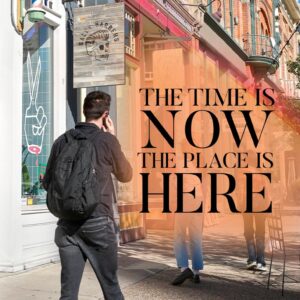
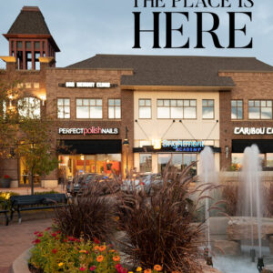
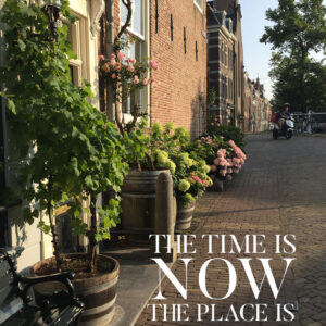
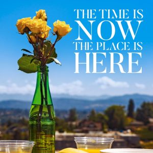
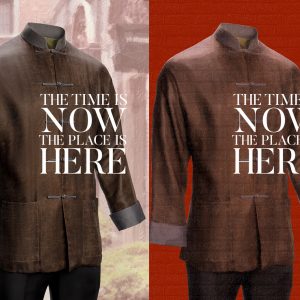
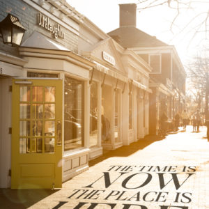
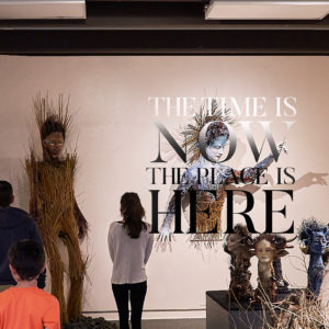
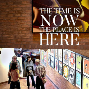
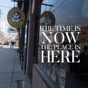
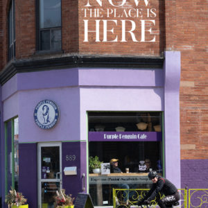
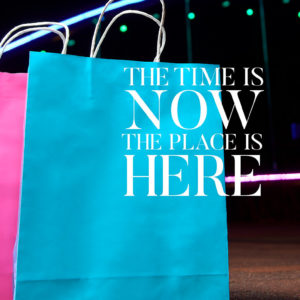
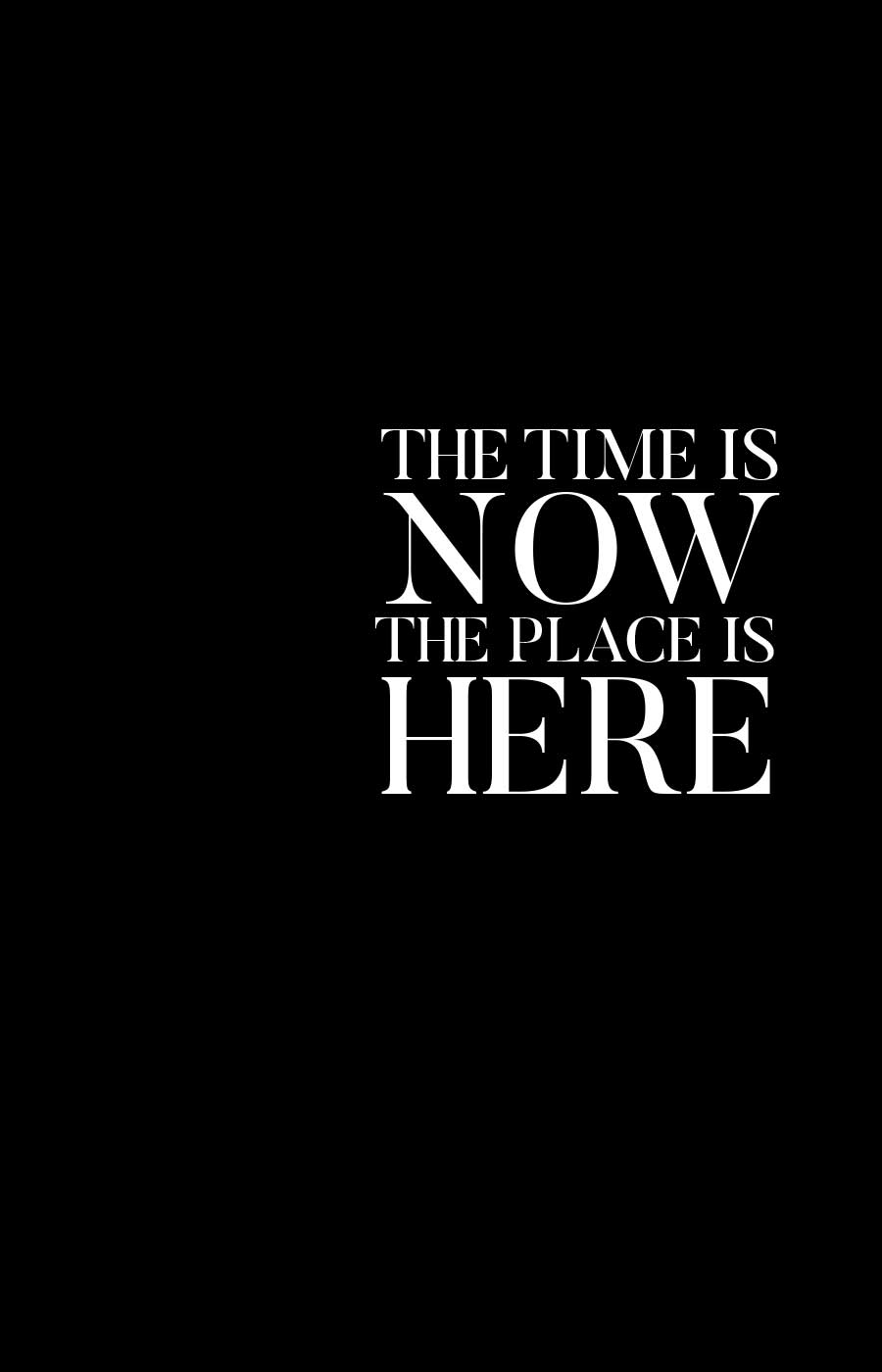
Here is the proposed layout from the city designer. Nothing other than the approved tagline is on it, but you can see it may be difficult to work around… so do the difficult thing and make it work.
The PSD has a dark type layer for a light photograph and a light type layer for a dark photograph.
OCTOBER 2021
PREVIOUS WORK
MARCH 2022

