ASSIGNMENT: WINE / BOTTLES FROM LAYOUT
THE BRIEF:
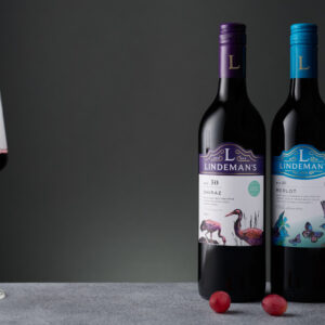
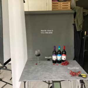
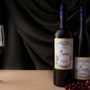
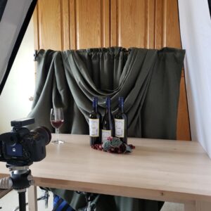
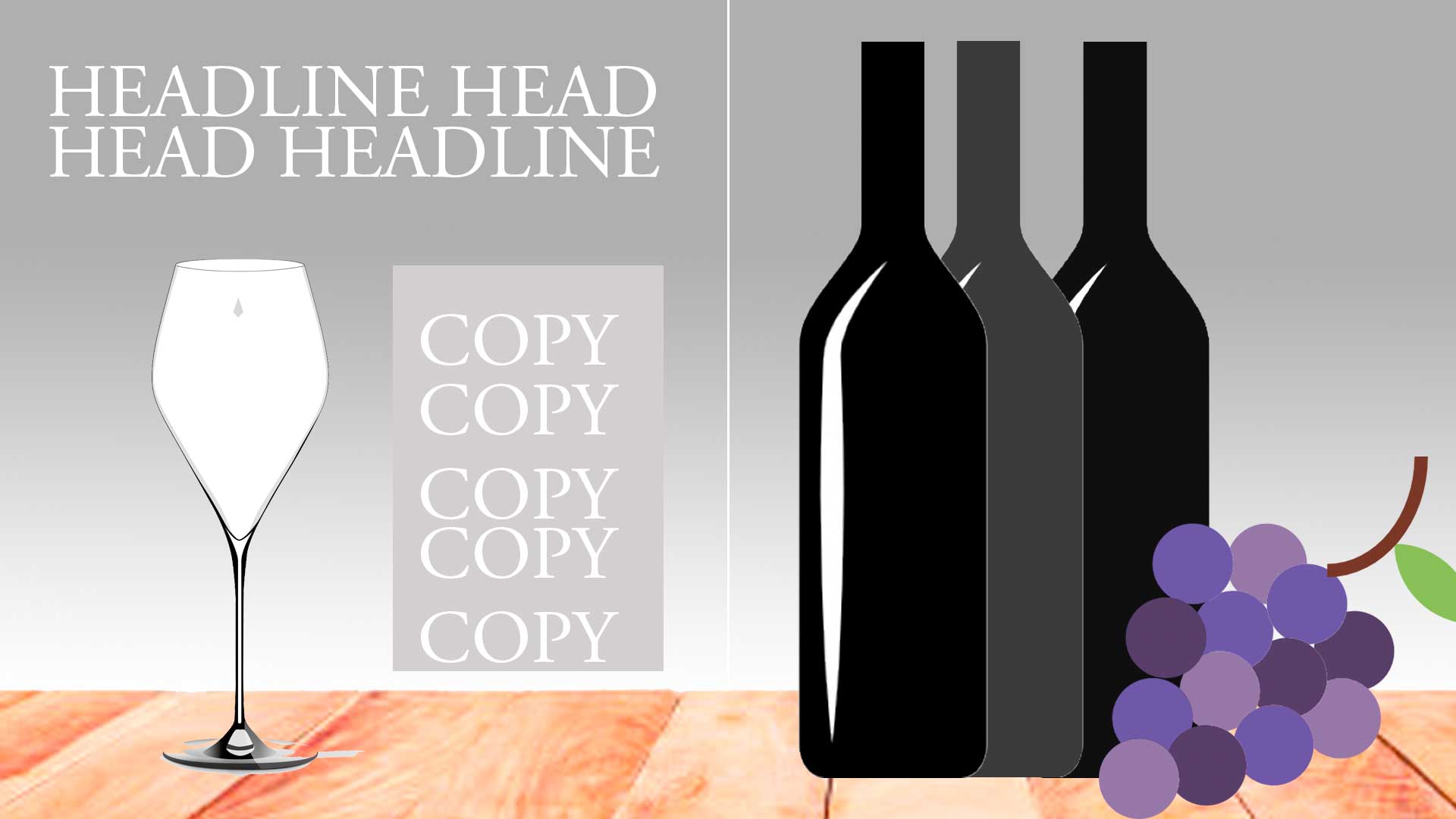
A double spread ad for a local restaurant to run in a local magazine. You have this layout sketch from the art director. This is a rough look at how they want the image. It is your job to present the image perfectly designed but styled and lit in your own way. The layout is a rough indicator of what they want: a glass of wine, three bottles of wine, some grapes, and a plank of wood or textured surface for the shot.
Now is where YOU come into play. Your eye, design, vision, style, and production are brought into play and you make your shot – but one that conforms to the basics that are asked for by the client. This is a typical way a client will interact with you.
I am the client, so if you have questions ask on the FB group, and remember to tag me. Whoever starts the question thread, let us use that for all questions pertaining to this image assignment.
THE PARTICULARS:
- Dark or Light wine – your choice
- The glass should have wine in it, but do not open the bottles in the shot
- Gradient background from medium light to a medium dark
- Grapes should be as good as you can get – you may even want to grab some additional leaves if possible.
- Labels on bottles may be removed if you wish
- Choose simple labels… ones with metallics may prove a difficult challenge
- The surface may be a single piece of wood or a table top, you decide
- Notice the camera angle is oblique to the bottles and wine glass… important to match (Do not shoot with very much of an angle to the surface)
This is a very important assignment. It will have you planning a lot and executing your plan with deliberateness and exacting processes.
Three Wine Bottles One (PDF)
HERE IS THE LAYOUT:
ASSIGNMENT INFO:
PHOTOSHOP TUTORIAL: MASKING ESSENTIALS

