LUGGAGE
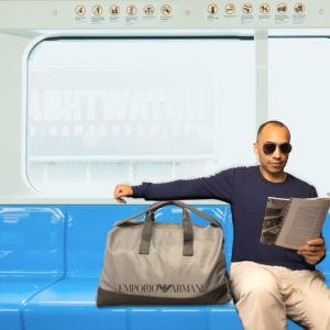
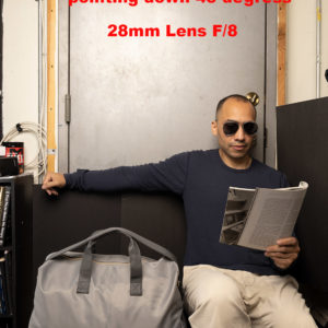
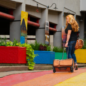
A high-end item that also sells at low-end retail outlets. The idea of luggage means travel… travel is romantic. Travel is personal. Travel is freedom. Now we have been asked by a small ad agency to produce an image for a new distributor of luggage in our area. It is a full two page ad (a double-truck as they are known) and it will have minimal type on it. Lots of image freedom here. The luggage is a bit over moderately priced. Not quite Louis Vuitton, but not Walmart either. The ad agency has given you a budget for a model or talent or person to add some life and possibly a bit of whimsy to the shot. Here is a chance to pull out all the stops. Once again we have a person and a product in the same image… emphasis on the product, but the person can also add some charm, fun, or drama to the ad as well. We must see:
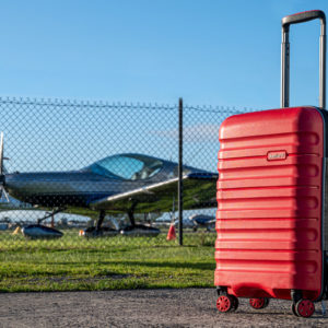
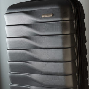
- the texture of the materials used in the luggage
- the color of the luggage
- logo if possible
- handle
- any special characteristics (like wheels, pull handle, or stitching)
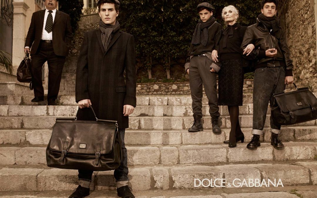
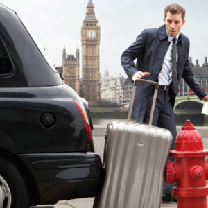
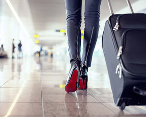
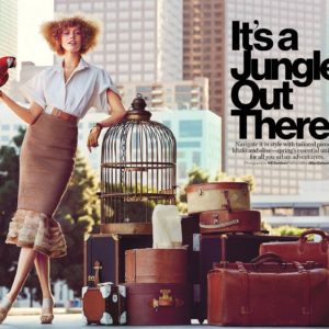
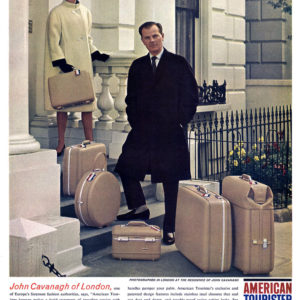
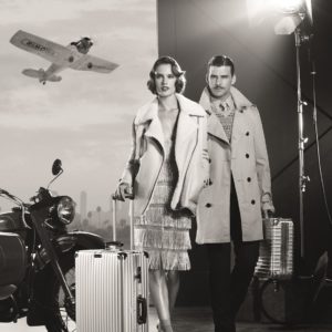
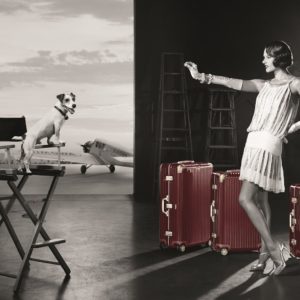
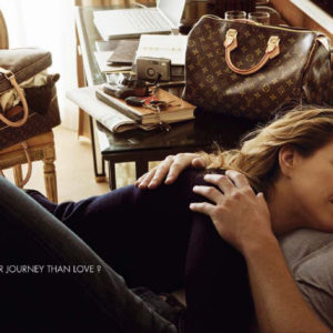
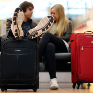
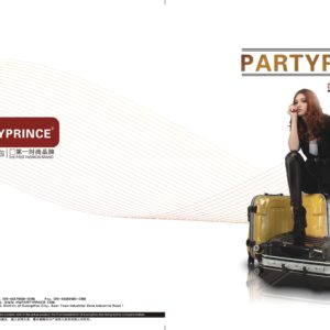
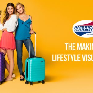
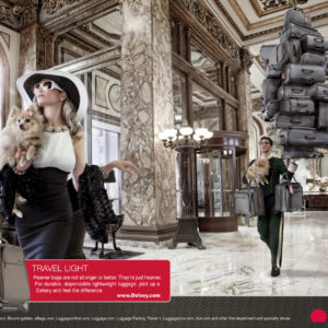
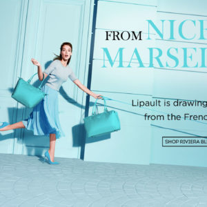
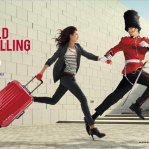
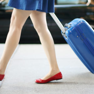
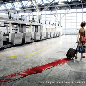
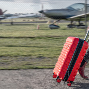
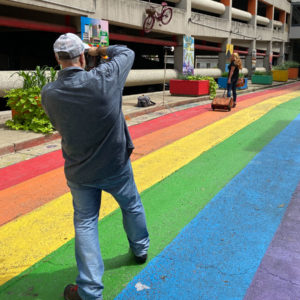
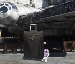
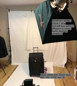
The person can add flair to the image by providing context and helping with the story. When you are planning this shot, think about the story of your subject and their relationship to the luggage, travel, destination, reason for going… so many different emotions that are tied to traveling. On location is preferred, but if you can make it work in the studio – go for it. (Especially if inclement weather is a problem for you.) A gallery of luggage ads you can use to be inspired:
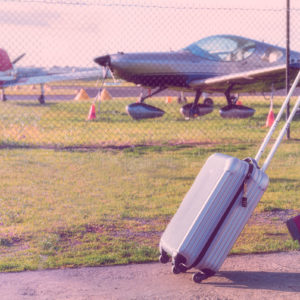
- girl with suitcase

