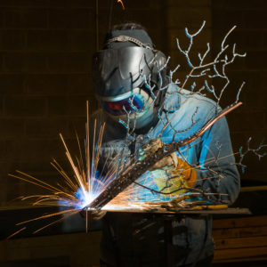
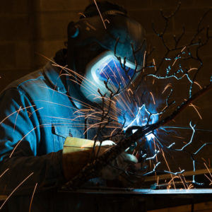
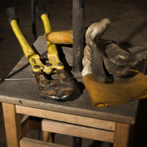
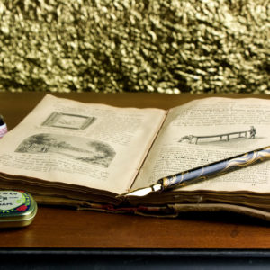
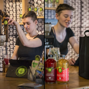
FOR THOSE OF YOU WHO WANT TO PARTICIPATE IN THE PHOTOSHOP FUN… Here is Duane’s file to process. Include image with next week’s upload.
This will be fun. And challenging.
Really challenging.
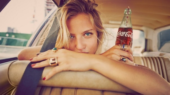
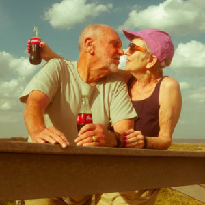
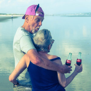
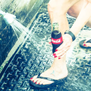
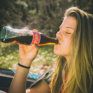
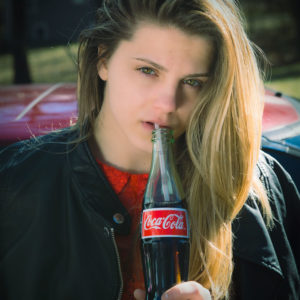
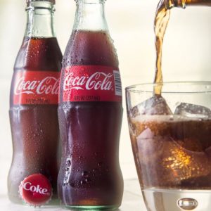
Here is an article with images from the new Coke campaign.
Read it. Twice or more.
You have just been contacted by a local Coke ad agency for a set of promotions and they want two images LOCALLY to add to the collateral / ad work they are doing for the local event. They have sent you the brief (see above) and need you to create the images ASAP within your own style, BUT staying true to their concepts.
However, they are wanting a more ‘real people’ look to the images. Not models – real folks in older demographics if that is what you have access to. Note the bottle of coke, not the position of the label in all shots. Note how the bottle is always a feature.
There you go. (BTW, this will be the next assignment for the regular class as well, so knock this one out of the park, please.)
Start a discussion on FB if you want any more clarity.
SATURDAY ADVANCED
FRIDAY WEBINAR (first five minutes garbled so I cut them out)
SATURDAY WEBINAR
Carol Liscovitz Images

