ASSIGNMENT THIRTY FOUR: CC MODULE ONE
PLEASE READ THE ENTIRE MODULE ONE PAGE BEFORE DIVING IN TO THIS ASSIGNMENTPLEASE READ ALL OF MODULE ONE TO UNDERSTAND THE ASSIGNMENT.
CHOOSE TWO BELOW.
The Creative Class: Module One
Use your own photography for these assignments.
Assignment 1: The Power of Simple
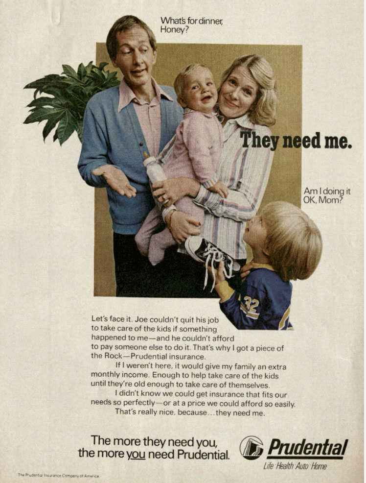
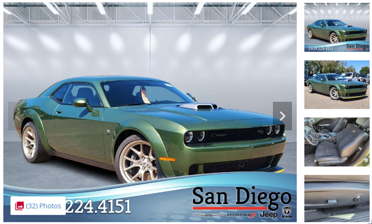
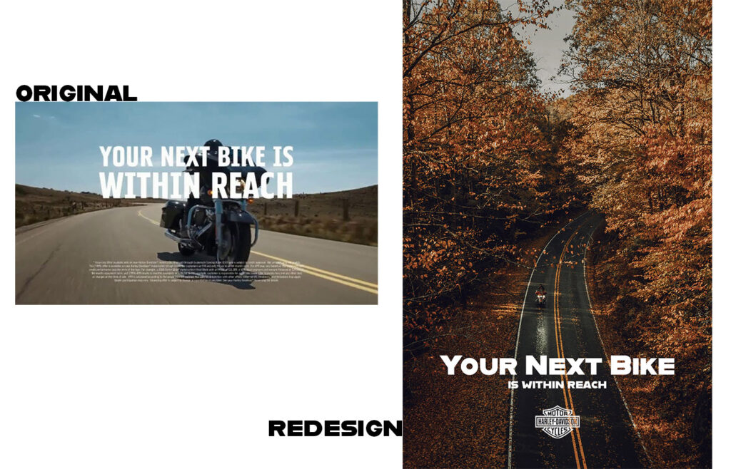
Find an advertisement, either print or digital, that you think is overly complicated.
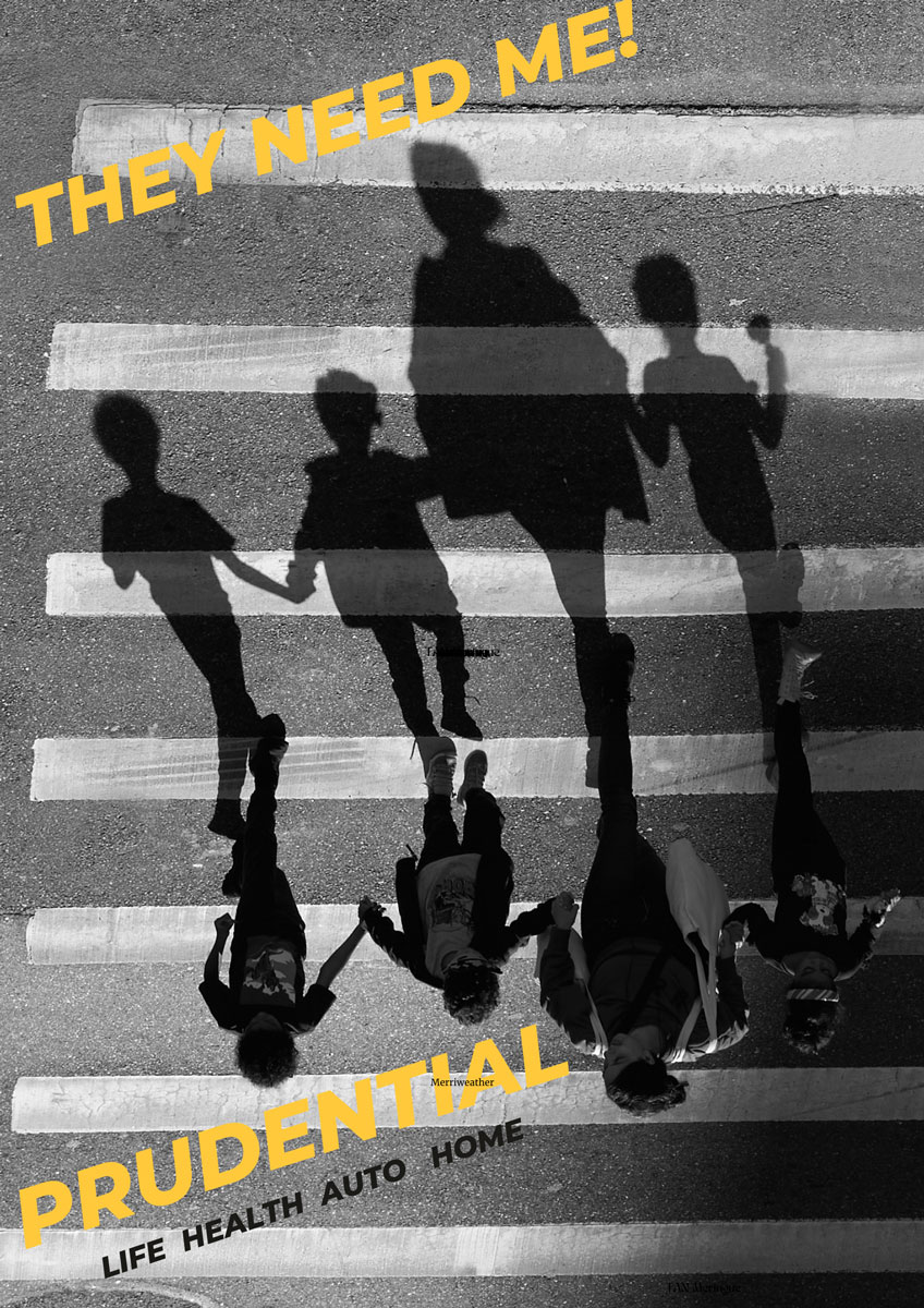
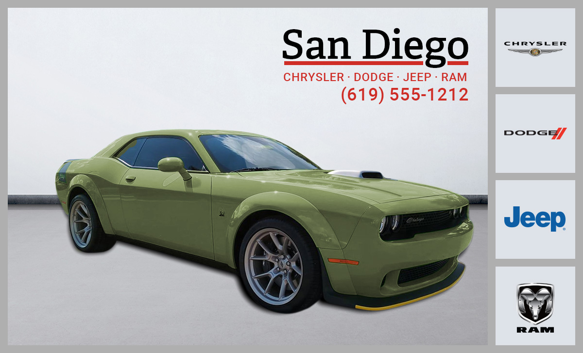
Re-design it.
Make it simpler.
Make it clearer.
EXAMPLE:
Find an ad on Google, or in a magazine and print it out.
Do a self-assessment on the ad.
How can it be made cleaner or less cluttered?
Use an image from Unsplash that could work better, and lay the ad out with similar fonts and words, but with an image you feel is less complicated or cluttered.
Assignment 2: Balancing Act
Take a snapshot of your everyday environment.
It could be a room in your house, a view from a window, a bustling street corner.
Now, turn it into a graphic representation, a visual narrative.
Pay attention to balance.
Are all elements harmoniously co-existing?
EXAMPLE:
Look for balance in the photograph.
Light vs dark
Subject vs background.
Seek images that seem to balance themselves in the frame.
Using cropping, re-framing, light, dimension… any and all tools at your disposal to create an image that looks balanced.
Now take that image and make it into a graphic by using color, graphic elements like lines, circles, or squares or whatever you come up with.

Hose on the porch.
Assignment 3: Directing the Eye
Choose a social media post from a business you admire.
Analyze it.
Where does your eye go first, second, third?
Is the hierarchy clear?
Is there a path?
Now, create your own social media post.
Guide us.
We’ll follow your lead.
EXAMPLE:
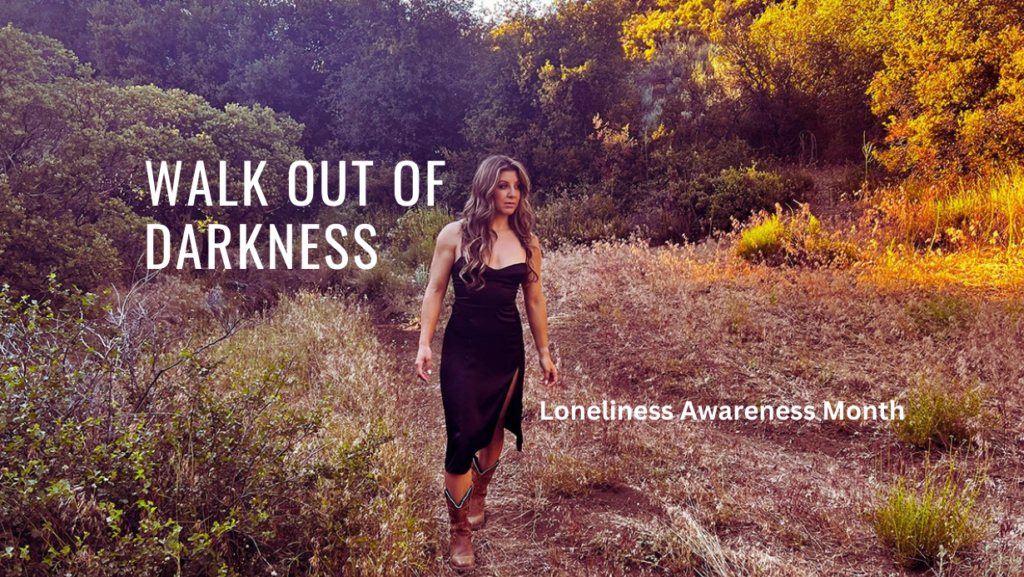
Open Canva or Adobe Express and choose to make a similar post to what you are examining.
Using elements, line, type, and a photo, recreate the ad and keep our eyes directed to the subject.
Assignment 4: Consistency is Key
Pick a brand with a strong visual identity.
Analyze their last 10 posts on any platform.
Identify the elements that make them consistent.
Is it the color scheme?
The typography?
The image style?
Now, create your own visual identity.
Design 3 posts that show us what consistency looks like.
EXAMPLE:
Choose an iconic brand: Apple, Coke, Taco Bell, etc…
Create a new ad that fits the look and feel of their brand.
Watch for color consistency, density (how much is going on in the ads) and subject matter.
Use one of their headlines if needed.

Assignment 5: The Ultimate Visual Story
This is your final act.
Create a visual story that represents your personal brand.
It could be an infographic, a series of photos, a comic strip, or anything else visual.
But remember, it should tell a story.
A story about you.
A story that connects, engages, and resonates.
Make it count.
EXAMPLE:
Think of this as your first brand image for yourself.
Are you a mnimalist?
Are you a classicist?
Are you just having fun and haven’t decided yet?
S’all good, folks.
This three-panel ad is about your view of anything; Potato Chips, Chevy’s, Beer, Tacos…


