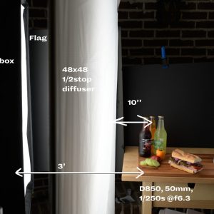
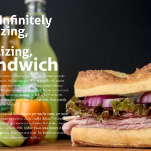
The Most Incredible Sandwich… EVER!
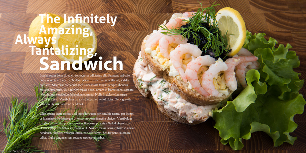
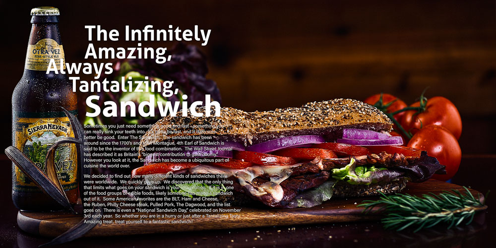
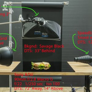
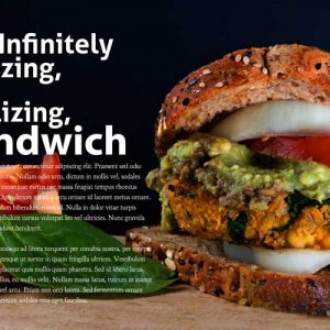
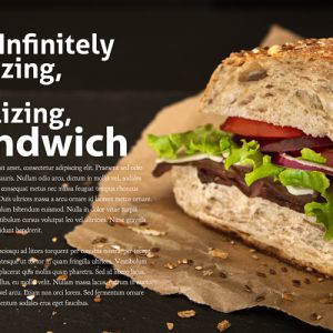
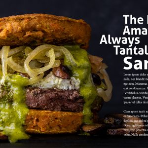
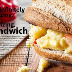
The client, a small regional restaurant/catering chain, has introduced a new sandwich line to complement their other prepared foods. But these sandwiches are different… more of a work of art these guys are.
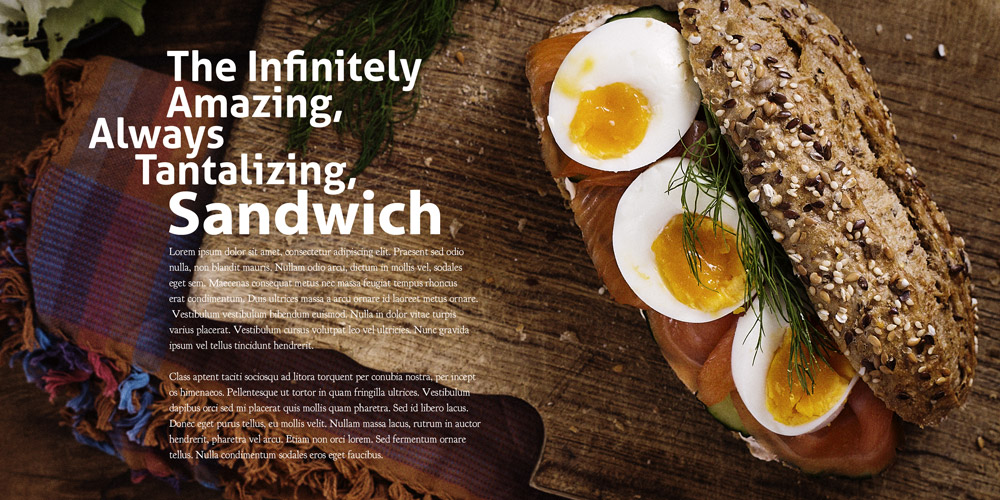
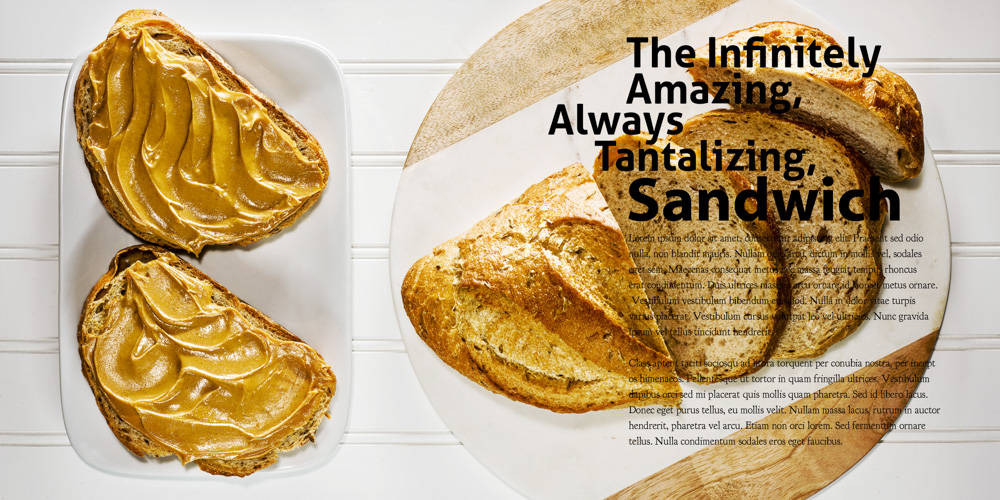
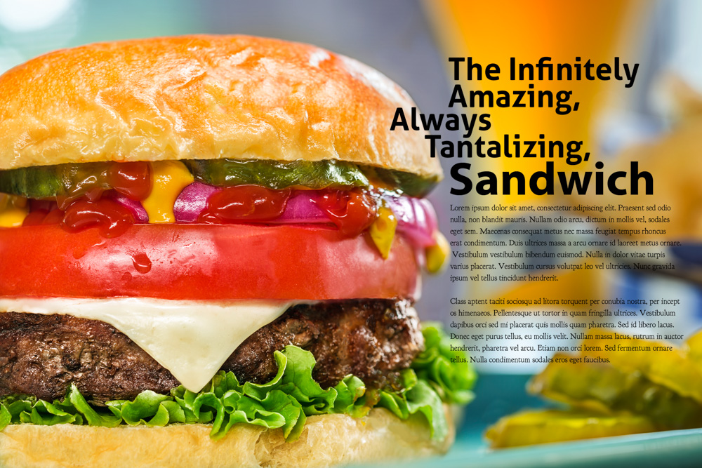
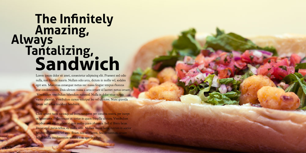
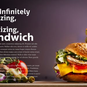
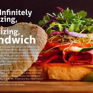
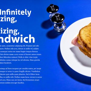
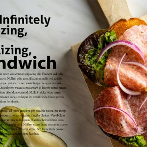
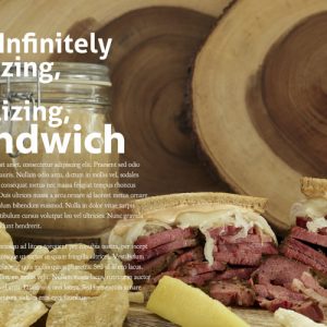
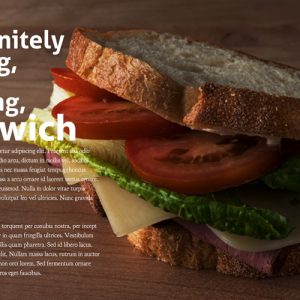
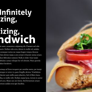
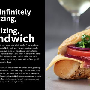
Your assignment is to do a very interesting sandwich shot that fairly reeks of “high-end cuisine sandwich” – and for this, you will have a layout. The designer has already created two other brochures for the client, so the placement is pretty much set. He hired a photographer to do it, but unfortunately, that photographer had never worked on any of the Project 52 stuff (probably didn’t have my book either) and totally, unconditionally failed to deliver the image.
Heh…
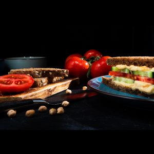
Anyway – you guys are up next. What will you do to make this shot so freaking awesome that people will want, no – NEED to buy a sandwich from his restaurant – and make the designer and client ecstatic.
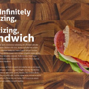
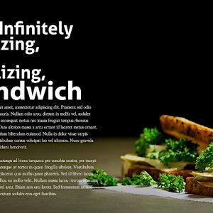
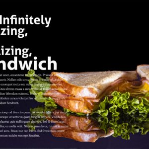
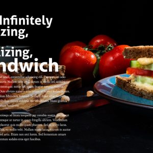
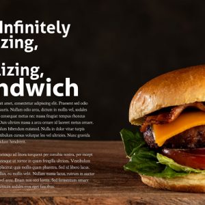
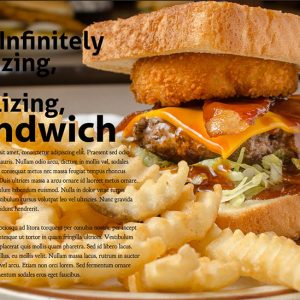
The layout is here (Photoshop) with black text on white and white text on black. You can shoot a dark area for the type or a light area for the type – just make dang sure we can read the type. Format is 6×12 – so it will require some cropping of the image.
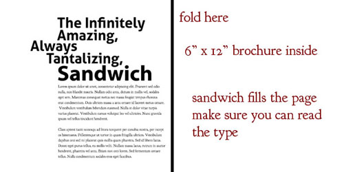
Download the Photoshop Layout Here.
NOTE: The white text is the lower text layer marked black text. It is actually the white text over a black background. Of course either put your image above the black background or remove it altogether. It is only there to allow you to see the white type.
PREVIOUS CLASS WORK
APRIL 2020
SEPTEMBER 2019 CLASS IMAGES AND REVIEW

