
PROPERTIES OF LIGHT THREE PART ONE: THE DISTANCE OF THE SOURCE
This is one of the more complex of the properties since it affects both the softness of the light, as well as the contrast of the lighting over all.
Every light source has a dimension that reveals its best properties.
For instance, we will take a 24″ Beauty Dish.
A beauty dish is not just the lighting instrument, but it is also the light created by it.
A beauty dish LOOKS like a beauty dish at 2.5 times the diameter or less. Beyond that distance, it just becomes a light. (BTW, the beauty dish is designed to go straight over camera and NOT be filled in from the sides. You are free to use it any way you want of course, but I thought I would share that with you.)
We will look at how that works with all the lights in the assignments to shoot below.
Distance can change the relative size of light source to subject.
A softbox – in close to the subject – can be relatively large (soft) light and produce lovely, soft shadows. But if we move that source far beyond the 2.5 diameters, you will find it begins to act like any other ordinary light.
For instance, a 44″ square softbox may look soft when it is 12 inches away from a small bottle of perfume. But if you move it to 15 feet away, you will find it doesn’t differ much at all from a bare bulb light source. Any difference is negligible in the presentation of (and from) the subject.
The distance can change the fall-off and contrast of the light.
The infamous Inverse Square Law at work right there.
Two good videos on using the Inverse Square Law.
Work and Assignments for those have never worked with these sorts of tools.
Assignment one.
Using a softbox on a boom, move it around the arc of beauty and choose a subject that is a stack of books. Make sure the stack is at least 18″ high. Shoot from a comfortable 30 degrees down so you can see both the front of the item, and the surface it is sitting on.
Put your light back left, back right, back top, side left, and side right. Use a fill card on the shadow side to keep the texture visible. Once you have the books set, do not rearrange the composition with the books for this test shoot.
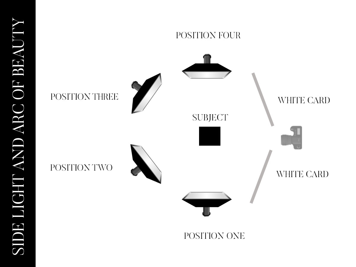
It is important to do this with the light top/back of the set as well.
Assignment two:
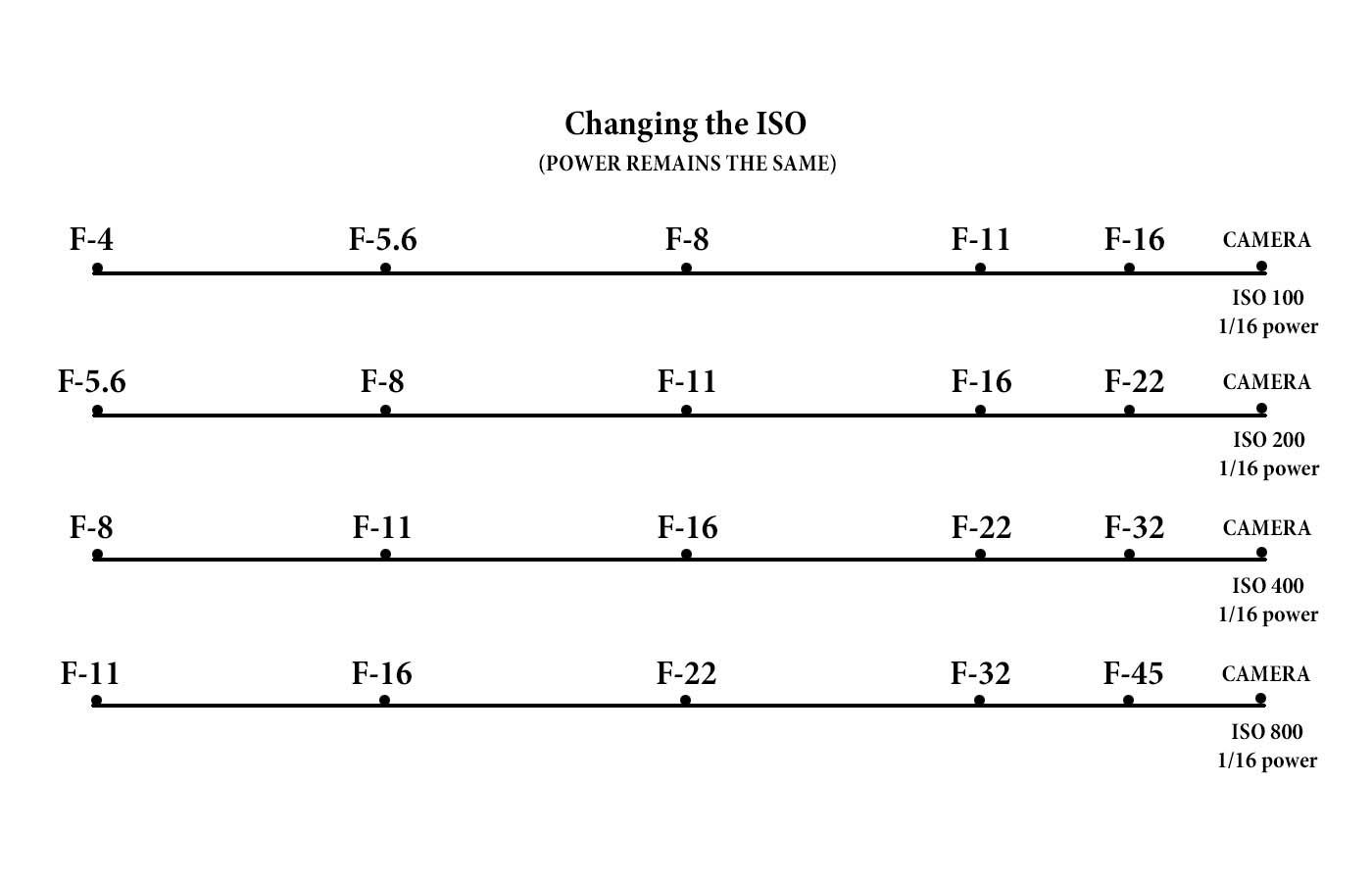
Put a subject 10 feet from a white wall. Light them to f-11. Make the photograph.
Do not move the light and have the subject be next to the white wall – touching it even. Put the light the same distance away from the subject as you did in the previous image, and shoot it at f-11.
In the first shot, at f-ll with the subject ten feet away from the background, you will have a gray background. The light ‘fell off’ from the proper exposure of the subject to ten feet away and is less light. In the second shot, the background will be far more white. This is because the light is the same on the subject as it is on the wall and is therefore the same exposure.
To control the exposure you can use the power of the lights (both up and down)
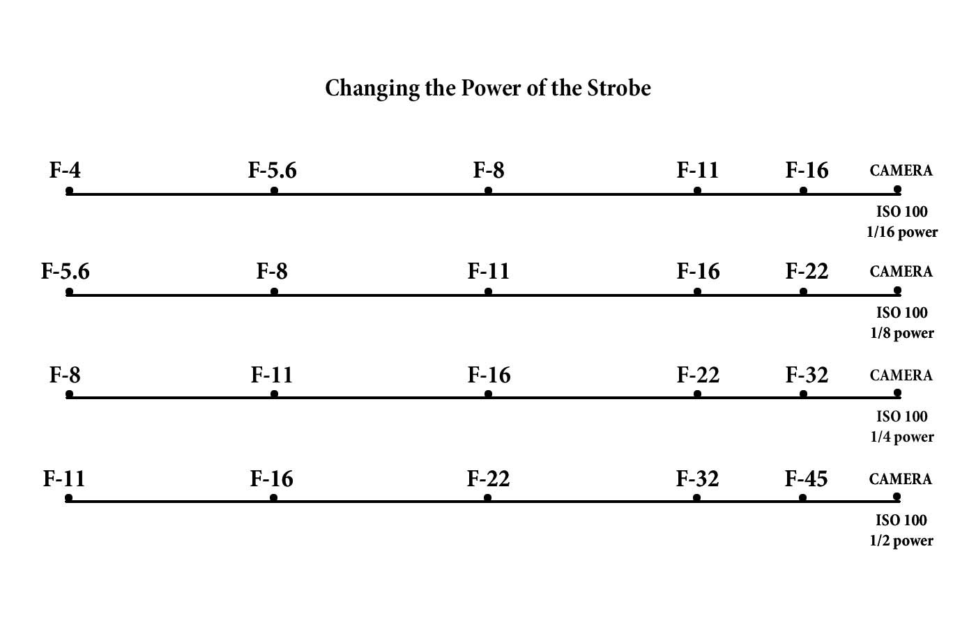
You can also leave the power alone and adjust the ISO for equivalent exposures.
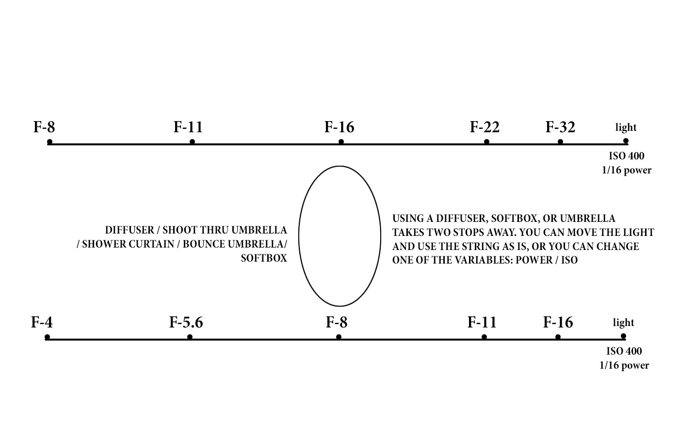
Using any sort of diffusion will take two stops away from your exposure, so adjust accordingly. (NOTE: If you are using a bounce umbrella, stretch the string meter from the back bounce surface of the umbrella for best results.) Also, silver bounce umbrellas only reduce by 1 stop.)
THE COLOR OF THE LIGHT
THE COLOR OF LIGHT AFFECTS MORE THAN WE THINK
One of the things that will cause your image to not “pop” or present at its best is the color quality of the light.
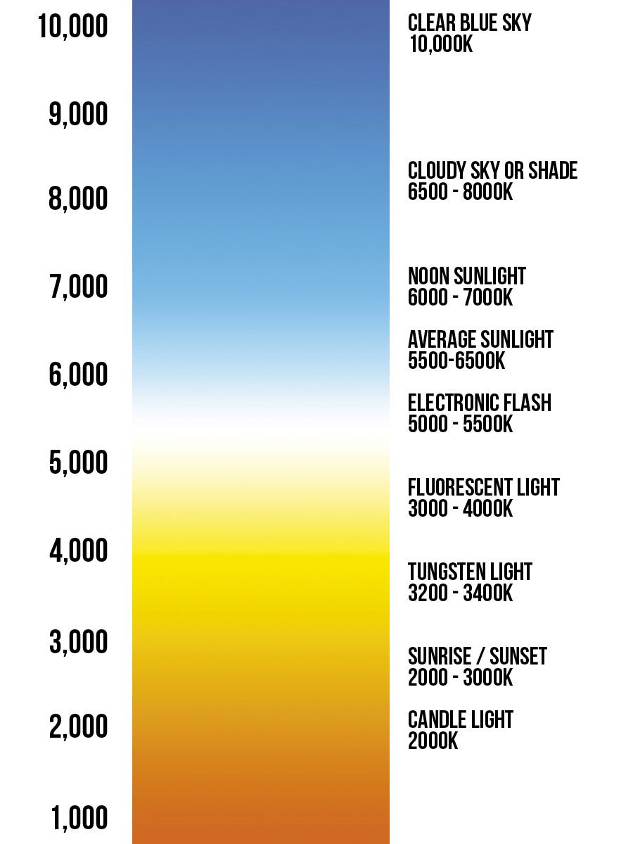
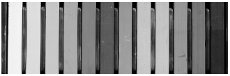
Our eyes see white light, but actually light has color that can be seen by many methods – photography is the easiest way.
Tungsten light is orange.
Flourescent light is greenish.
Mercury Vapor is green/blue
Sunlight is white (with variations through the day)
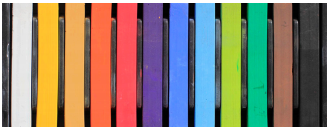
Here is how the color of light is seen:
This can be pretty ‘science-driven and can be can get a bit wonky to delve into why.
Let’s look at it through the eyes of a photographer.

This image is rendered as if it were shot under tungsten light. Notice the warmth to the skin, but also to the background. The image appears to be a bit muddy and not very contrasty.

This image is color corrected for the white background. All of the other colors (skin, feathers, hair) fall into line when we correct for the white in the background. Effectively we have removed the warm cast from the tungsten light.
Understanding White Balance In Photography
White balance will be a challenge for us when we use multiple light sources of different types.
For instance, most strobes will be balanced to the daylight end of the spectrum, while tungsten house lights will be warmish and tend to orange and yellows.
If that ambient (house lights) are able to influence exposure, they may be able to change or muddy the color as well.
Here is how to test if the ambient tungsten light is affecting your exposure with flash.
Once you have your setup, and you have chosen aperture/shutter speed, take a photo with the flash not firing. If you can see a little bit of the image in the capture, that means that you are getting some influence from the ambient light. The easiest way to cure that is to raise your shutter speed. Try the shot again. If the resulting picture shows nothing, then the ambient light is not adding to your exposure and will not have any measurable impact on the image.
If you are outside, the ambient will usually match your strobes pretty easily unless you are shooting at dusk or sunrise.
Here’s a test for you to work on to find out how shutter speed works with ambient light.
Set your camera up with a subject in the shade, and the background in mixed shade.
Start with your string distance (basic setup) at f5.6.
ISO 100, 1/100 of a second, and the flash at the f5.6 distance.
Make a shot.
The subject should be well lit and the background a bit over exposed.
Now shoot the subject at 1/200 of a second, and then at 1/400 of a second.
Do not change the distance of the strobe or the ISO or the aperture.
Lastly, shoot the subject at 1/800 of a second. The subject will remain the same exposure, but the background will get progressively darker.
This is because the incident light behind the subject is affected by shutter speed, while the subject is only affected by the power of the flash.
And while you can use all of this to great creativity, we are discussing the ability of the ambient to affect your color in the image you are making. Ambient ‘bleed’ can alter the color of your image unless you can block it out. Shutter speed is one way.
COLOR SETTINGS IN YOUR CAMERA
WHITE BALANCE SETTINGS:
Auto White Balance
You can use this setting as a default in most straightforward lighting conditions. Auto White Balance works by evaluating the scene and deciding the most appropriate white point in it. The setting works reasonably well if the colour temperature of the ambient light is between 3,000-7,000K. However, if there is an abundance of one colour in the image, or if there is no actual white for the meter to use as a reference, the system can be fooled, resulting in an image with a colour cast.
Daylight setting
Use this setting if you are shooting in bright sunshine. It will balance for a colour temperature of around 5,200K, which is actually very slightly cooler than noon sunlight. However, it is very rare that you will actually be shooting at noon and so this setting will work best for the greatest part of the day.
Shade
Although we perceive shaded areas to be colder, the colour temperature is actually higher (bluer), usually around 7,000K. This setting is most suited to areas of light shade rather than very heavy shadow.
Cloudy
This sets a colour temperature of around 6,000K. It is best used on days when the sun is behind the clouds, creating a very even and diffuse light.
Tungsten
The first of the artificial lighting settings, this assumes a colour temperature of around 3,200K and is suitable for most tungsten lamps that normally emit a yellow light. It is the equivalent of an 82-series blue filter used with a film camera to correct for the same colour cast.
Fluorescent
The second artificial light setting is set for around 4000K, the approximate colour temperature of fluorescent lights. The problem with fluorescent lights is that there are six types, each with a different colour temperature. They also emit an interrupted spectrum with peaks over quite a wide range. To complicate things further, they also change over time, gradually altering the colour temperature of light they emit. This setting has the same effect as fitting an FL-D filter to a film camera.
Flash setting
For use with either a built-in flash or an external Speedlite. Flash is a very white light with a colour temperature around 6,000K.
All these settings still rely on the camera doing some calculations to obtain the correct colour balance. However, there are two further settings which give you total control.
Custom white balance
Custom White Balance allows you to tell the camera which area in the scene is supposed to be white. The camera can calculate the colour shift required to make that surface white. It then applies that shift to all colours in the scene to provide a correct colour balance to the image, whatever the lighting. The EOS-1D Mark III, EOS-1Ds Mark III, EOS-1D Mark IV and EOS-1D X cameras allow you to store up to five different Custom White Balance settings and give them names or captions to make them easy to identify so you can switch to them quickly.
Kelvin
This enables you to set the colour temperature in degrees Kelvin in 100K increments from 2,500 to 10,000K depending on model. If you have a separate colour temperature meter then this may be the best setting to use as you can set the exact colour temperature shift needed. But, remember, if you do this you will need to take a few test shots to calibrate your colour temperature meter with the camera’s meter.
GLOBAL COLOR SETTINGS VS LOCAL COLOR SETTINGS
Changing the color settings in the camera are what we call global changes. That is, they affect every part of the image, not just one part. So if we apply a blue filter globally, we will end up adding blue to the entire image. And if we add a warming filter in Photoshop. we warm the entire image.
Local color settings refer to adding color modifications ONLY to the subject so that we do not interfere with the entire shot.
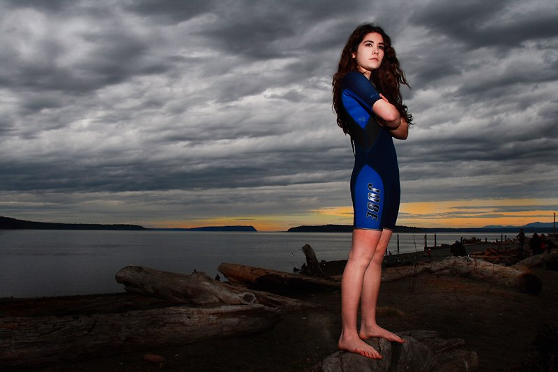
This image was shot on the beach in Seattle. We had a little bit of color in the background, but the light where we were was very cold and with a blue cast. I added a warming gel ONLY to my flash, not the entire scene. The result is local color applied to match the warmth in the sky behind the subject.
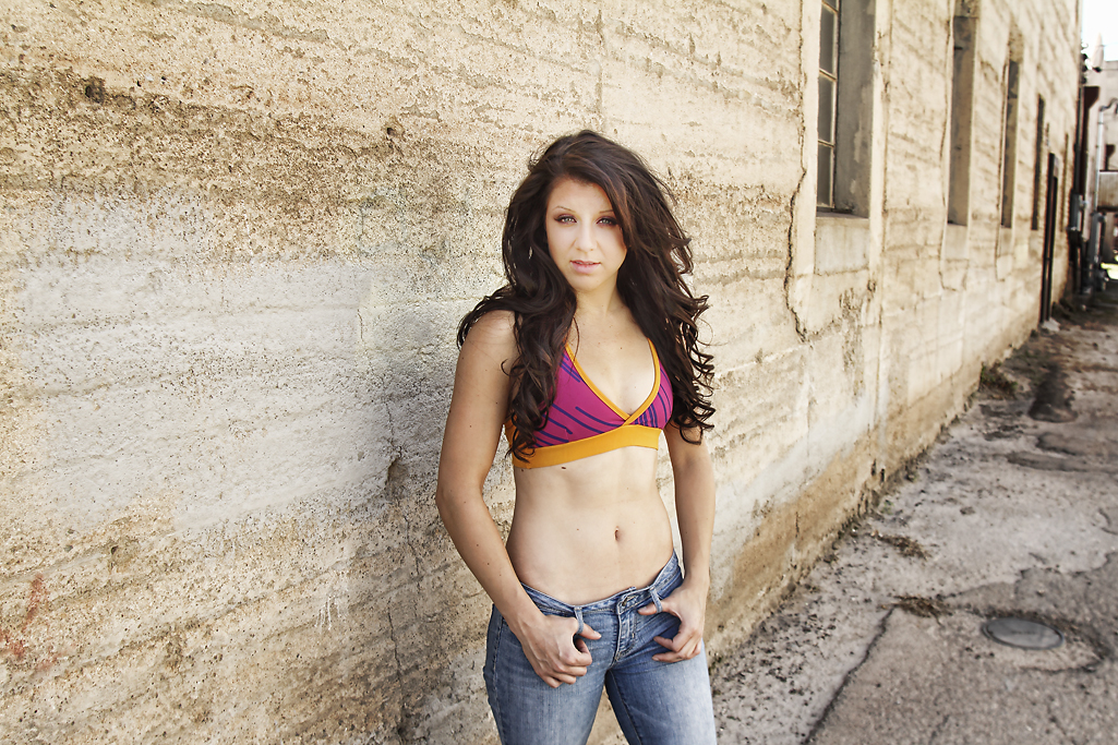
This photograph was done in a shady alleyway in Superior, Arizona. I added warmth to the image globally because the blue sky had added so much blue that the picture seemed a bit dingy.
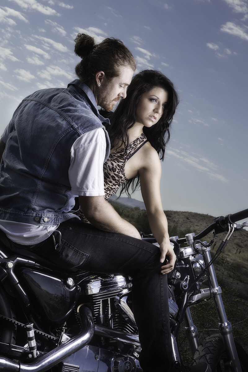
In this shot, I again added a tiny bit of warmth to my light to help accent the heavy blue I was getting from horizon to horizon blue sky. I wanted the subject’s face and skin tone to be a little bit more warm.
ADDITIONAL COLOR SETTINGS:
PICTURE STYLES:
Most modern DSLR’s have color settings for the RAW shooting that helps the preview come out looking as good as possible. Just remember you are only working with the preview. The RAW file will be able to changed to any of the color settings available.
(For instance, I like to shoot my camera in the Black and White preview mode. It helps me see composition, contrast, and luminance better than the color. No worries though, the camera is shooting RAW, and all the color information is saved with the file.)
Any Picture Styles applied to RAW files can later be changed or modified. When applied during post-processing with the Canon Digital Photo Professional (DPP) raw developer you can apply any Picture Style you like, whenever you like. The Picture Style you choose will not become a permanent part of the rendering until you export the RAW file as a JPEG or TIFF. This option is not available with many third-party applications, which often apply a preset rendering regardless of the Picture Style you have set.
Available Picture Styles (Canon DSLR)
Standard: Provides crisp, vivid images with increased saturation, contrast and sharpening. Default on EOS DSLRs.
Portrait: Optimizes skin color tones and saturation. Reduces edge sharpening for smoother skin texture.
Landscape: Produces punchier greens and blues with stronger sharpening for crisper-edged mountain, tree and building outlines.
Neutral: Has lower contrast and saturation than Standard. It is therefore ideal for images you intend to post-process by selectively adjusting the color, saturation, contrast and sharpening of individual images.
Faithful: Similar to Neutral but produces images that are colorimetrically almost identical to the actual colors when shot under standard daylight conditions (i.e., an average color temperature of 5200° Kelvin.)
Monochrome: For black and white photos. Also includes four optional B&W contrast filter effects (yellow, orange, red and green) and toning effects (sepia, blue, purple and green).
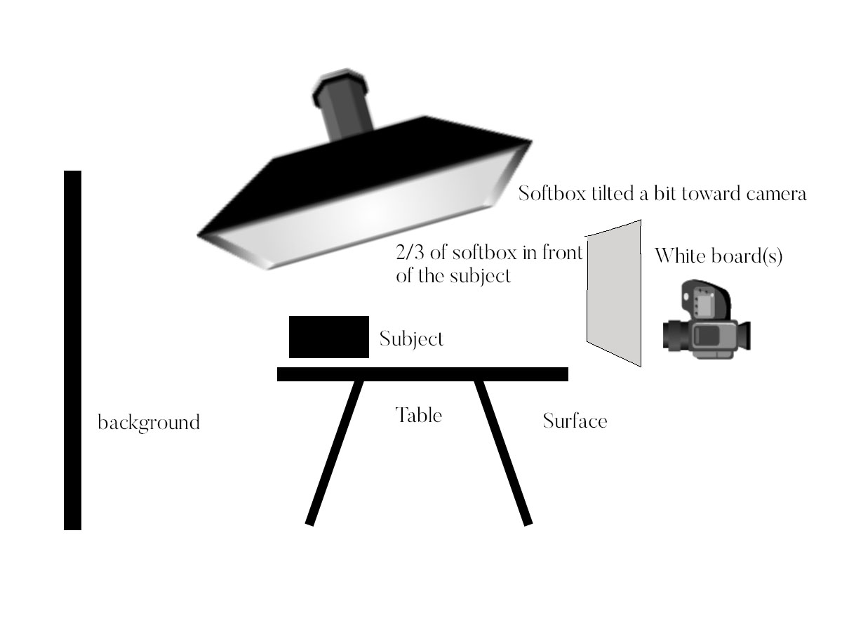
SHOOTING A TABLE TOP
This can be a bit more tricky since you may have modeling lights assisting and they can be very close to the set. Make sure they are not interfering with your exposure. Shoot a shot without the strobes going off to see what – if any – bleed the ambient lights are creating.
There is much to watch for when shooting in small areas. Colors can reflect, so can the walls or fill cards. Make sure labels are not in a position to cast color back on the subject or create reflections that can be problematic.
Working on a table means OWNING the table, and everything that can be seen around the table. You have to take responsibility for ambient light, reflected light, and color contamination that could even be coming from your wardrobe.
POST PROCESSING
Unless you want a warm, or cold image, your whites should be crisp and clean. It is imperative that you nail exposure, focus, and color when shooting for clients.
Learn as much as you can about color control. We will be focused on that (and many other things) during this course. You will learn a half dozen ways to control and correct color.