ASSIGNMENT: NUTRITIONIST BROCHURE COVER AND SPREAD:
AND EITHER A 20 SECOND MOTION GRAPHIC (REEL),
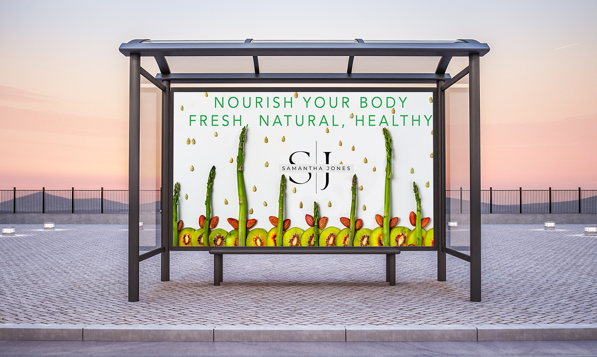
OR A POSTER DESIGNED FOR A BUS STOP BOARD.
THE BRIEF:
A local nutritionist needs a new brochure. He has hired a local graphic designer to do it, and you are the photographer. Your client is a designer, and his client is a nutritionist. This kind of shot is going to require some important questions to be answered before you can move forward.
What is the size of the brochure?
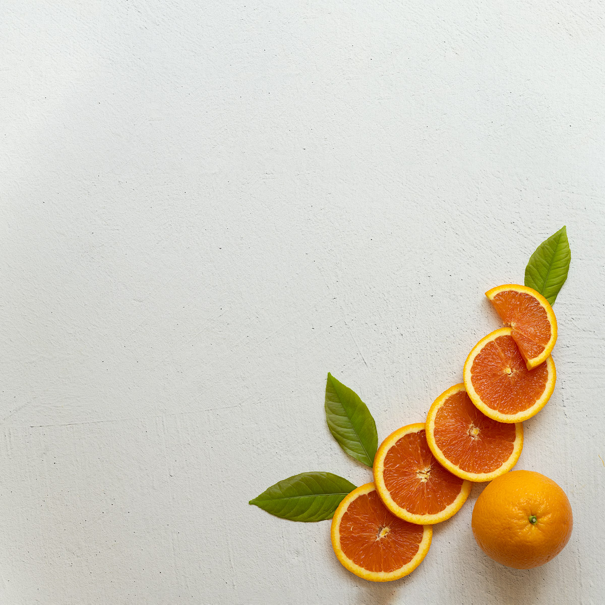
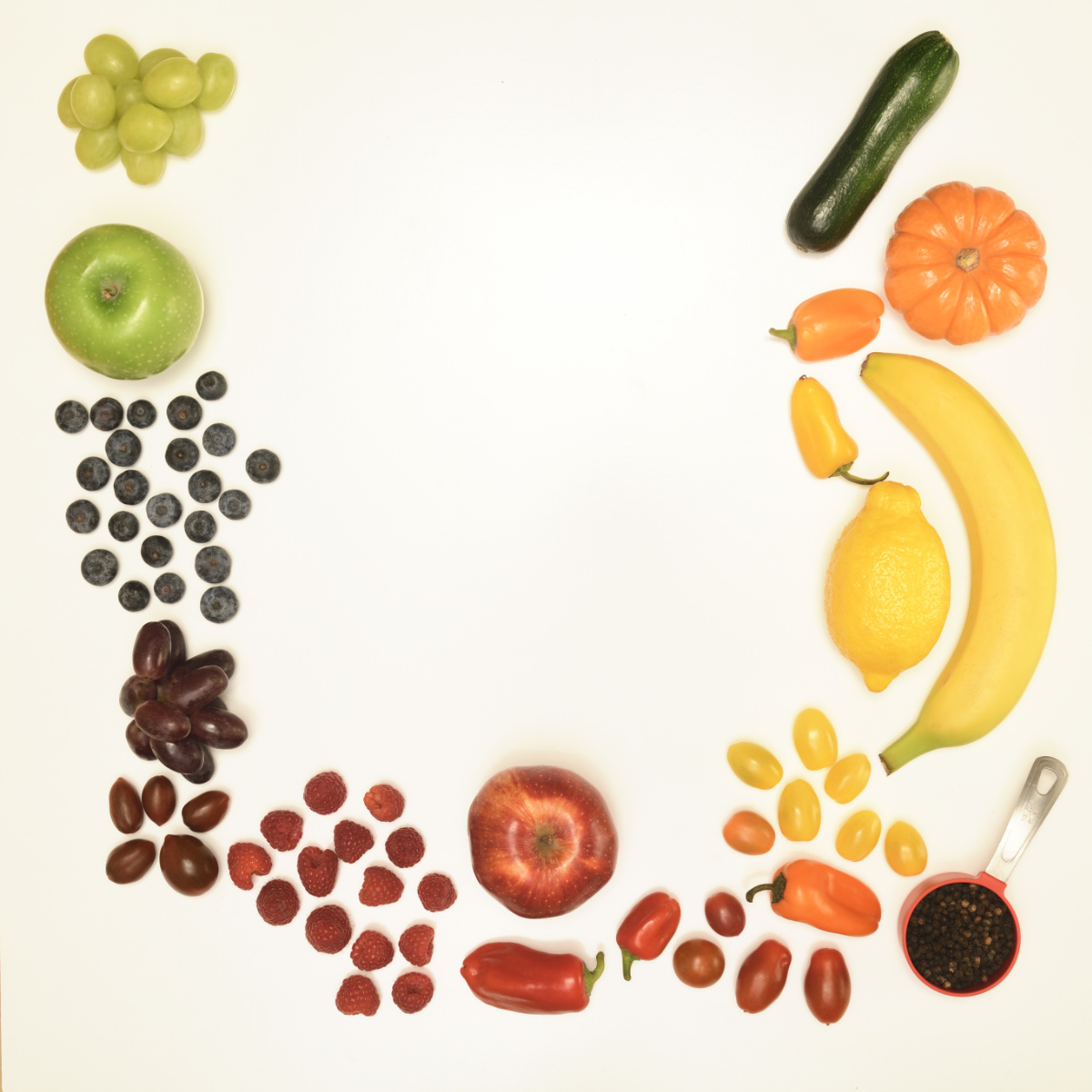
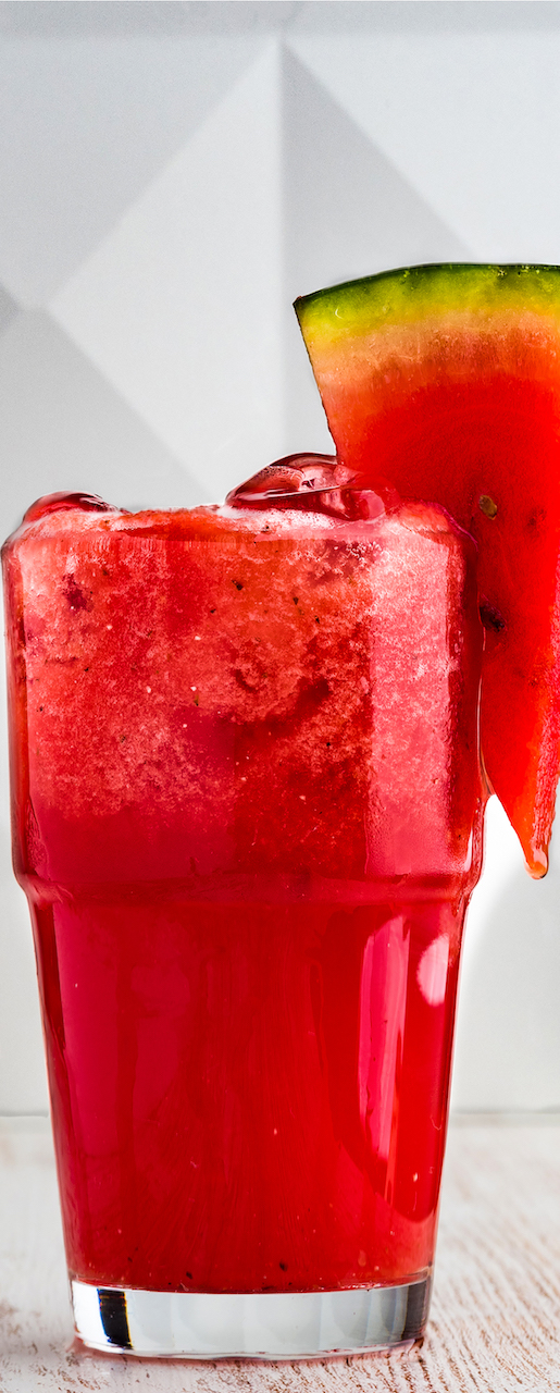
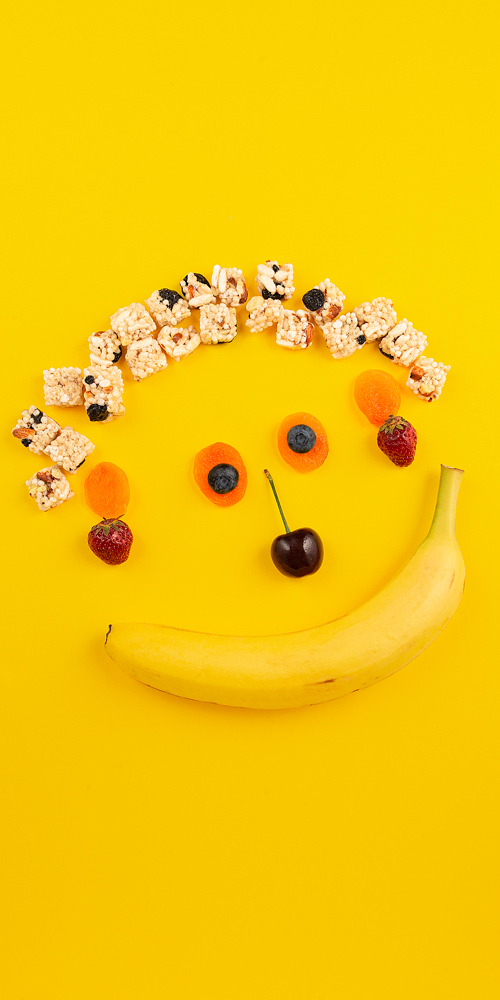
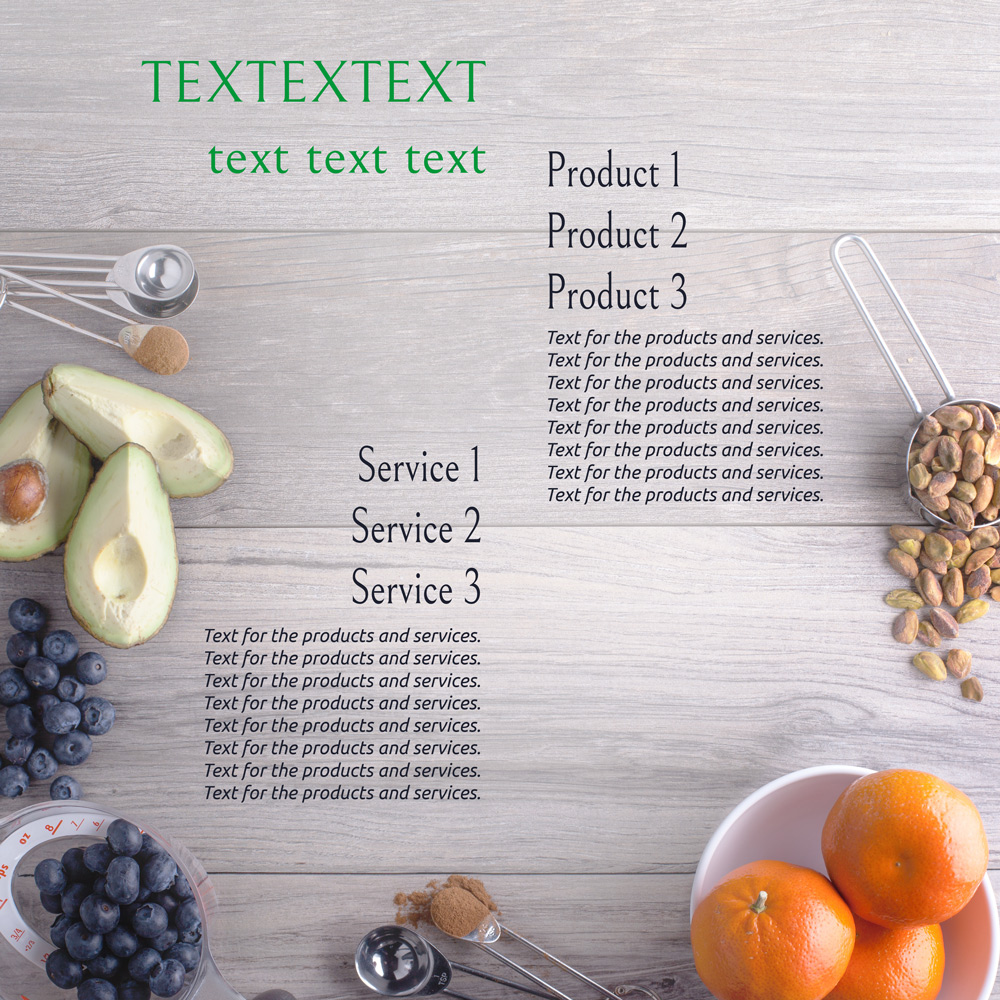
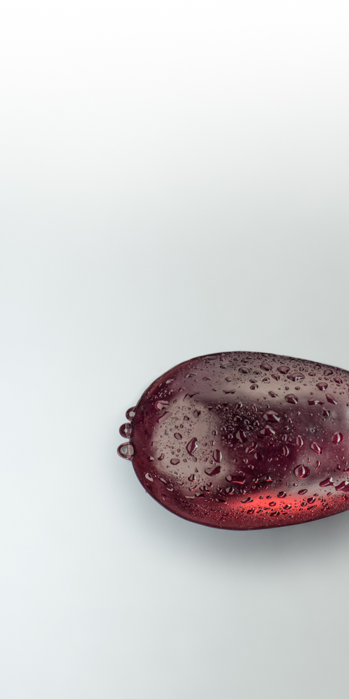
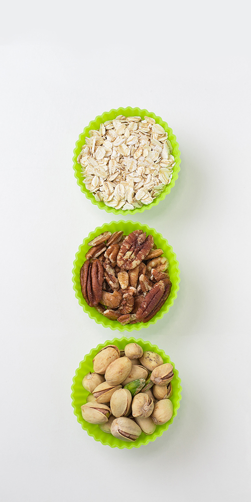
12″ x 6″ portrait orientation. This means it is much less wide than the format of the capture. You will have to keep this in mind as you shoot the image.
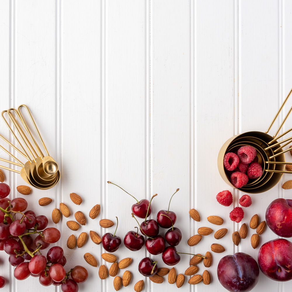
What is the focus of the nutritionist’s diet?
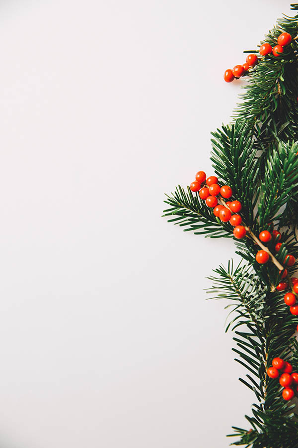
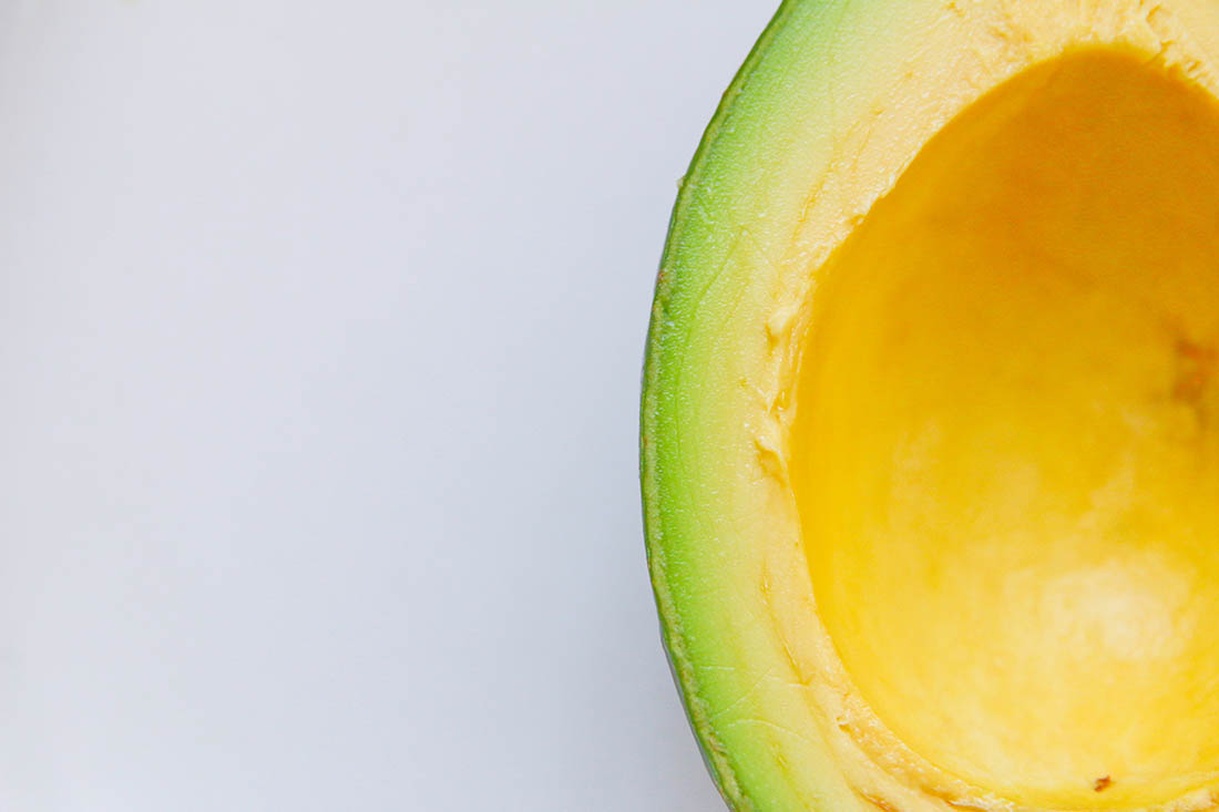
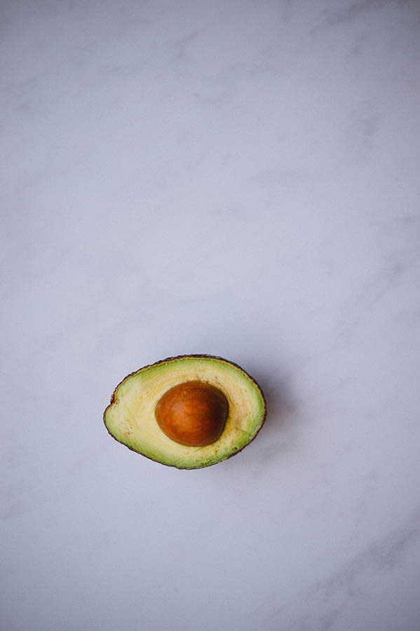
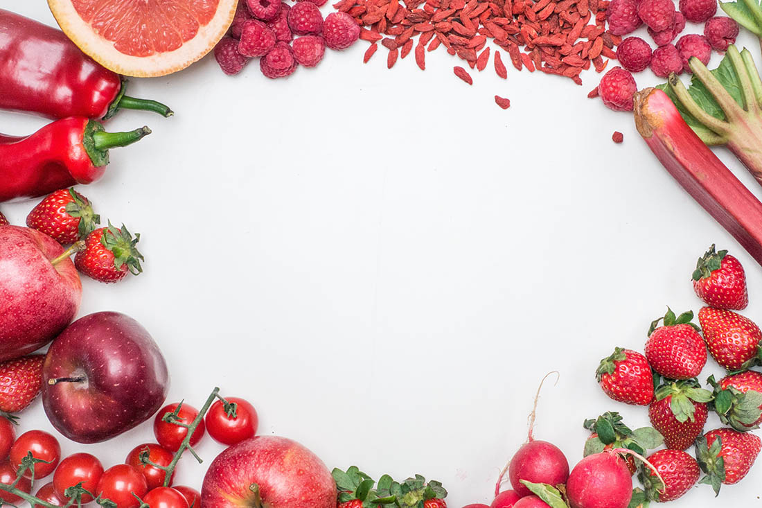
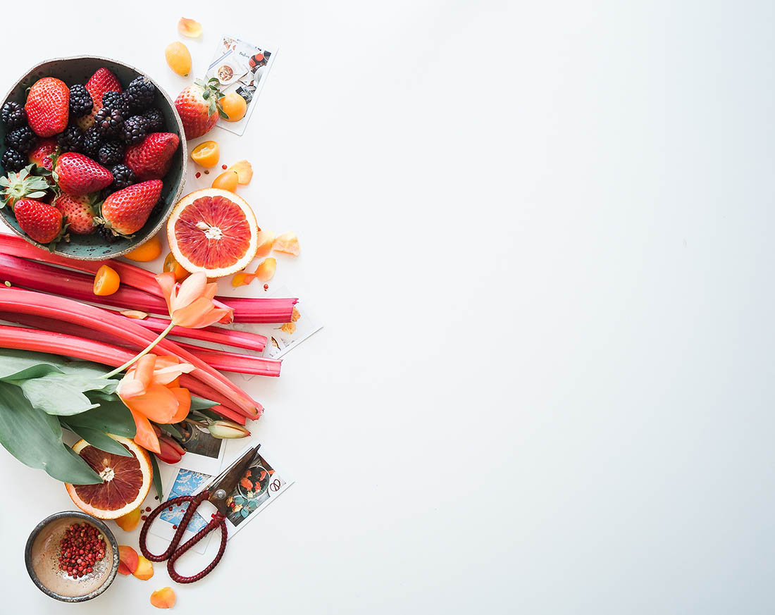
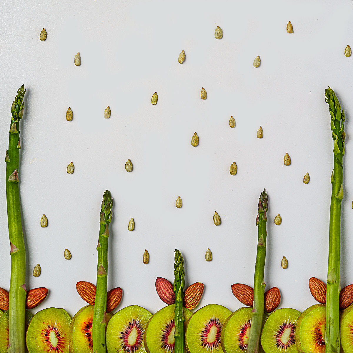
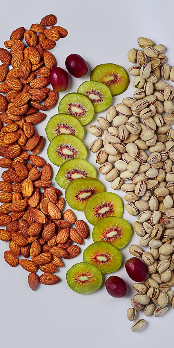
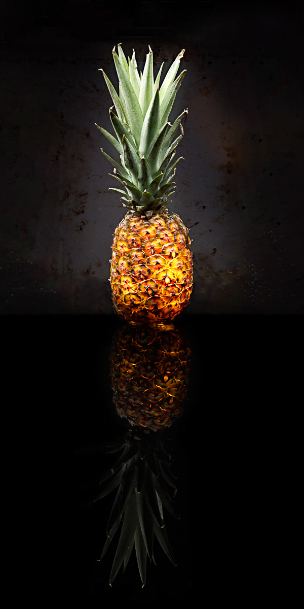
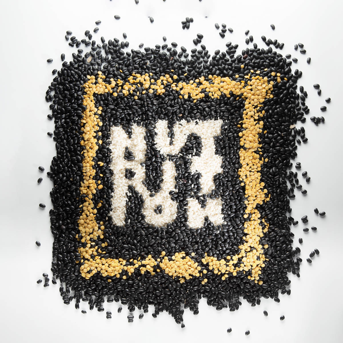
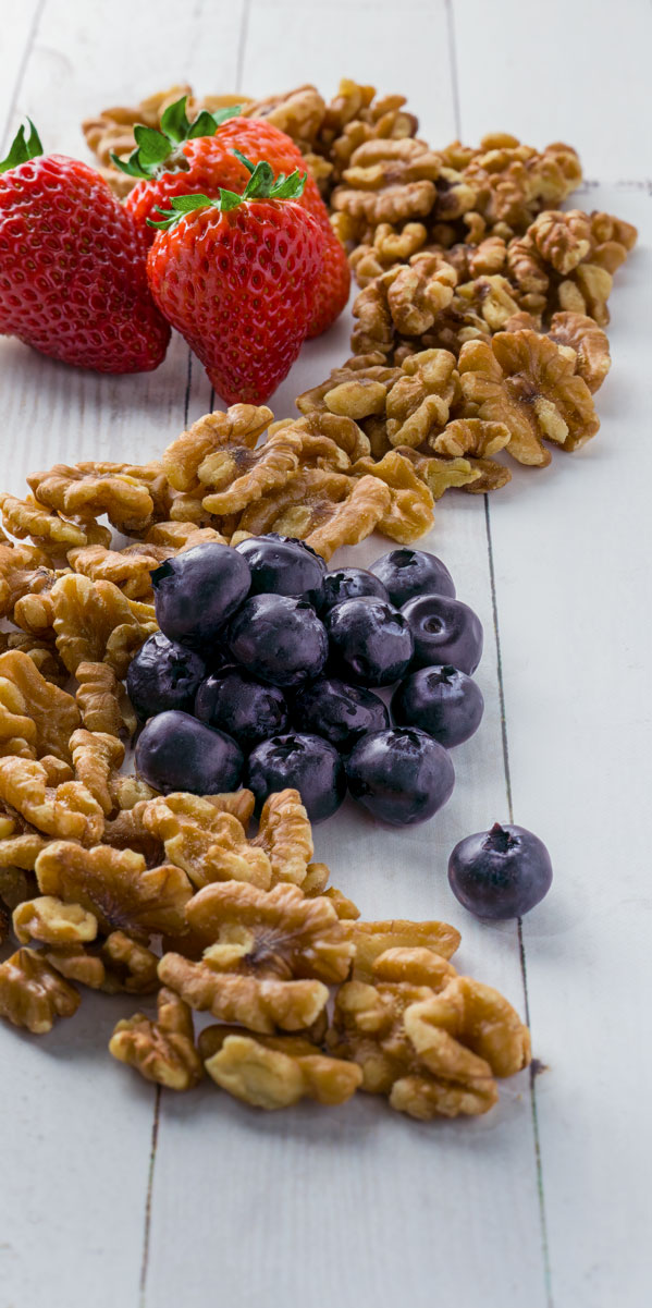
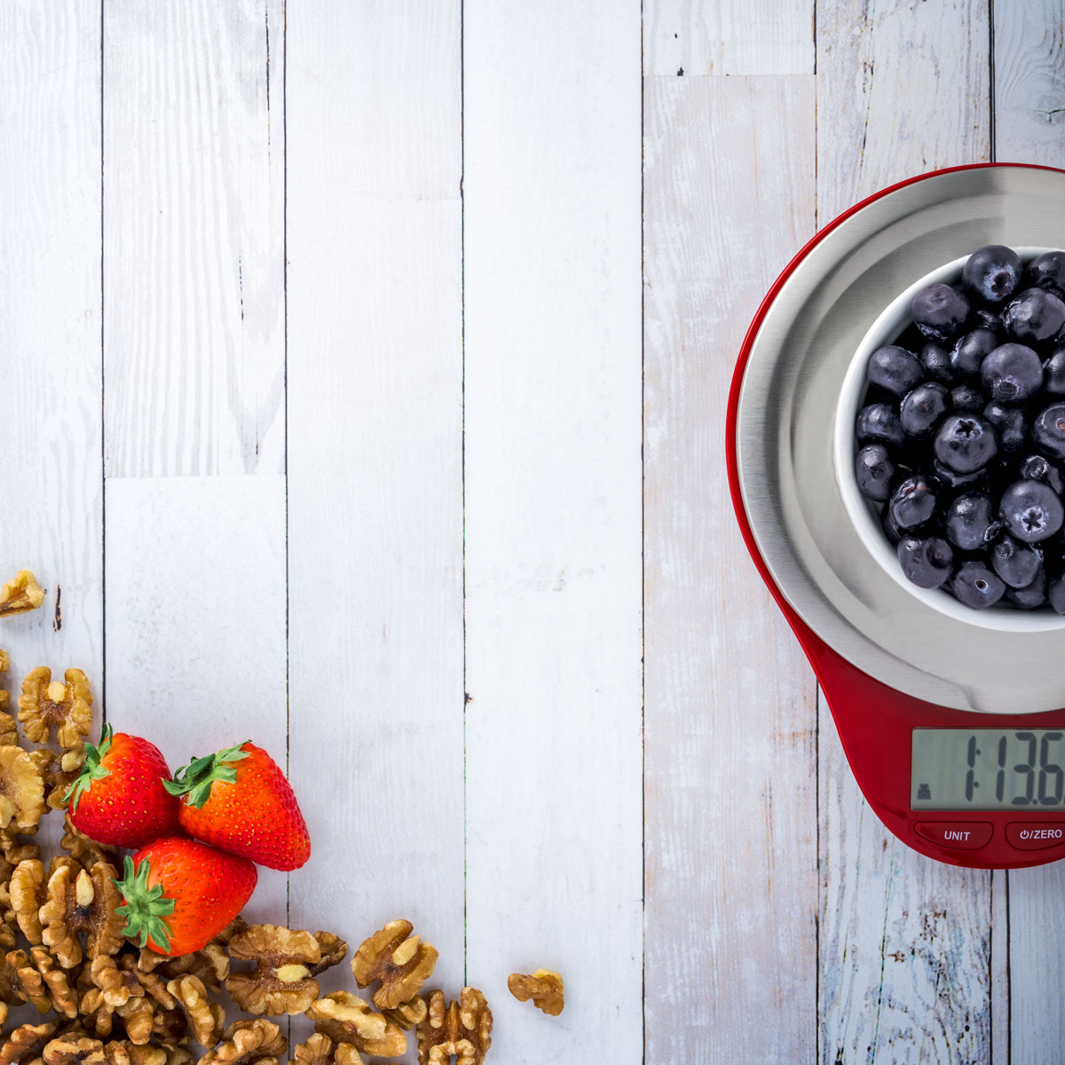
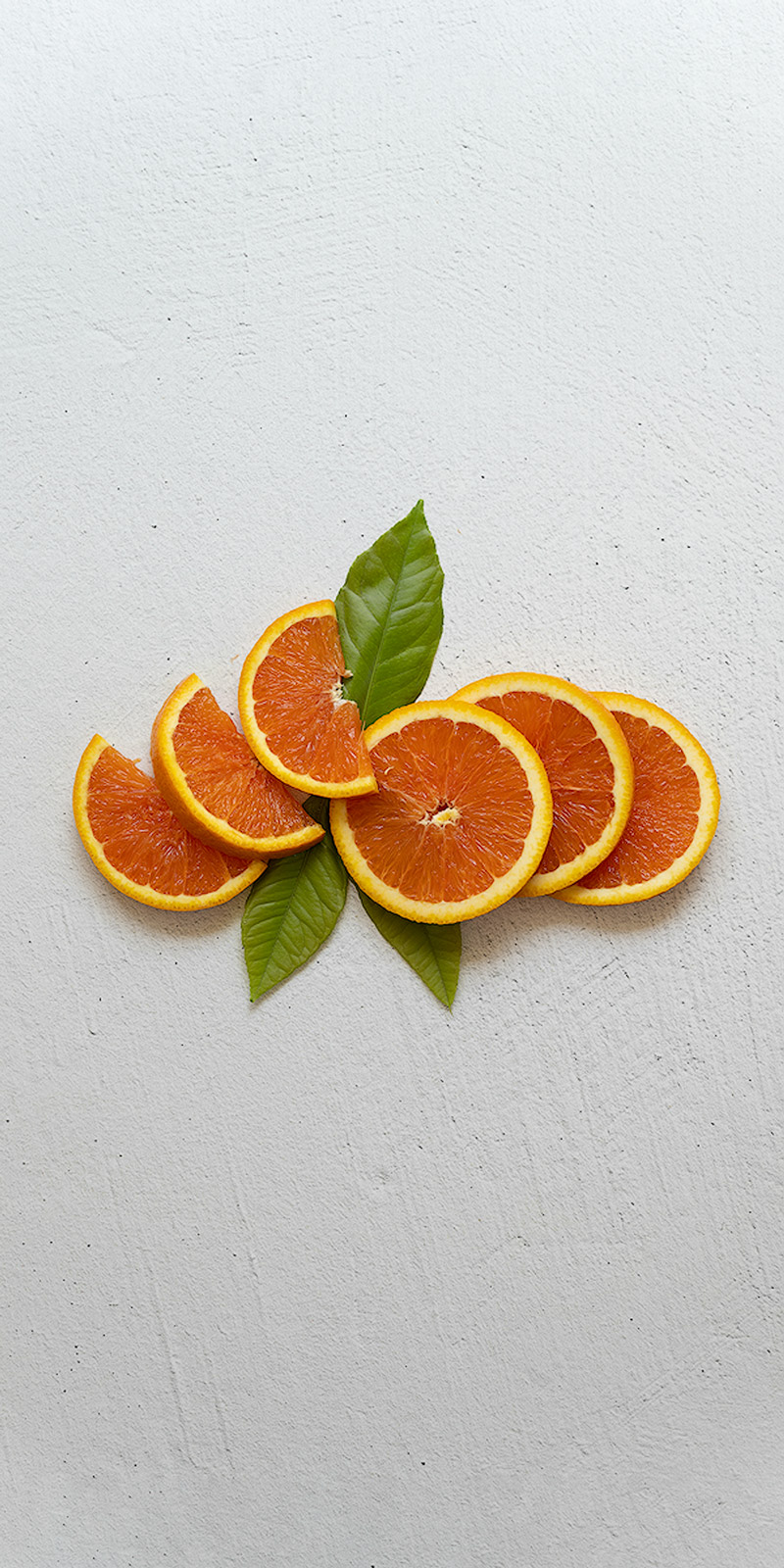
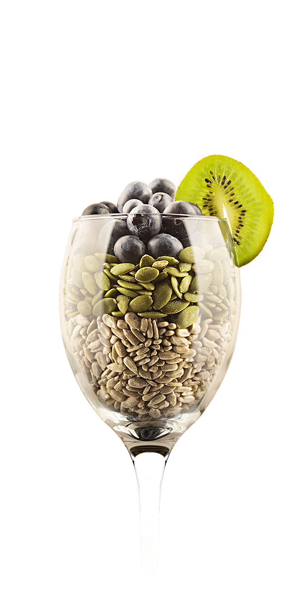
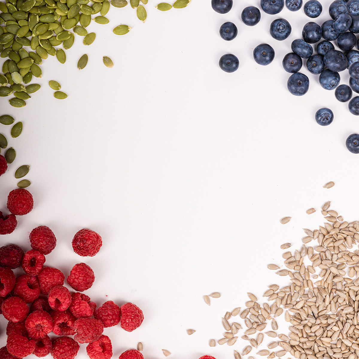
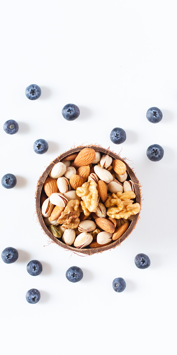
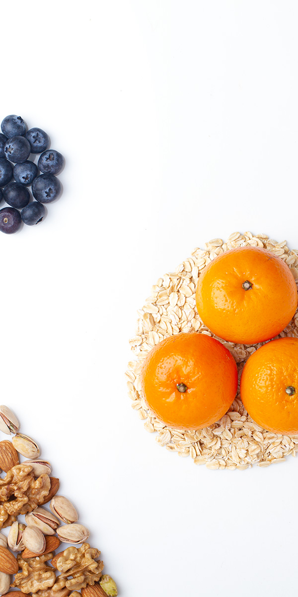
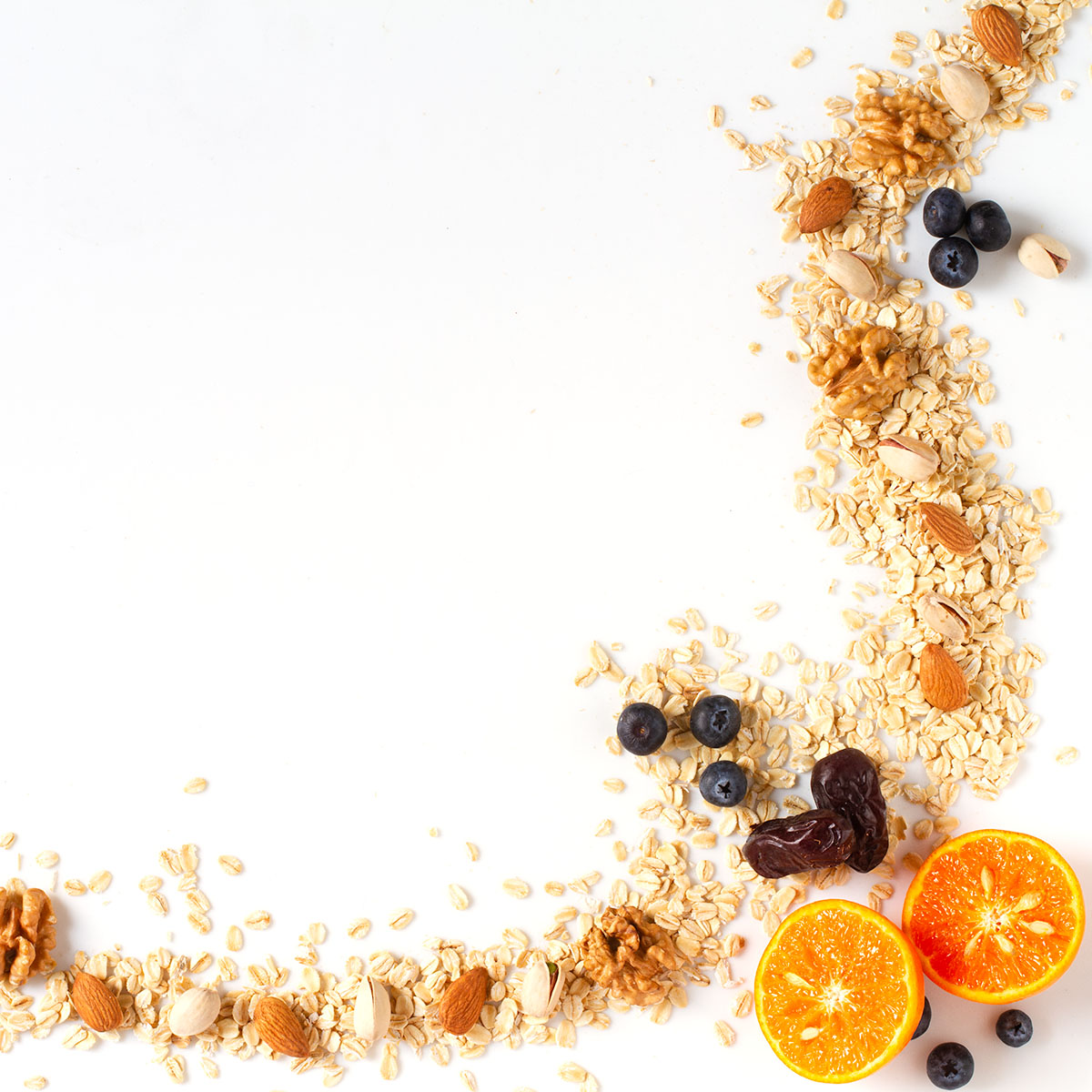
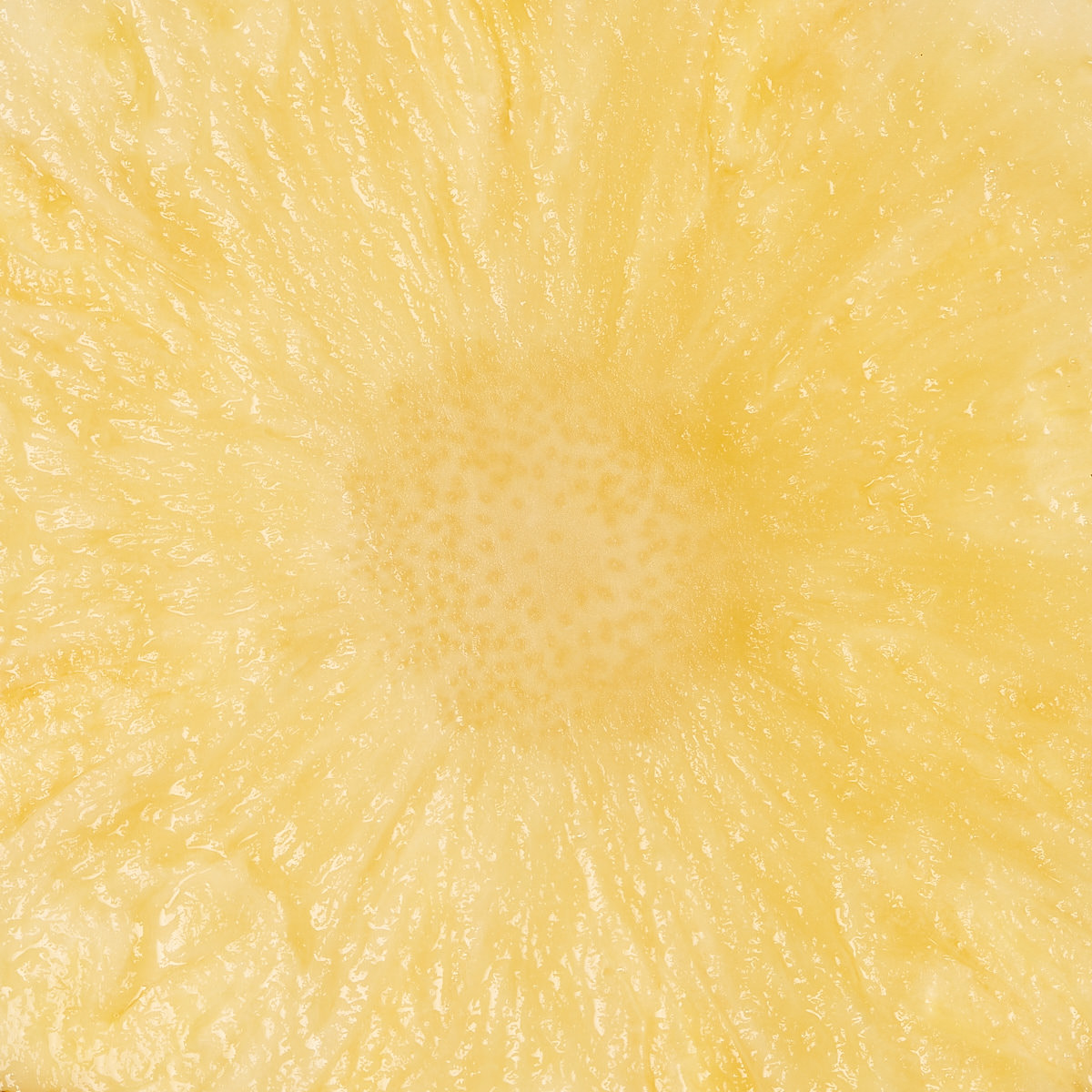
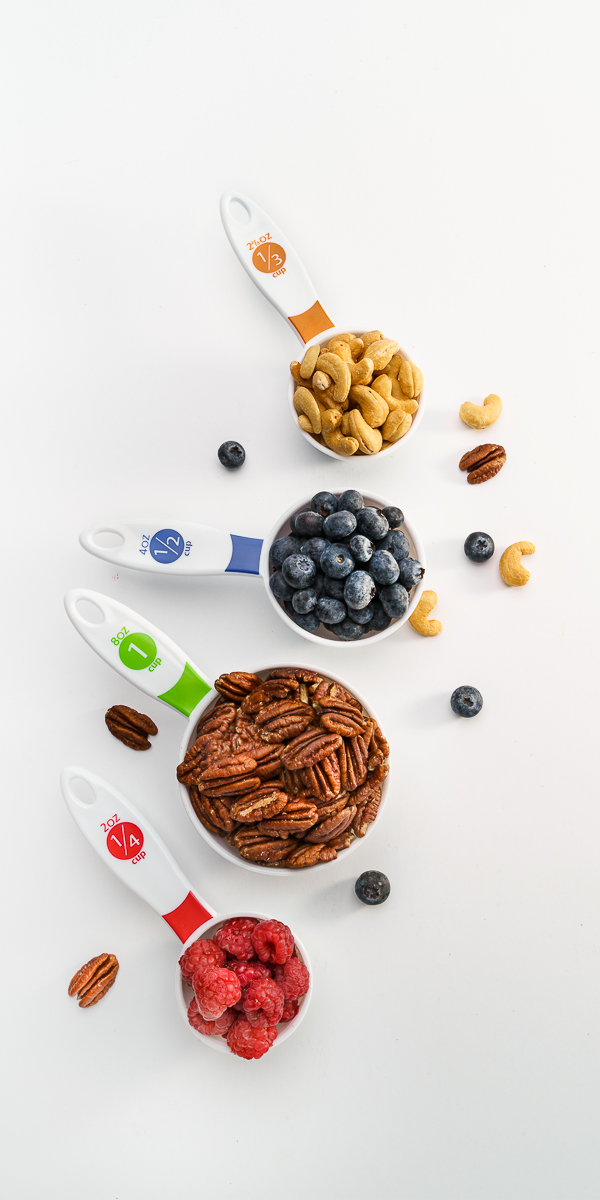
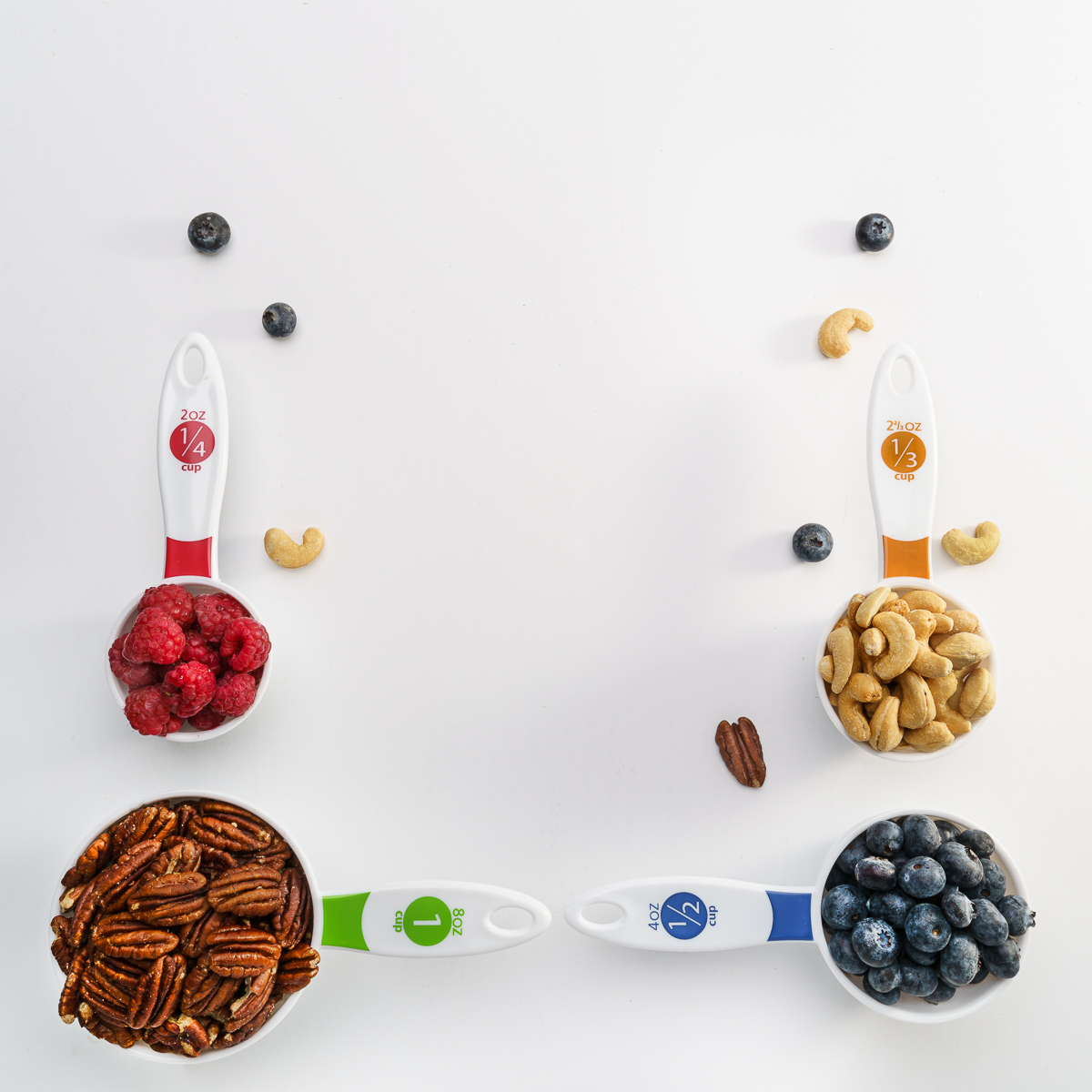
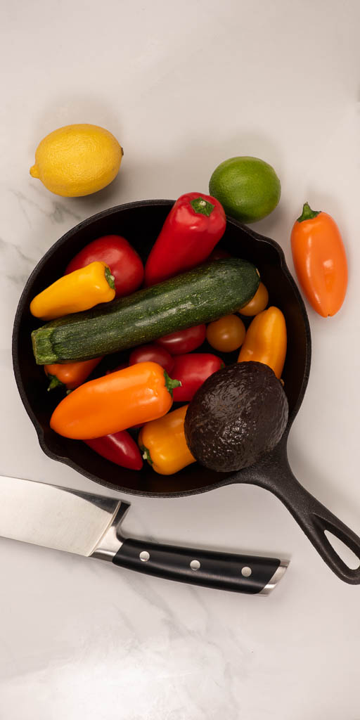
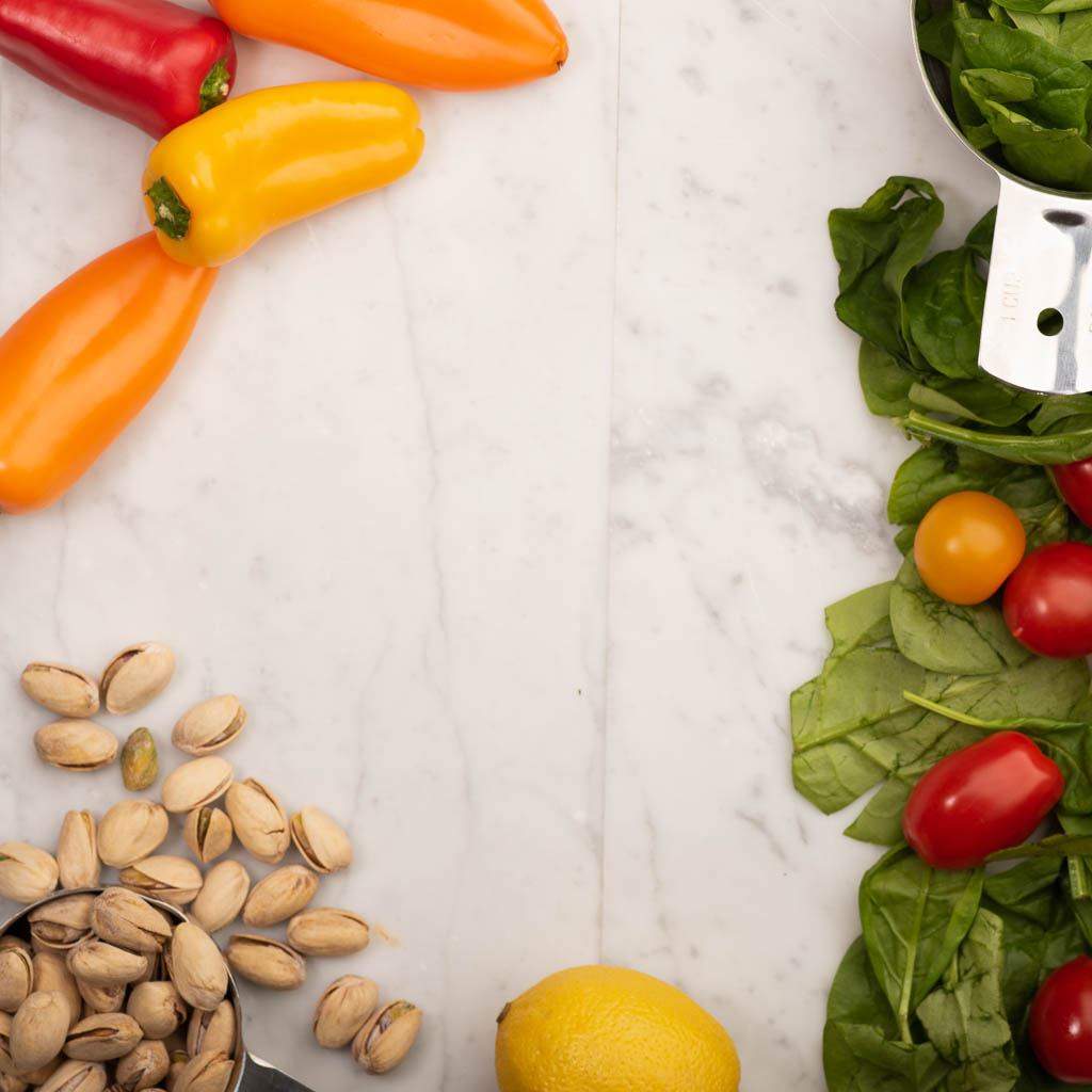
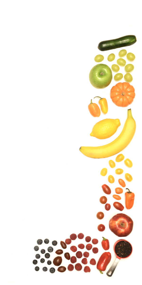
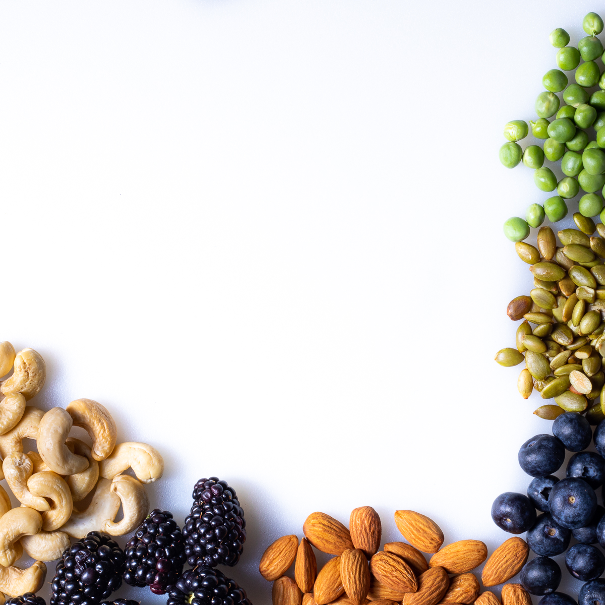
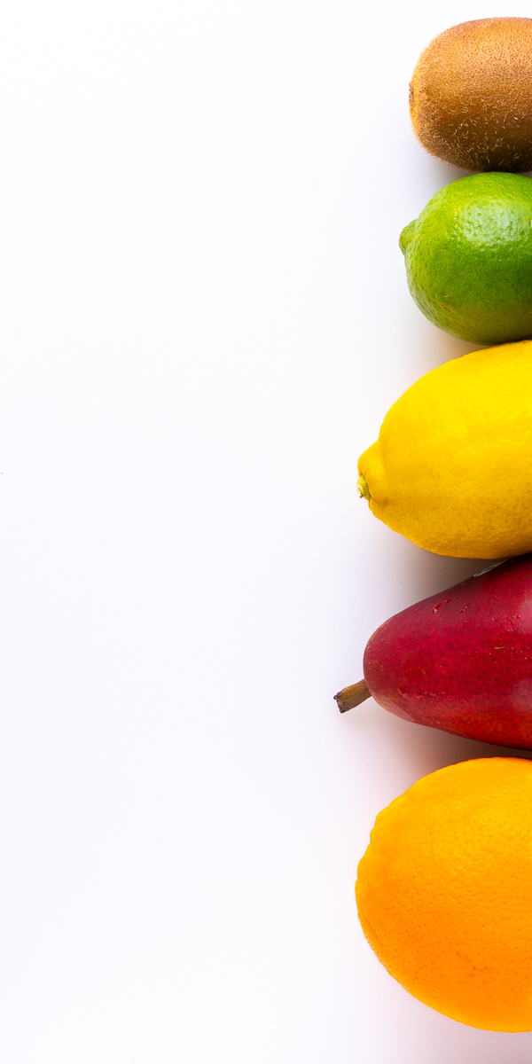
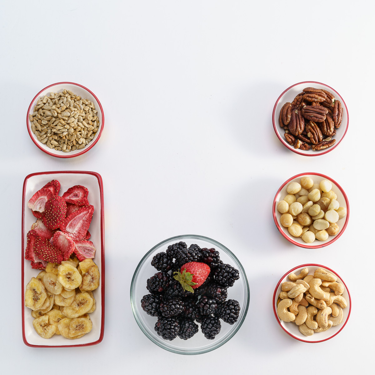
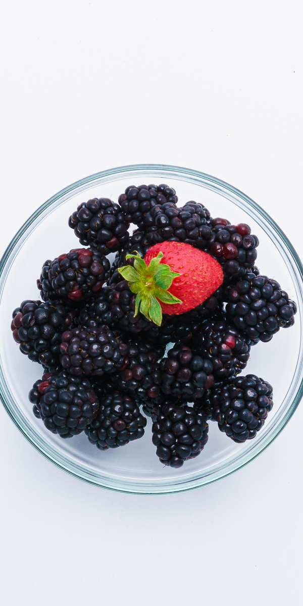
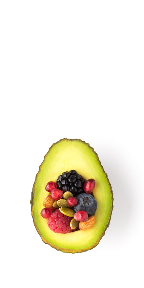
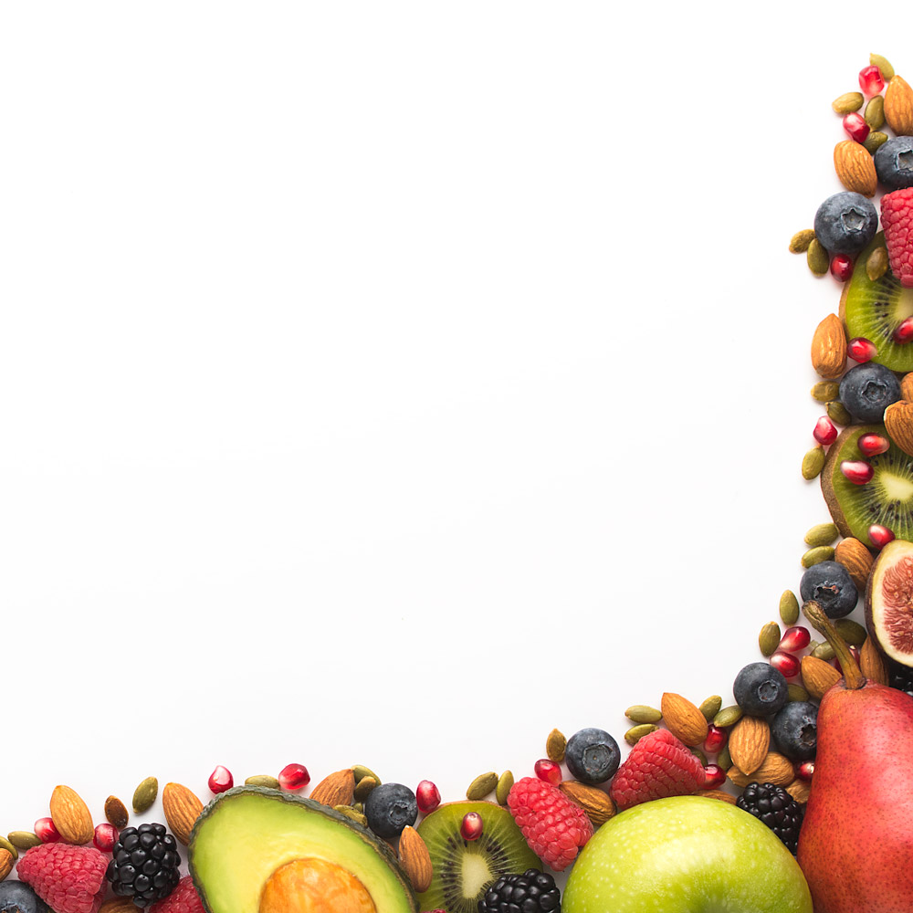
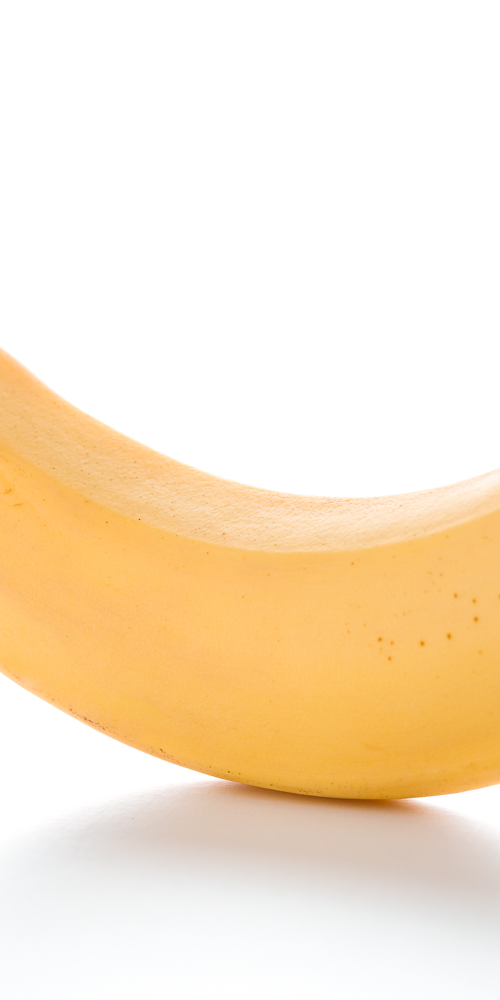
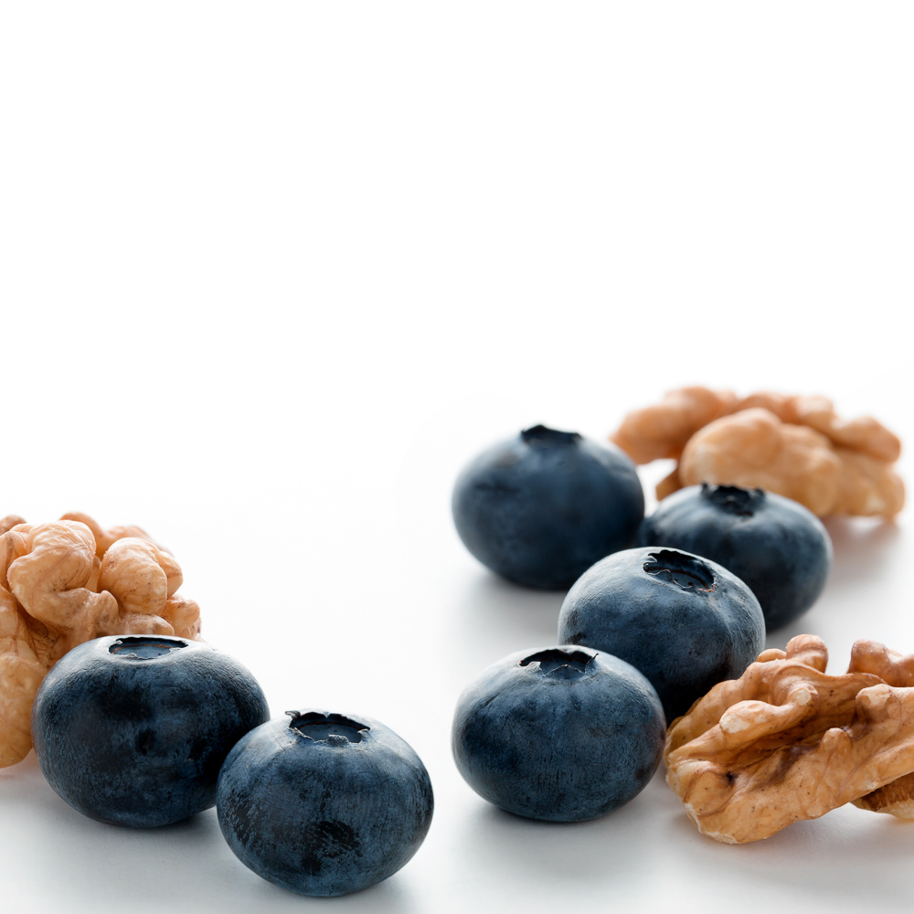
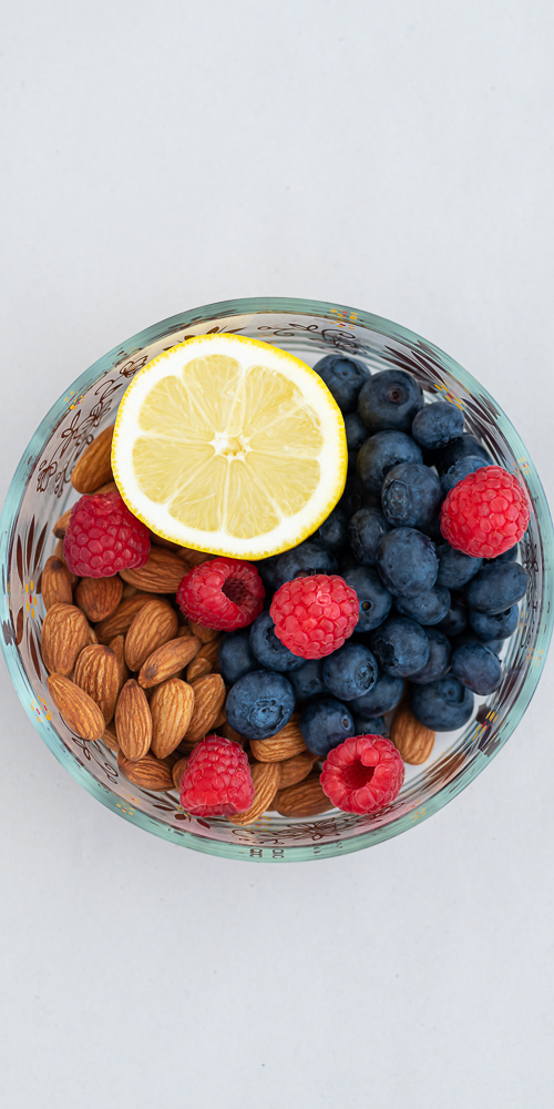
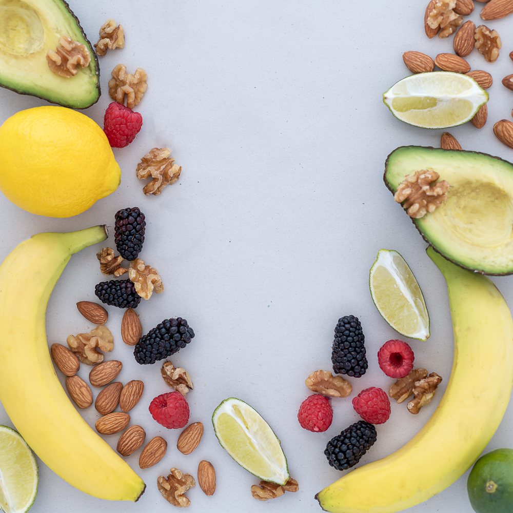
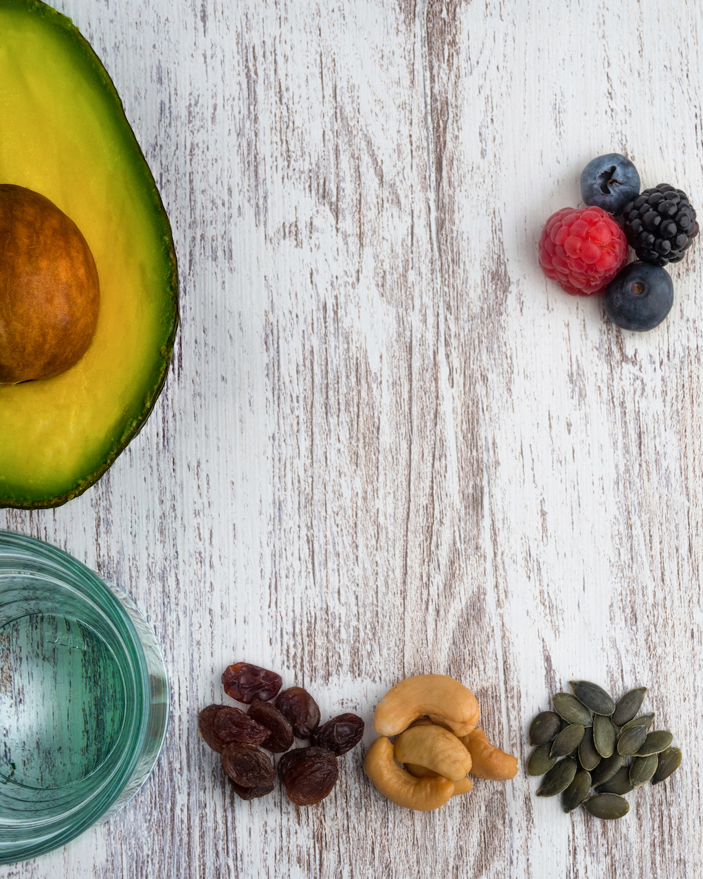
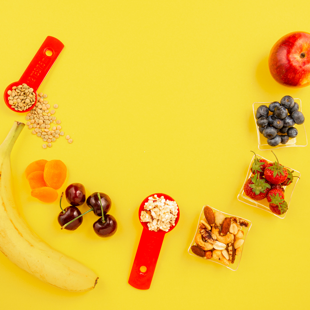
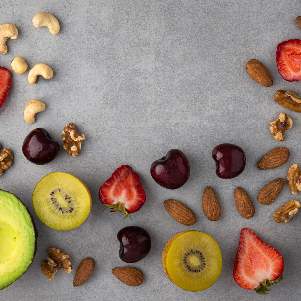
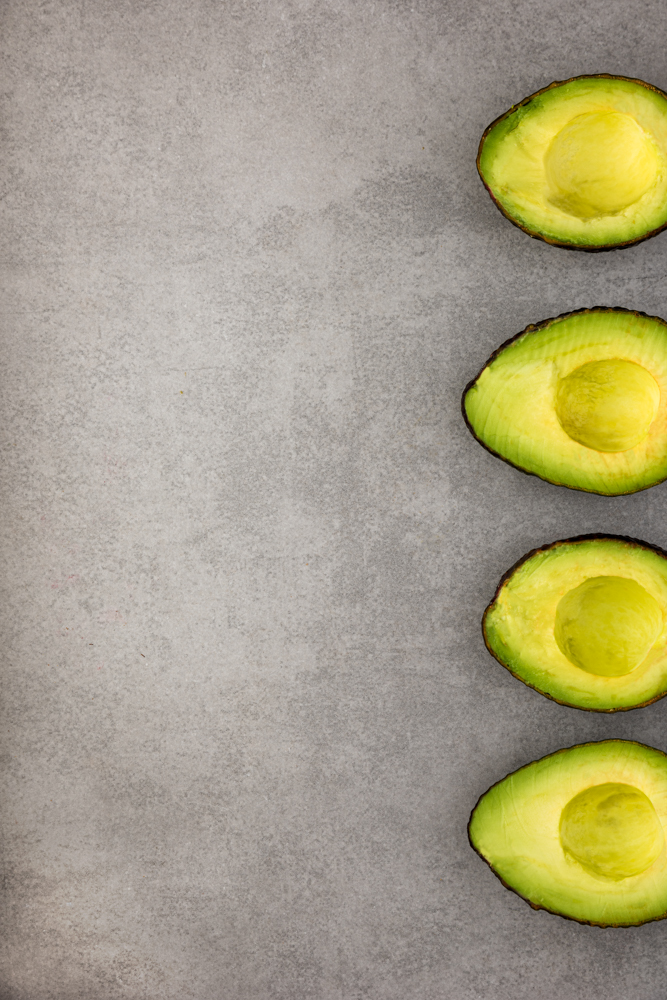
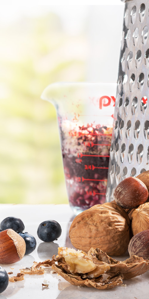
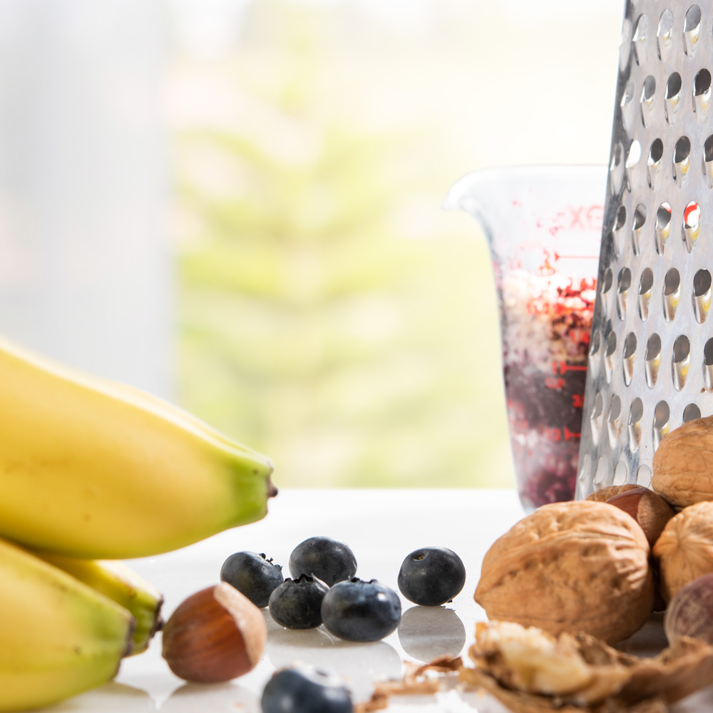
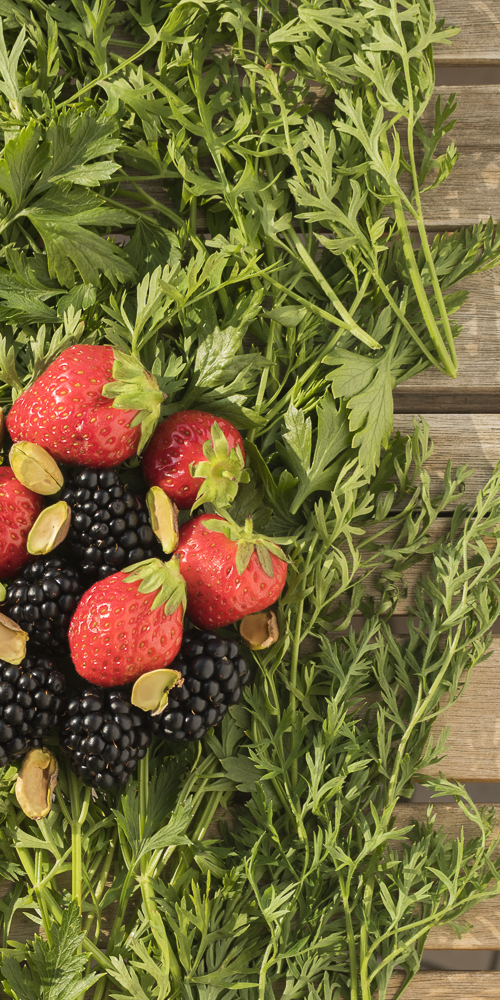
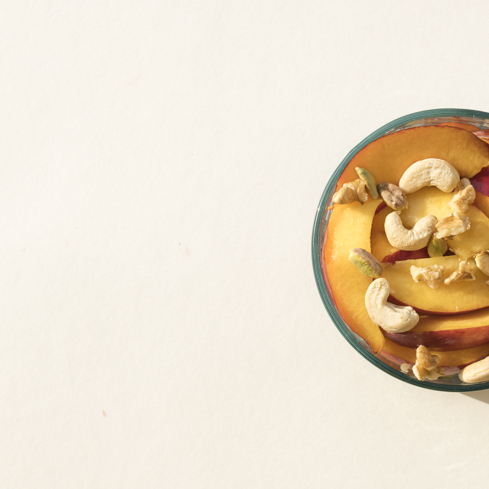
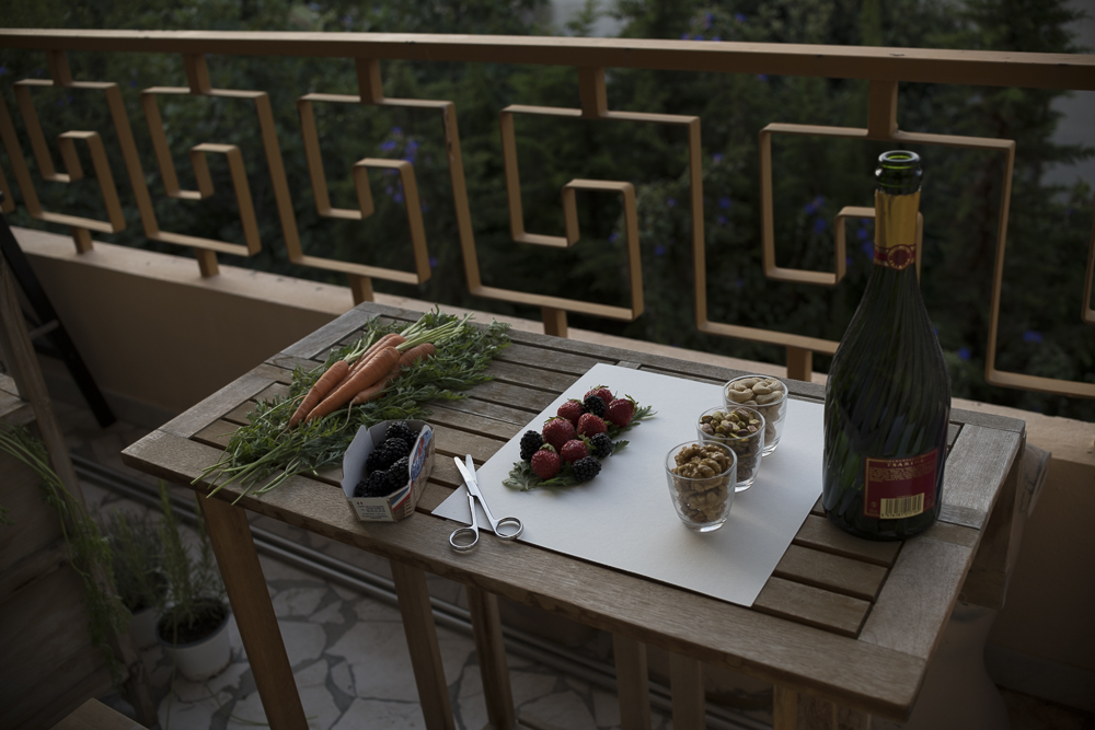
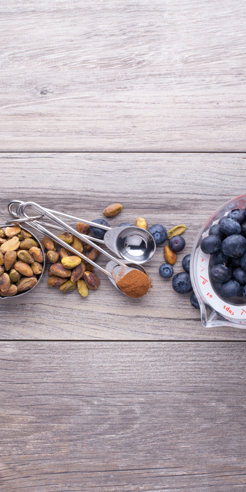
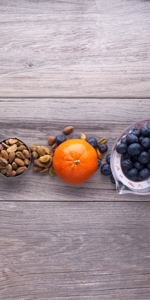
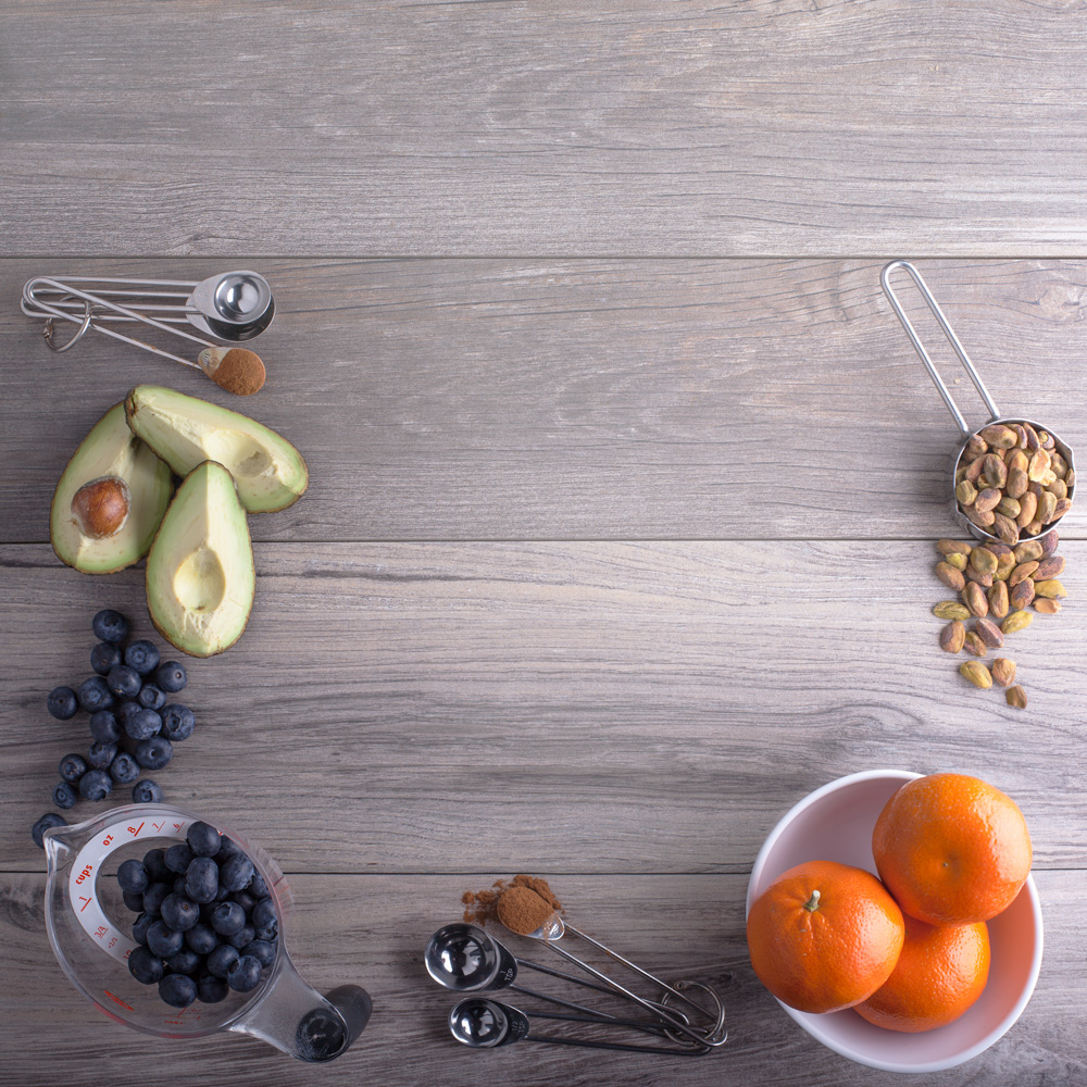
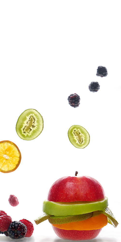
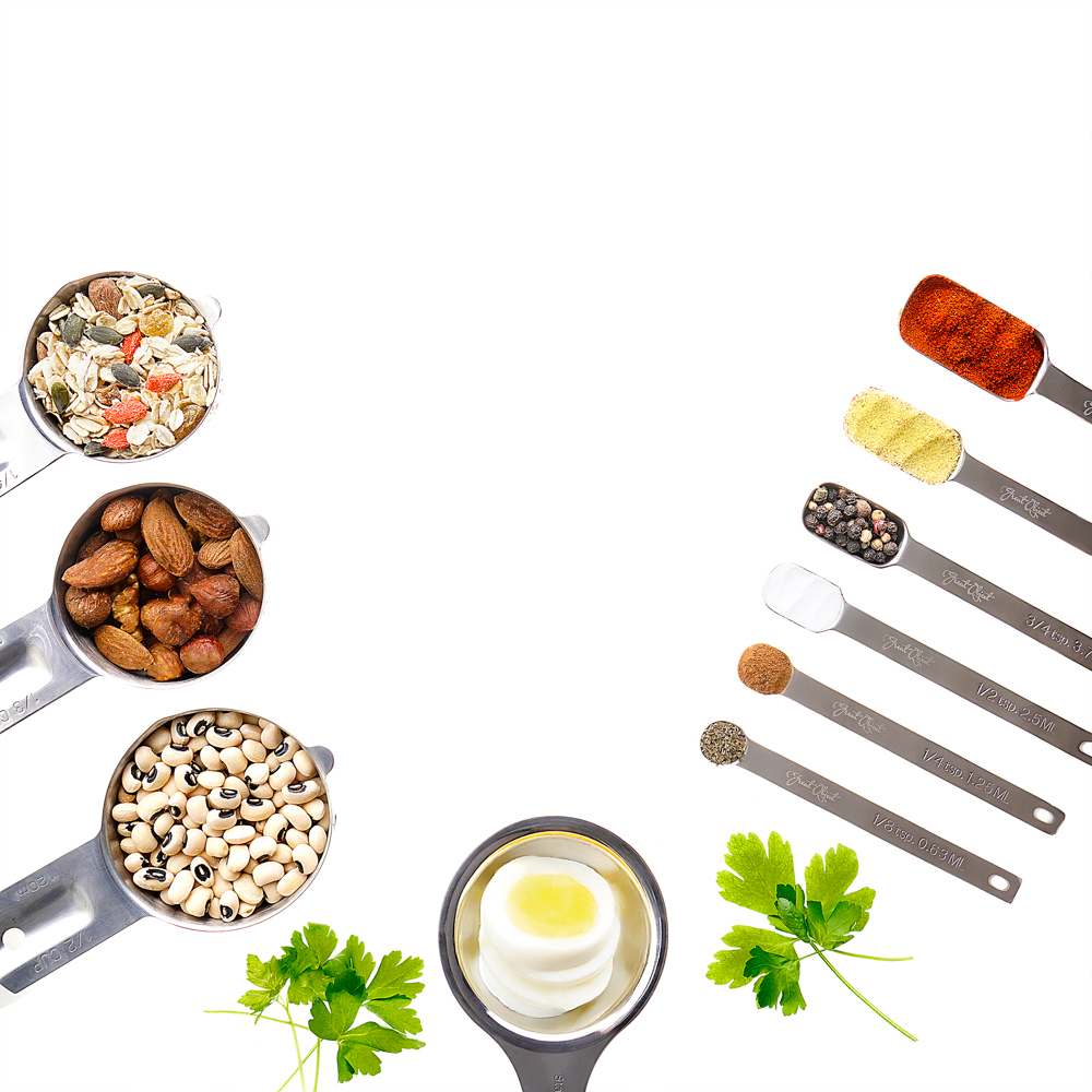
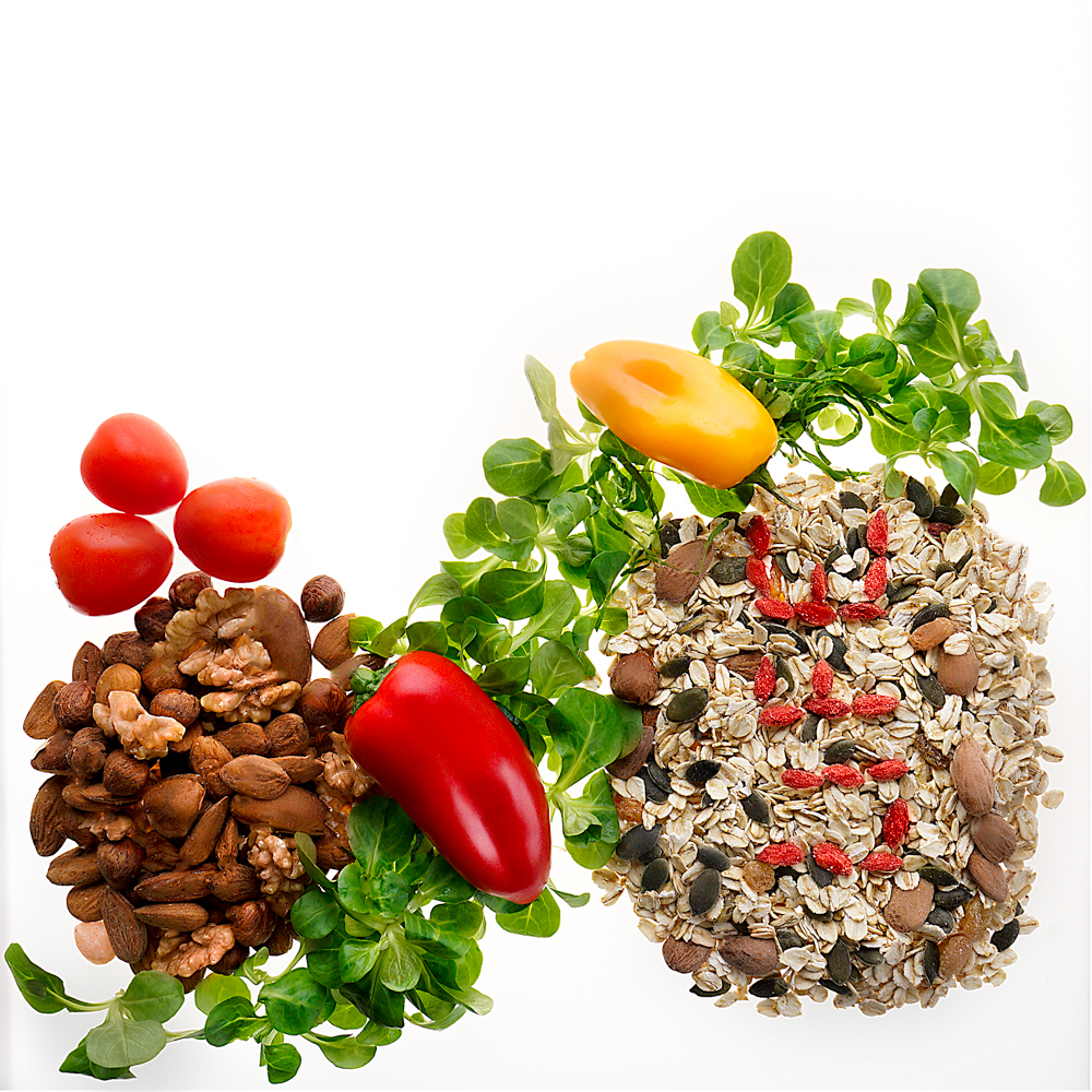
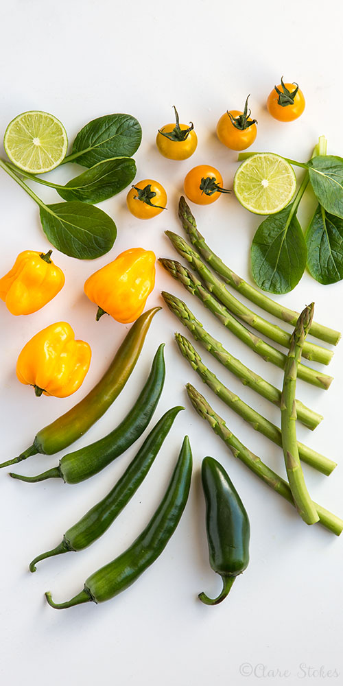
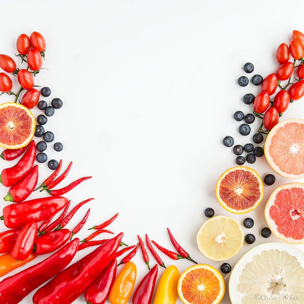
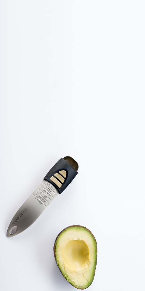
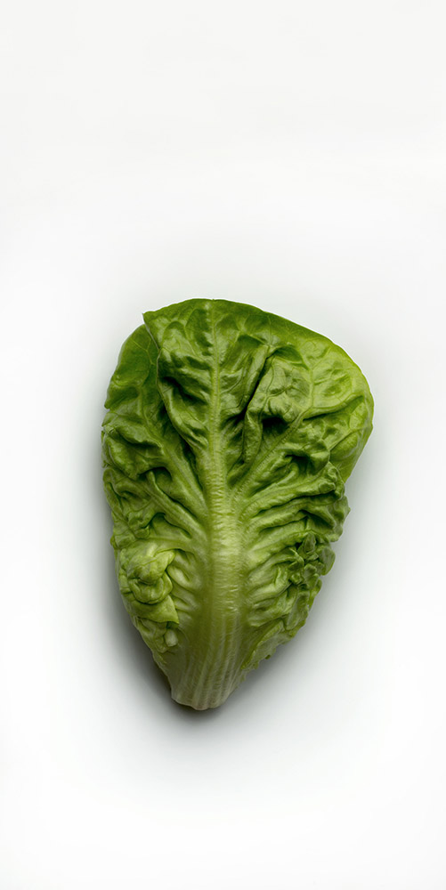
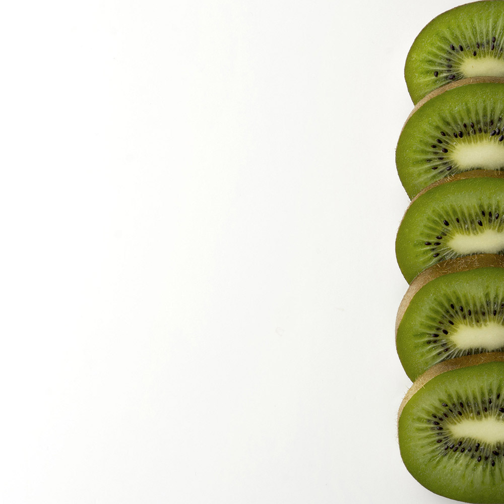
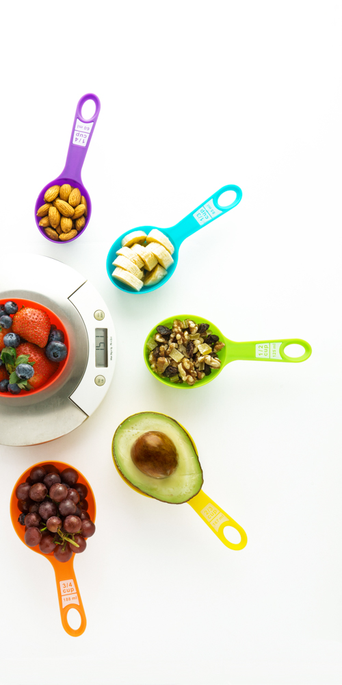
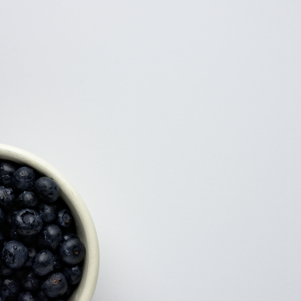
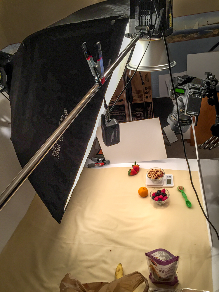
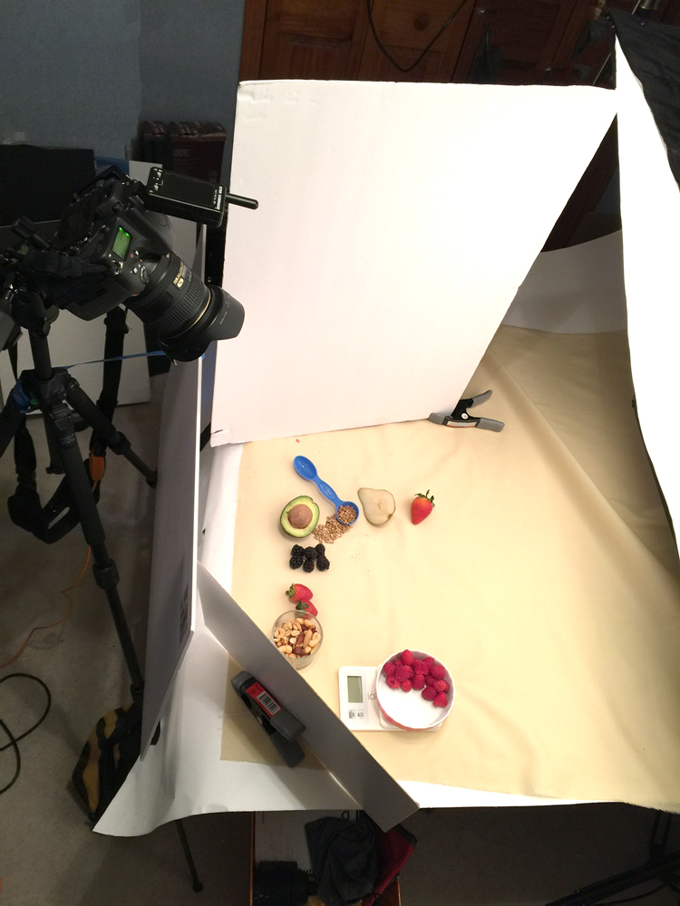
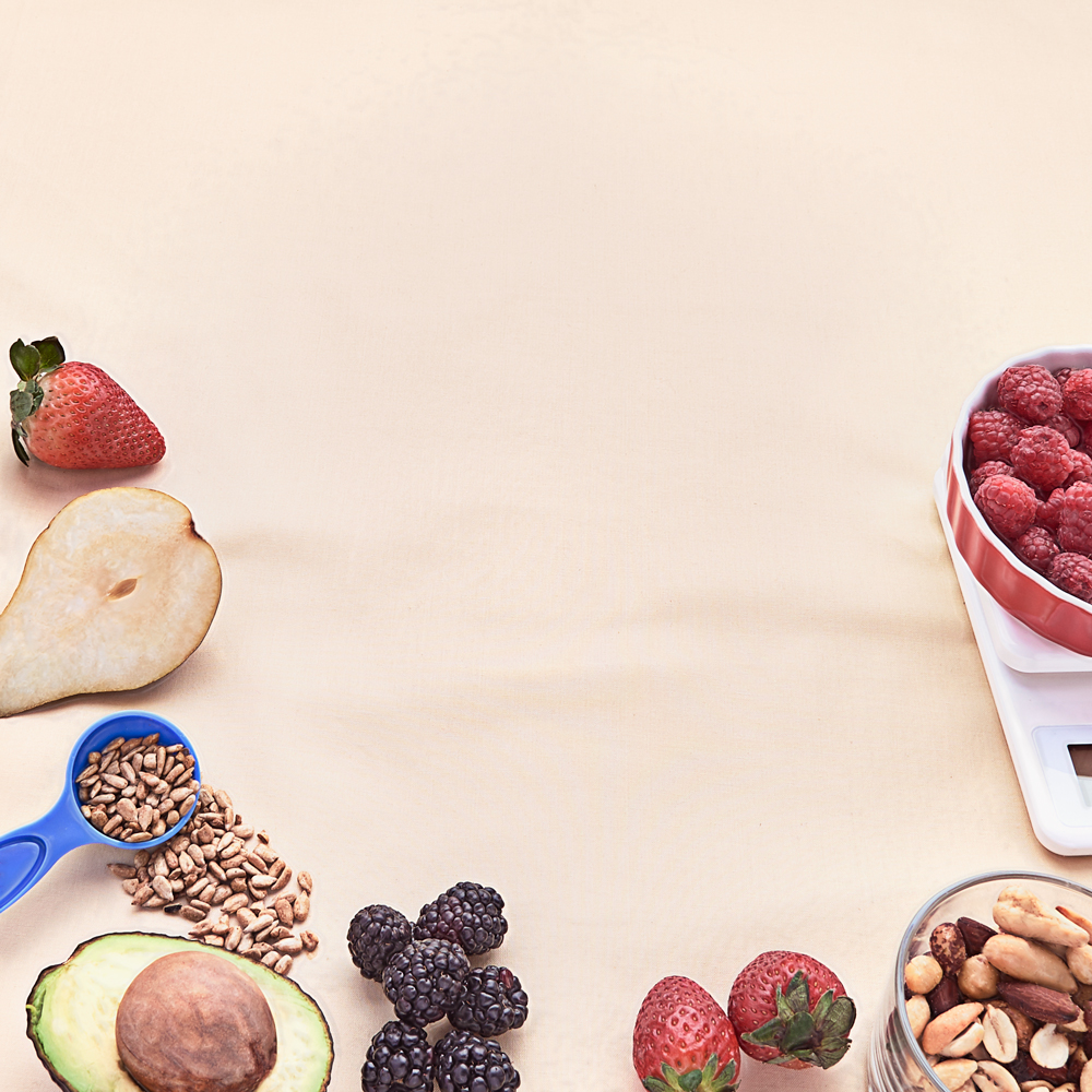
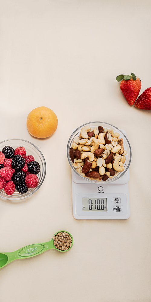
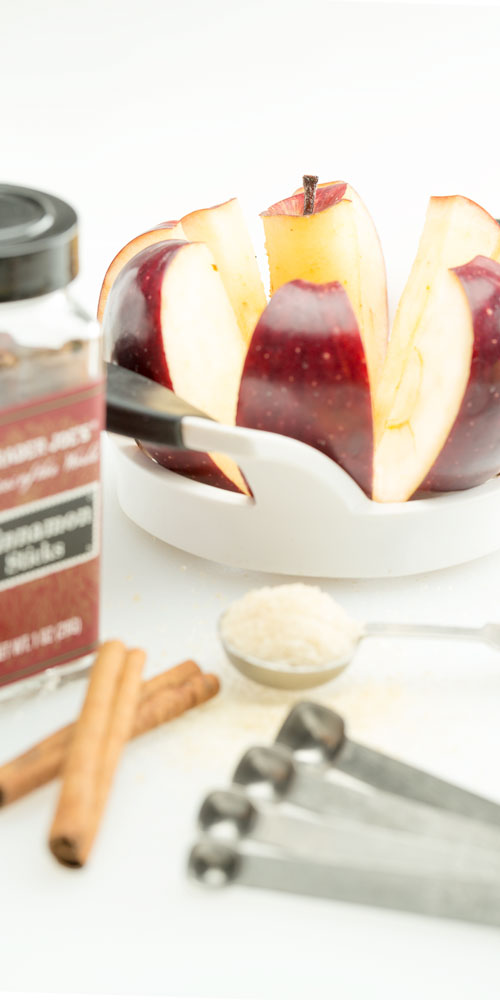
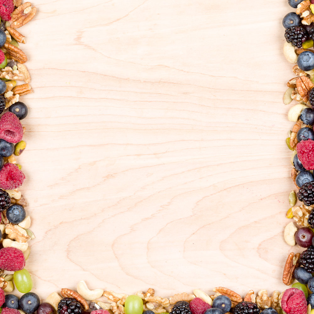
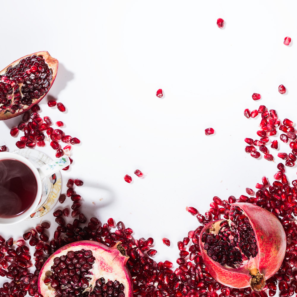
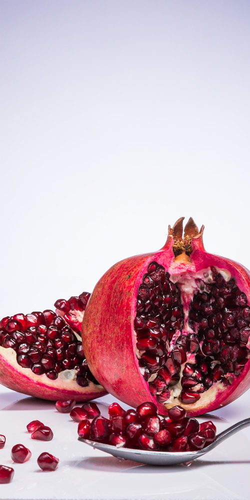
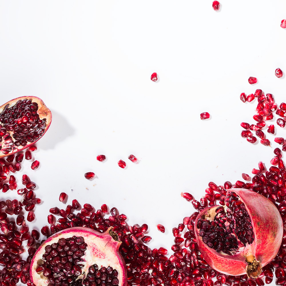
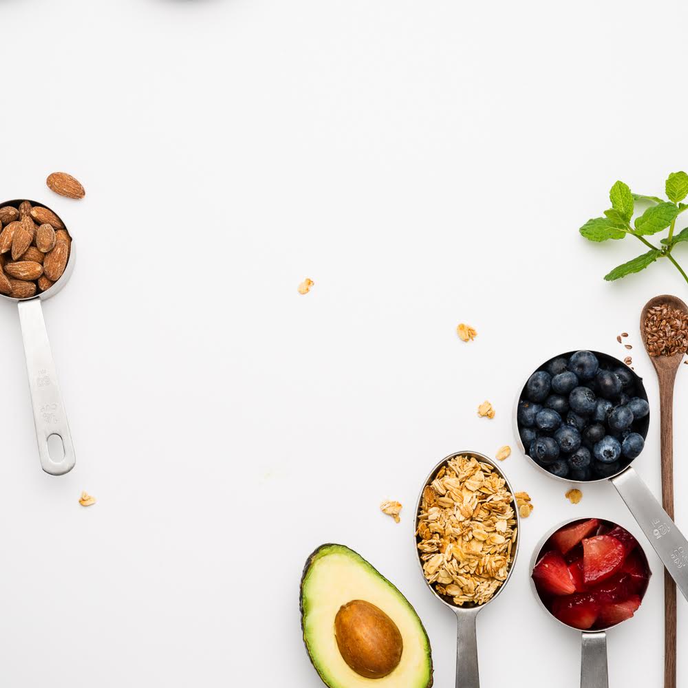
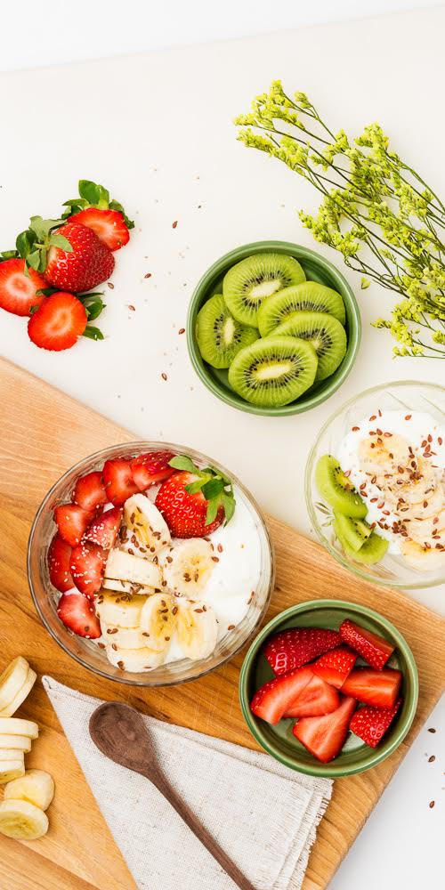
Fruits, nuts, berries, bananas, avocados, and precise measurements in food preparation are some of her core tenets.
Will there be copy on the cover?
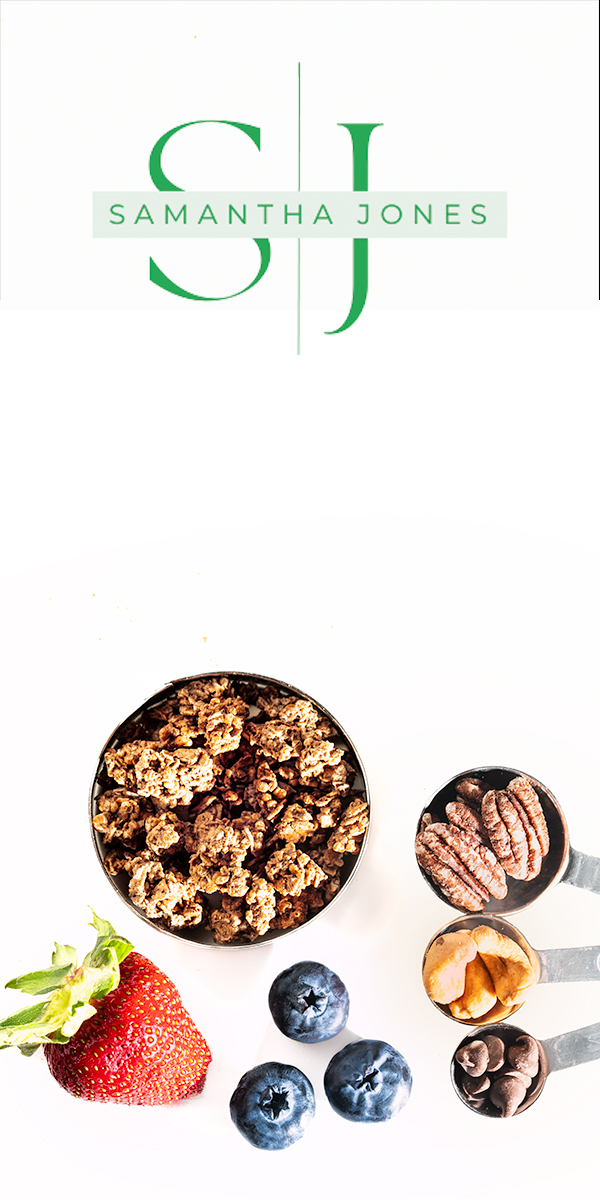
Yes, the logo is at the bottom and the title is at the top. The title must be legible over the image and will probably be a dark green.
The brand color is PANTONE 2257 CP.
Now is a good time to learn about Pantone colors so do your research and ask questions if you cannot find what you need.
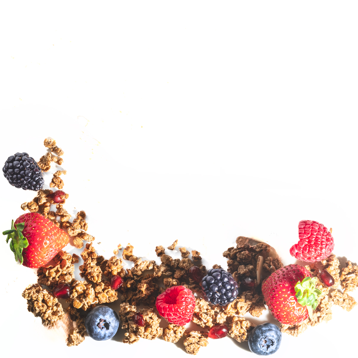
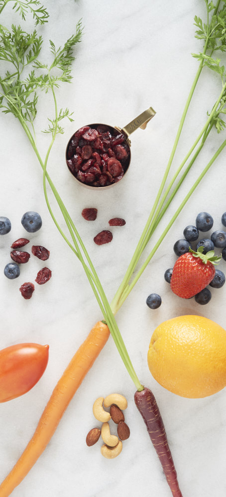
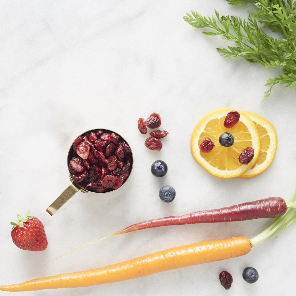
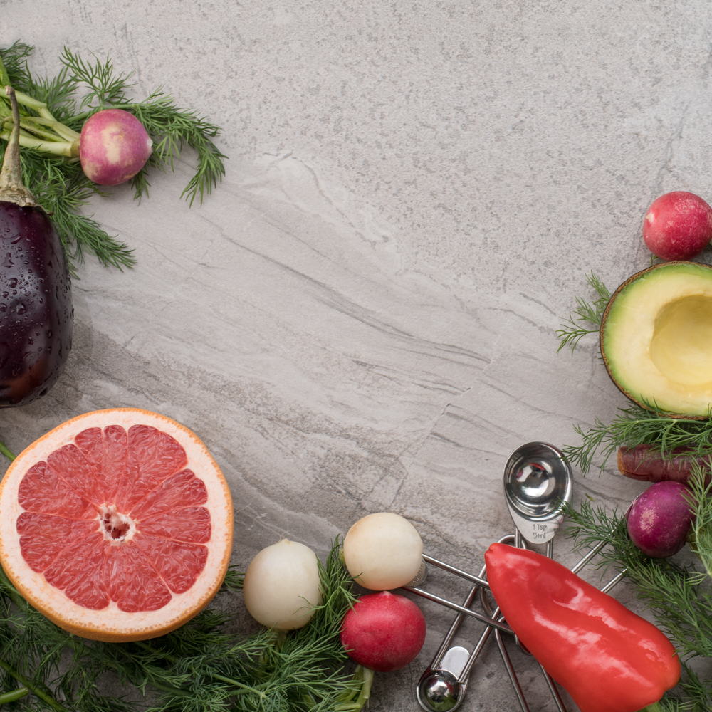
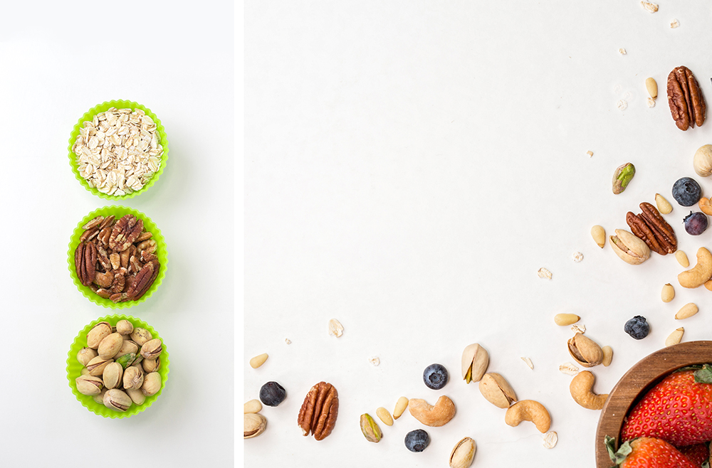
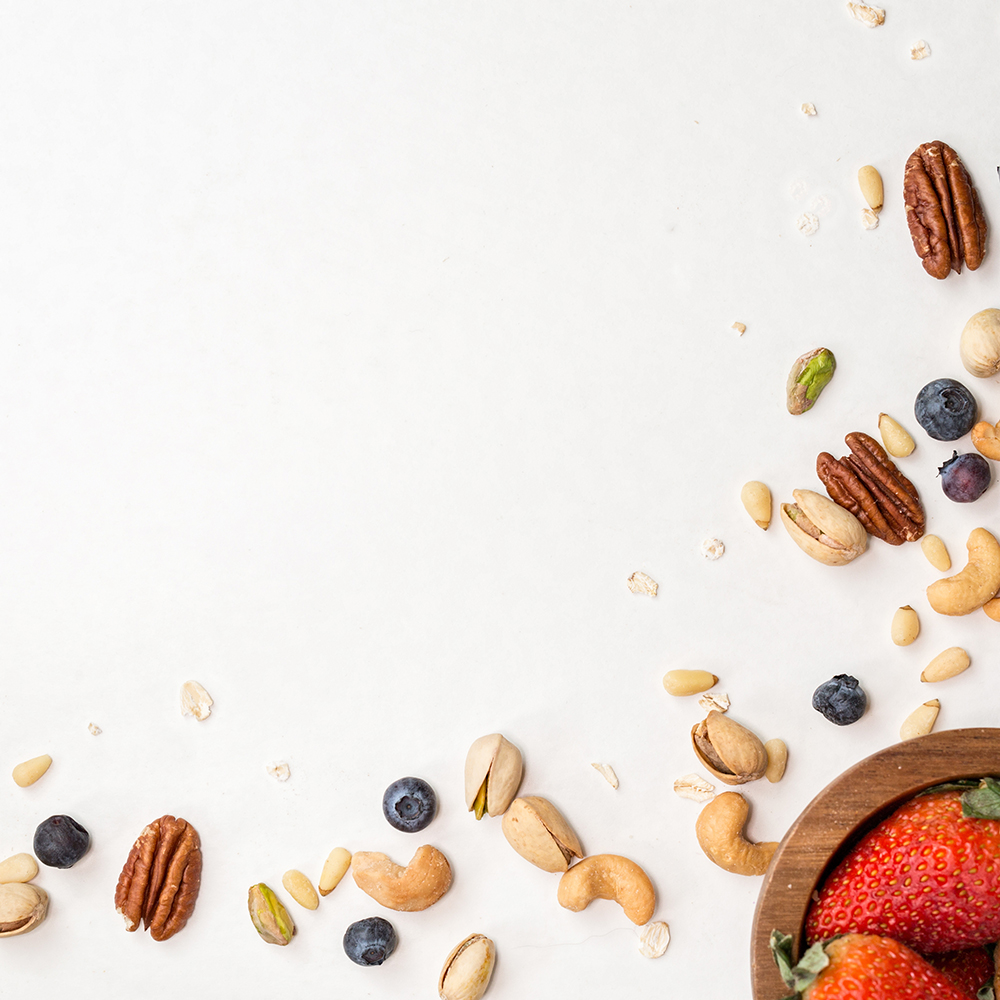
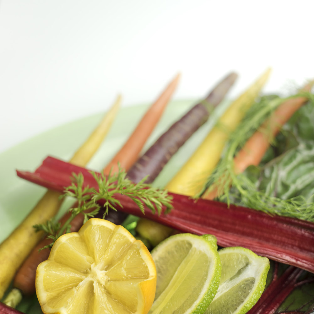
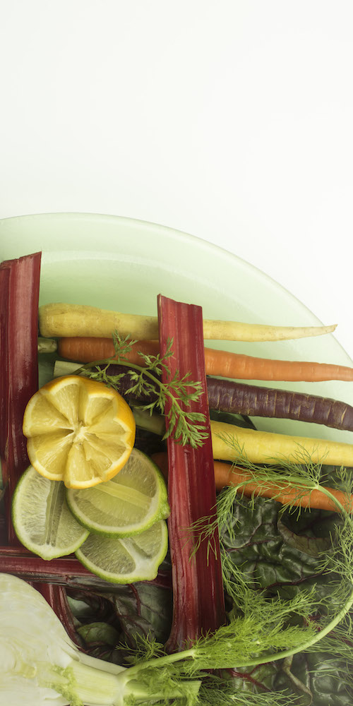
Will the spread shot have copy to be inserted?
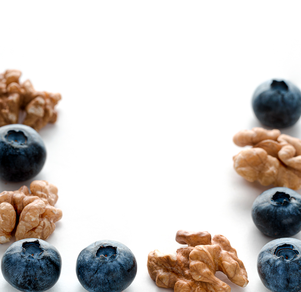
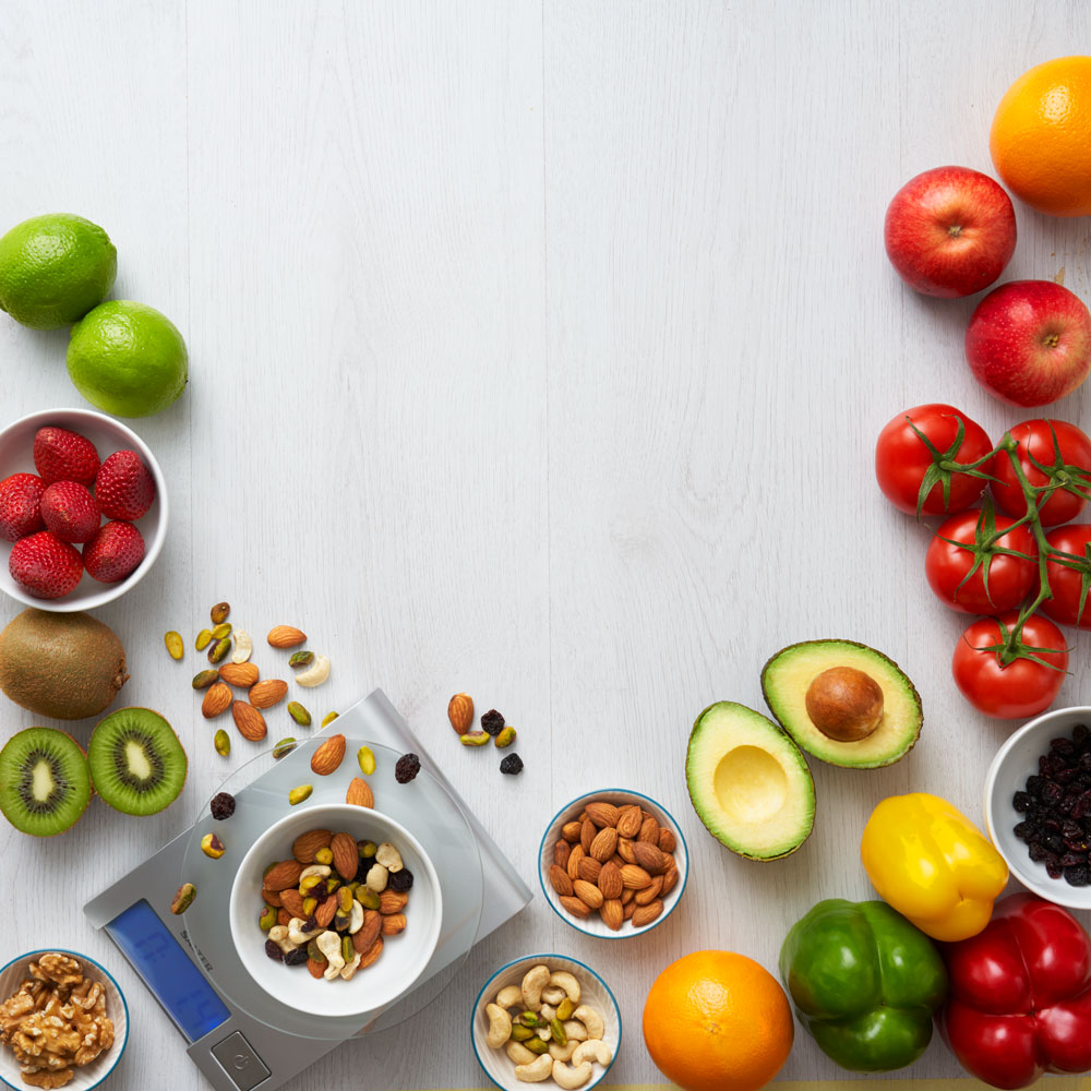
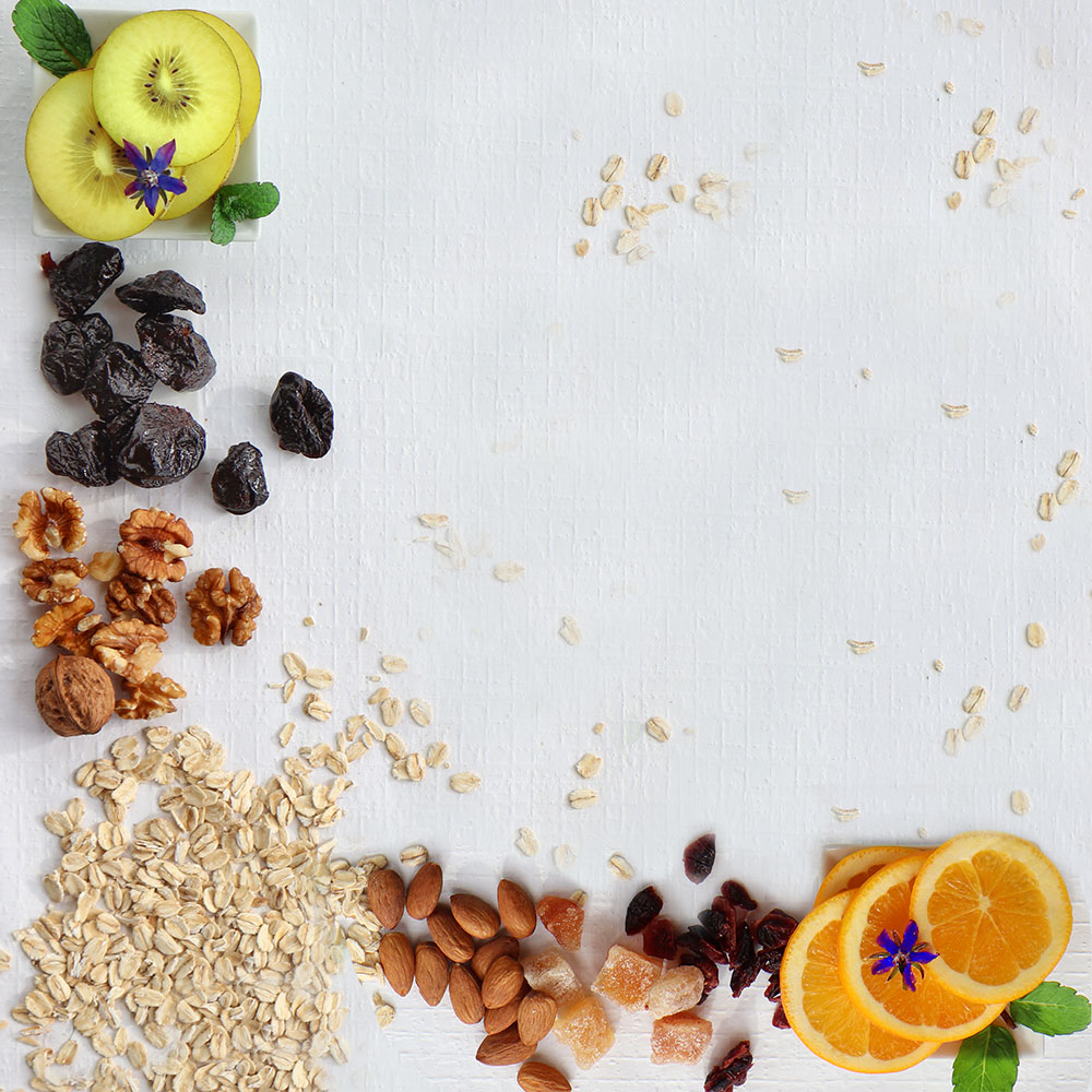
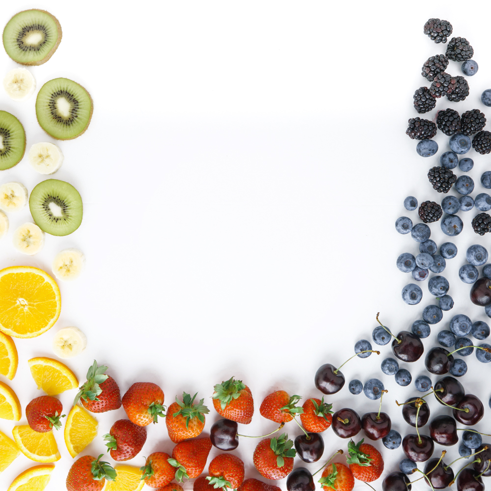
Yes. They want to have the photograph on a clean background so the copy can be shown. Keep the food, props, etc on the edges. Left, right, bottom. Nothing at the top unless it is very subtle and doesn’t come down too far into the copy space.
Does the surface have to be some specific color?
No. As long as it is light enough to place copy over. Light wood, white, light marble (without too much texture), or a light slate would be fine. Just make sure there is not much contrast in the background – we don’t want the text to be garbled by the surface.
THE PARTICULARS:
- Vertical cover
- Square spread
- Color
- 2 images, please
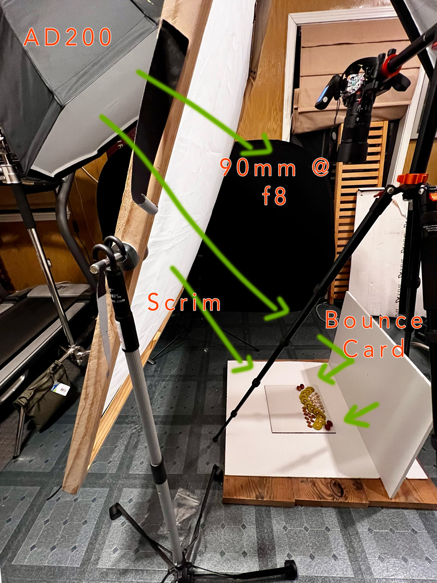
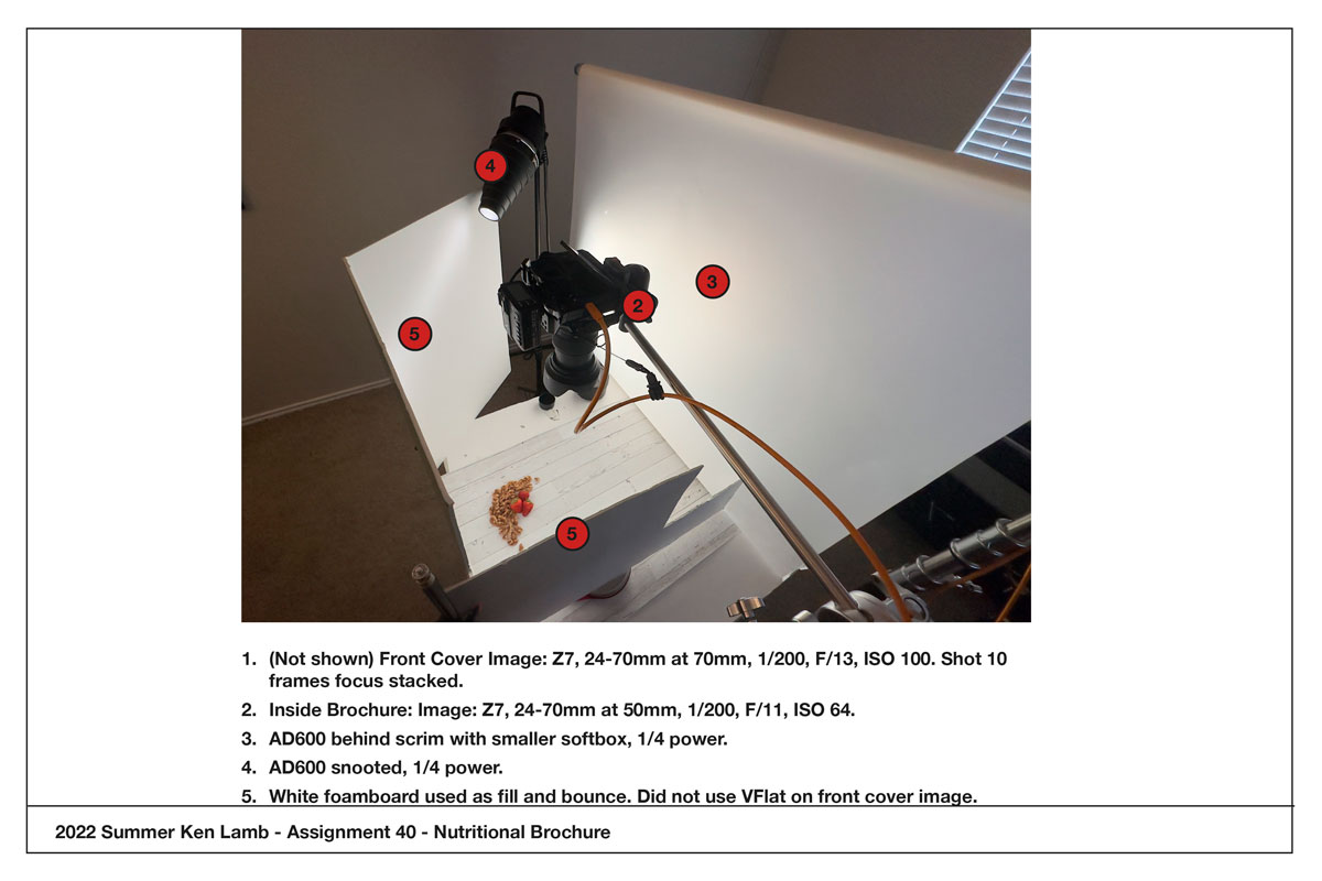
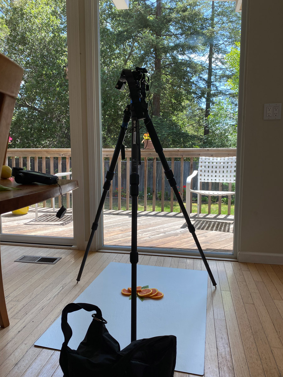
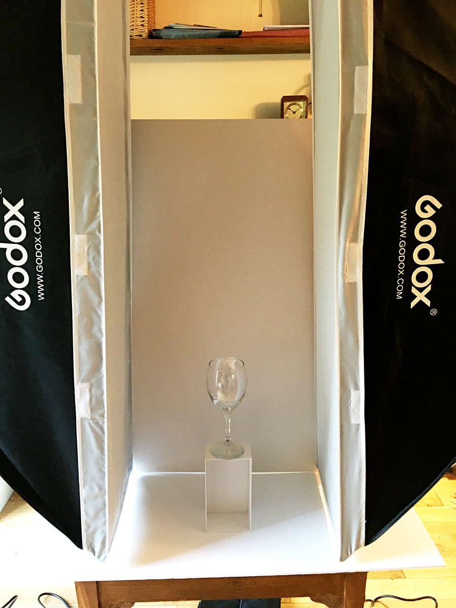
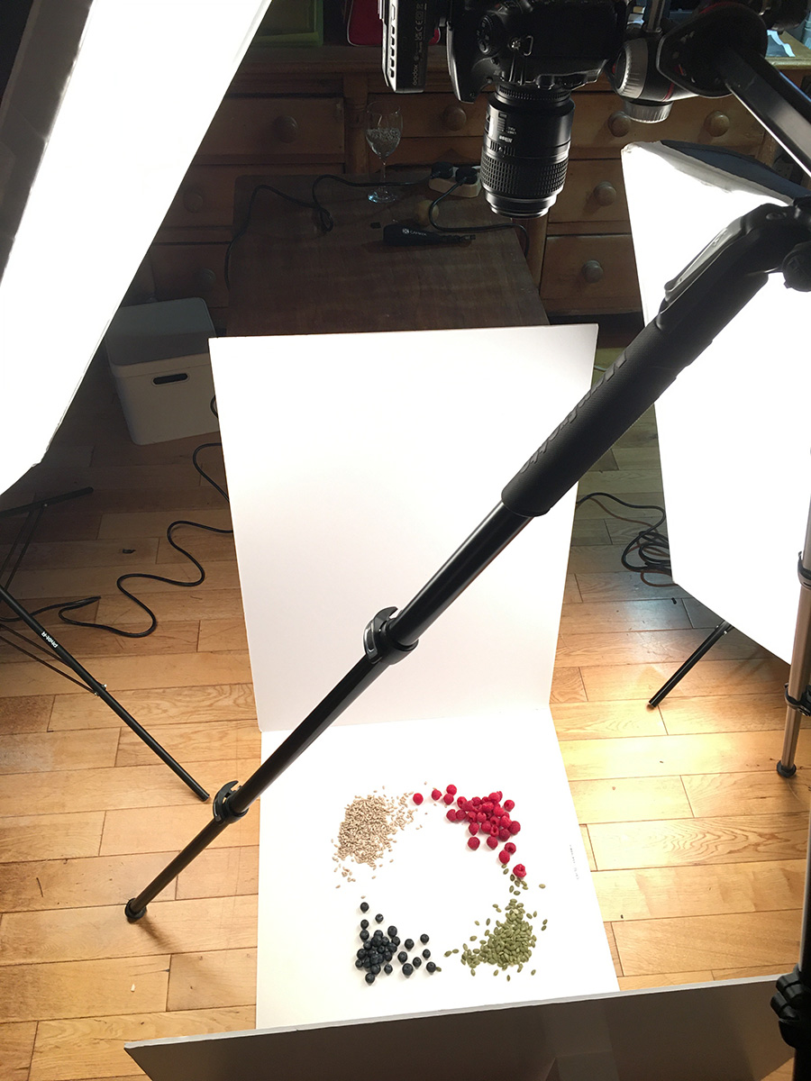
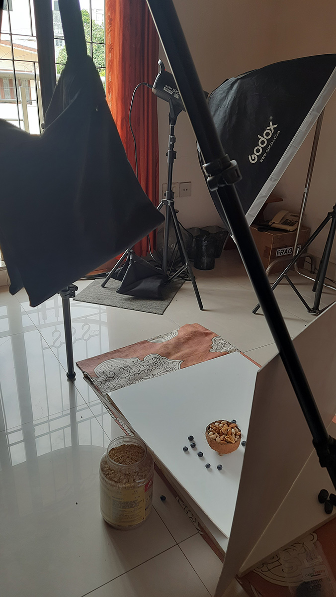
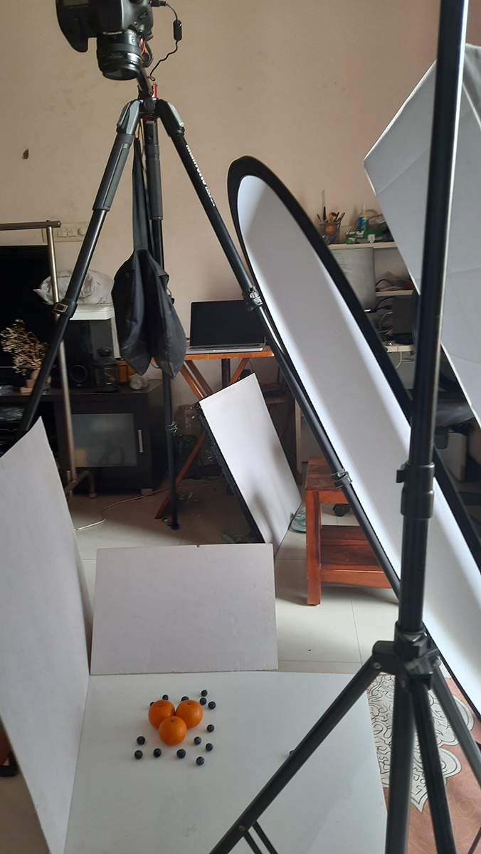
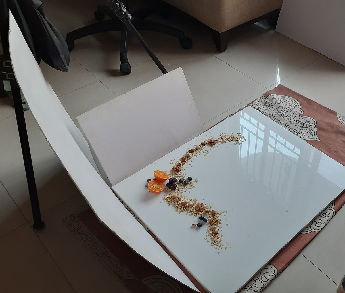
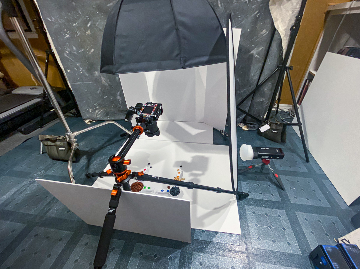
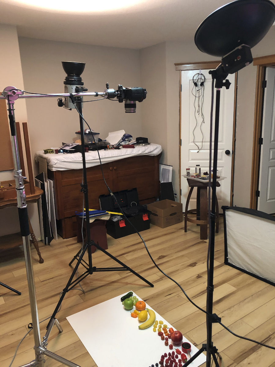
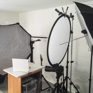
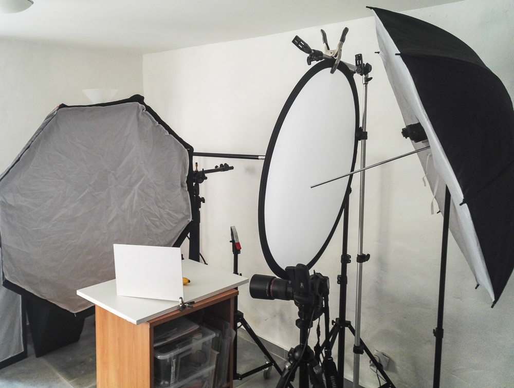
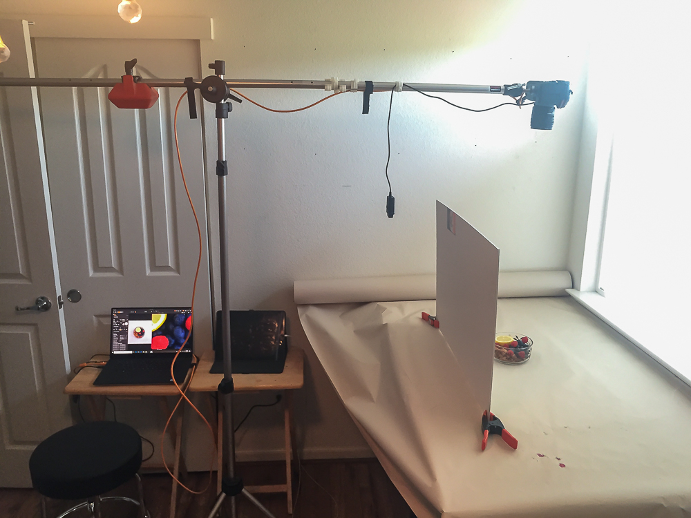
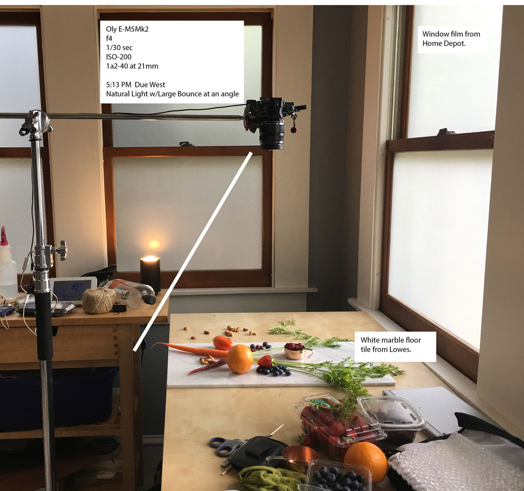
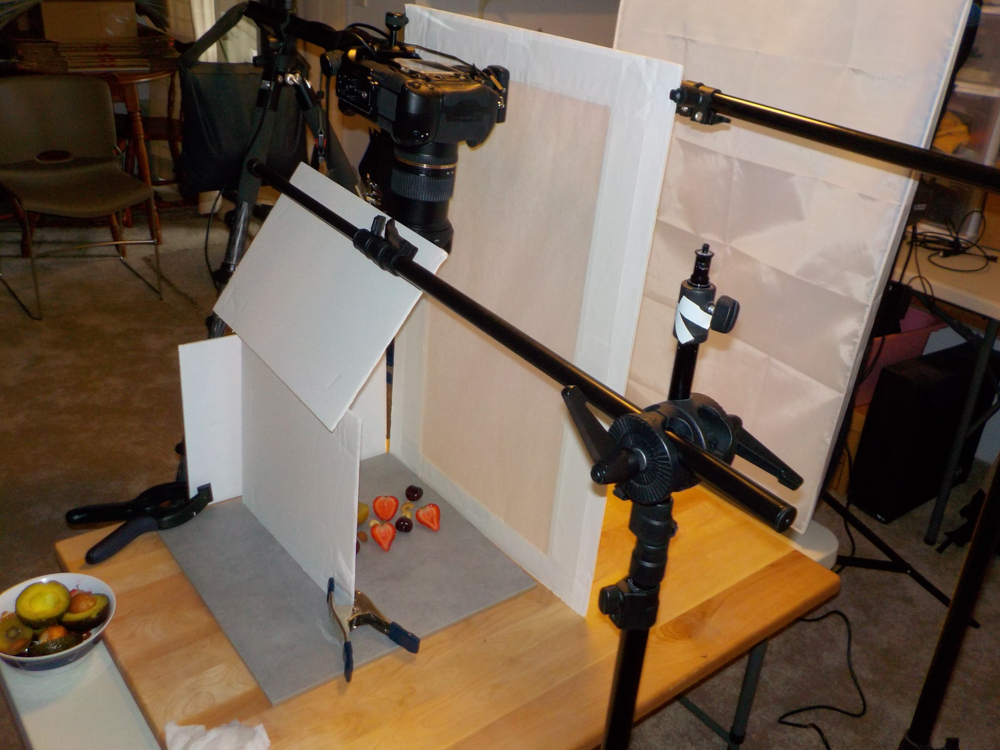
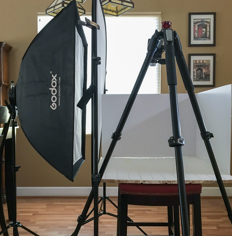
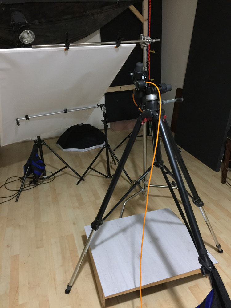
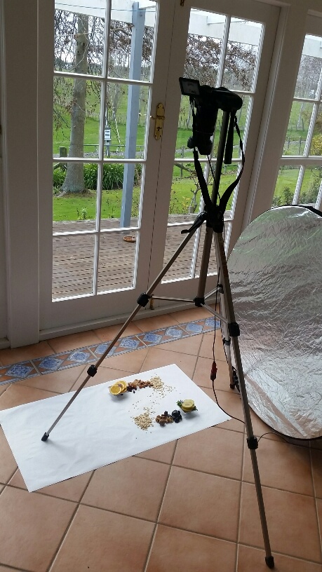
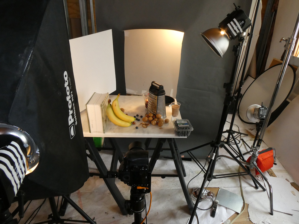
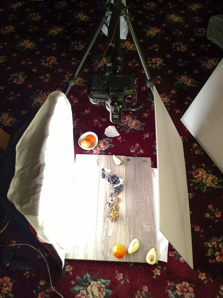
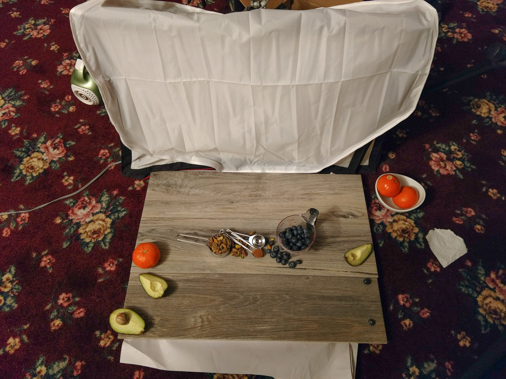
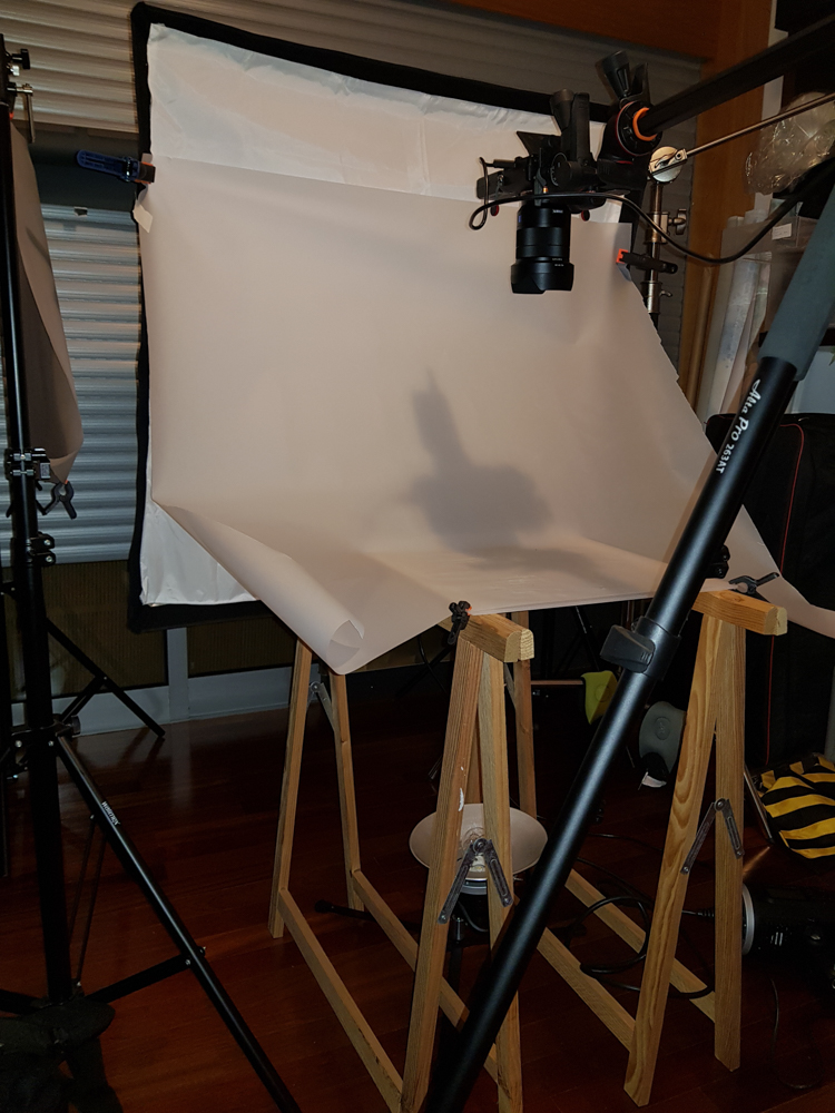
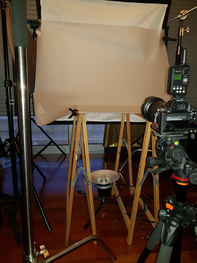
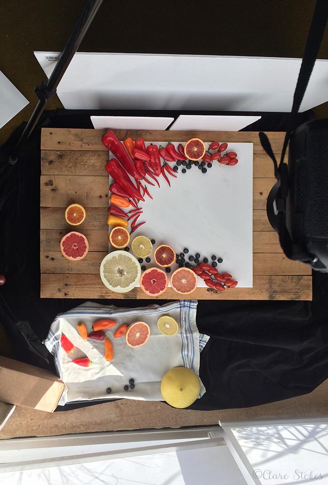
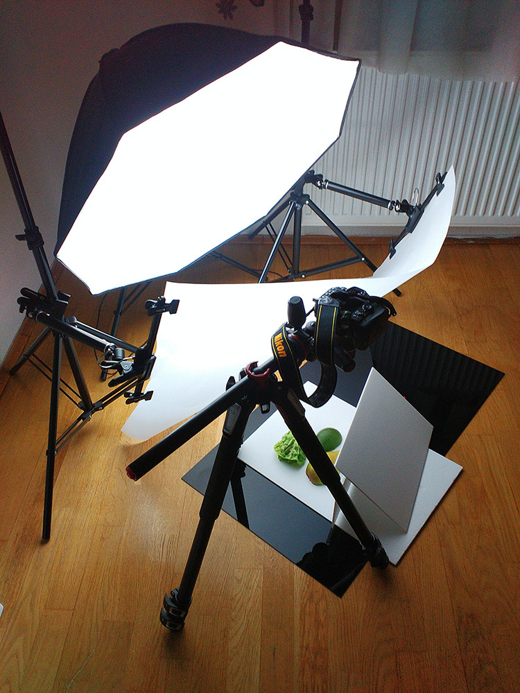
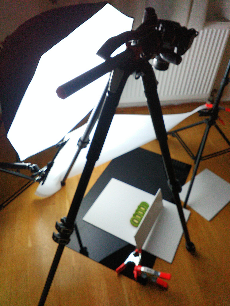
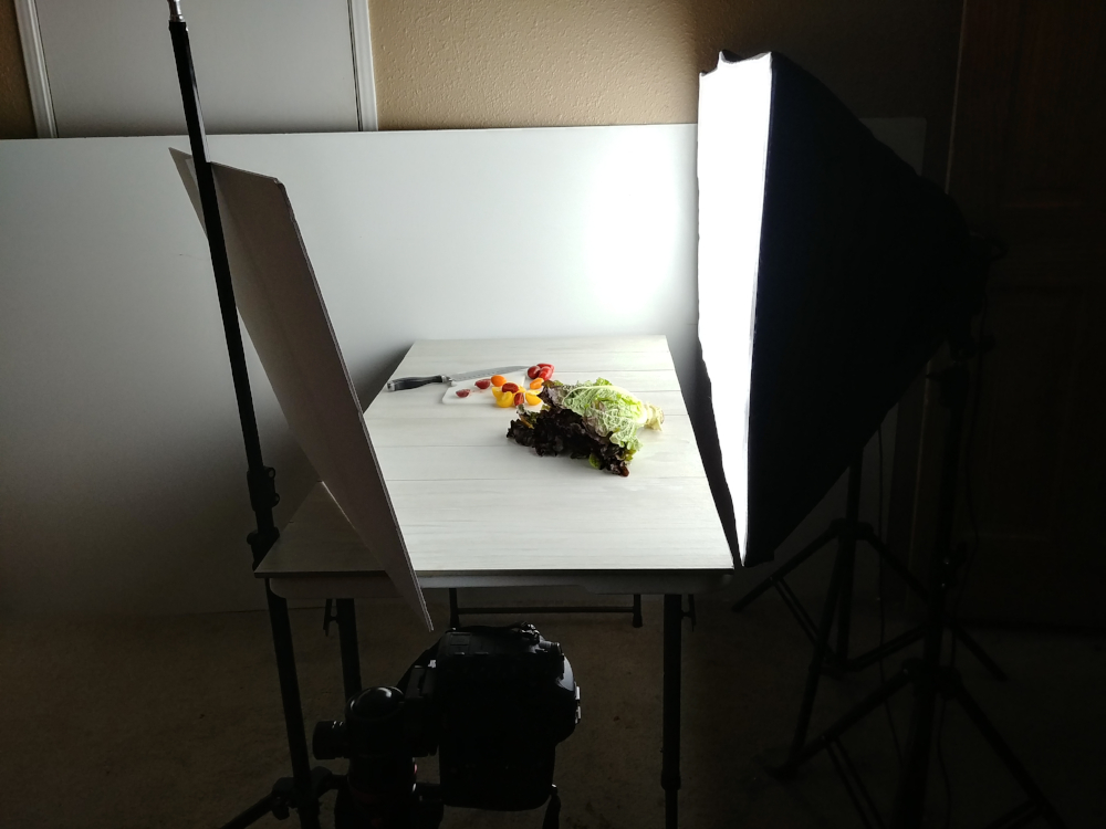
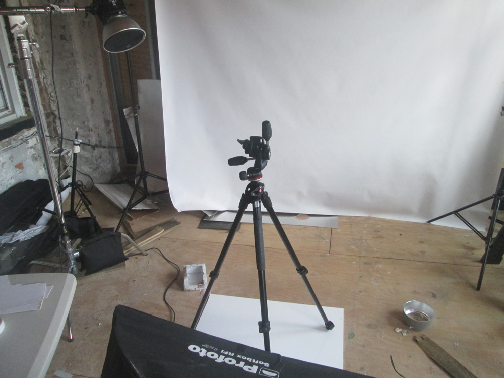
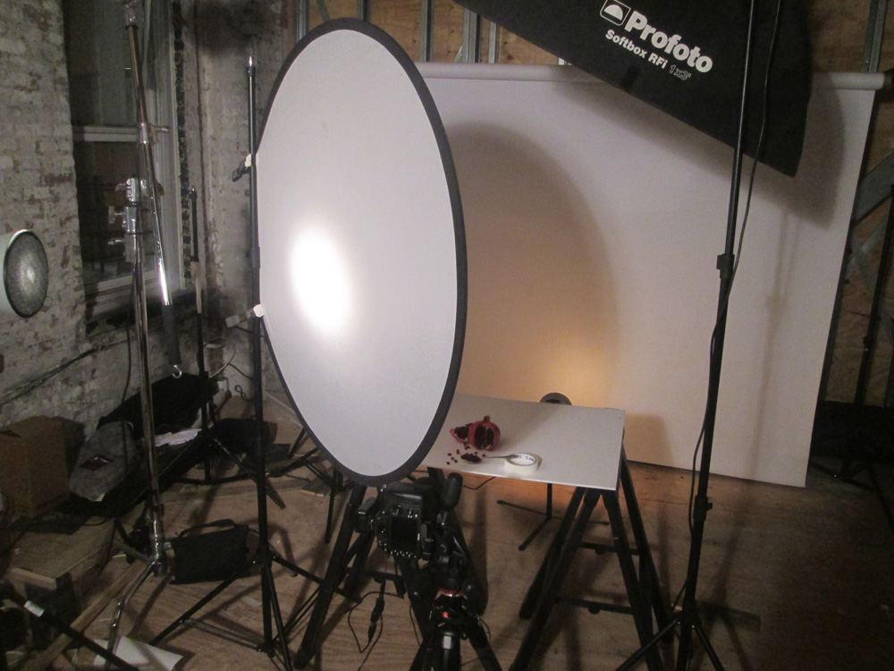
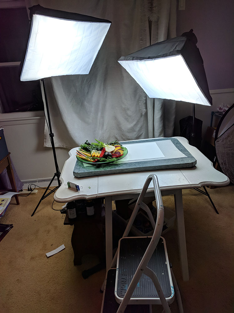
- Don’t forget BTS
- Samantha Jones Logo (Transparent background PNG)
ADDENDUM FOR THE ASSIGNMENT:
- A video 20″ long in verticle format for Instagram. Use motion graphics, stills, and possibly a little bit of video if you want, to make something to promote this nutritionist.
- Alternative: A poster for a bus stop (Canopy) visual. You can download it here. Bus_canopy.psd (zipped)
Make sure you check out the design and typography modules in The Creative Class.
ASSIGNMENT INFO:
PEOPLE
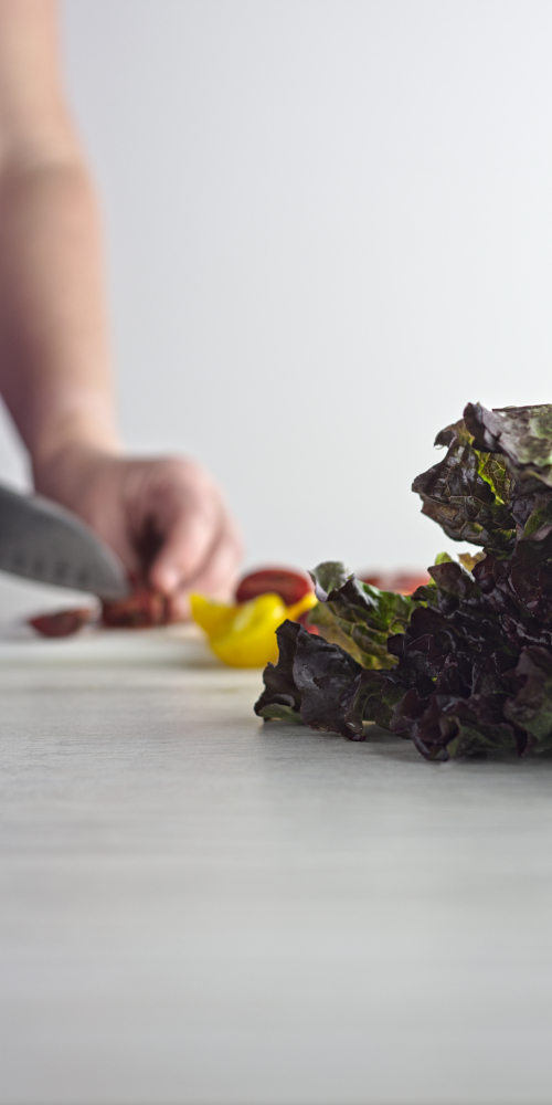
If you are going to use a people shot on the cover, remember to keep the person anonymous. No age specific. This can be done with DoF (putting the subject out of focus) or using only parts like hands and arms to introduce the food into the frame.
Be very careful to keep the color scheme correct. The client uses a specific color green and you must keep that in mind with wardrobe and props.
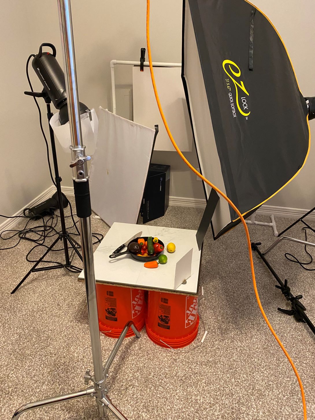
STILL LIFE
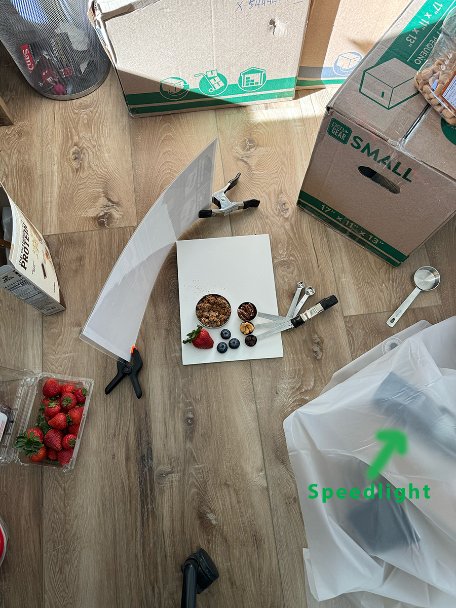
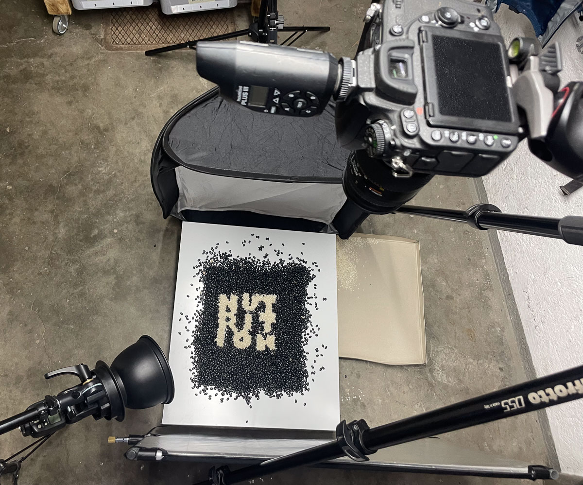
The spread is going to be a still life shot for sure. And you can introduce some great creativity into the making of this image as well. You will probably want to shoot down on the surface because that is the natural instinct for this shot – and it is extremely valid. But you can also try some different angles. If you do and want to share with us, it is fine to add an additional shot to the mix.
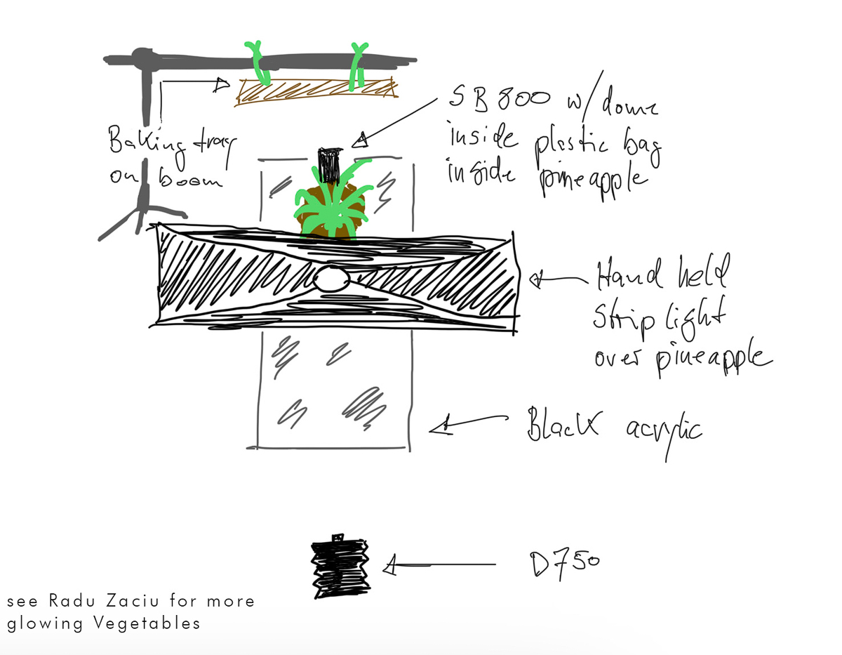
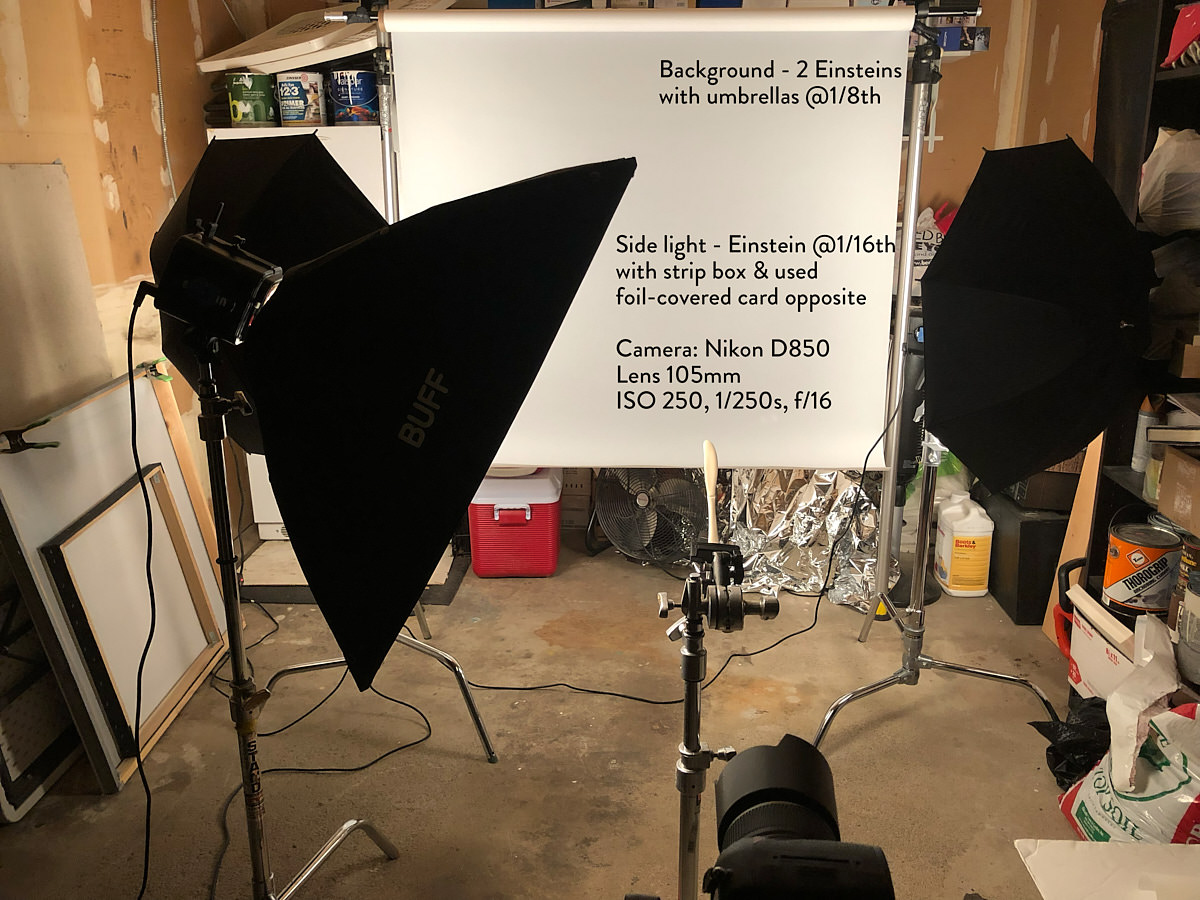
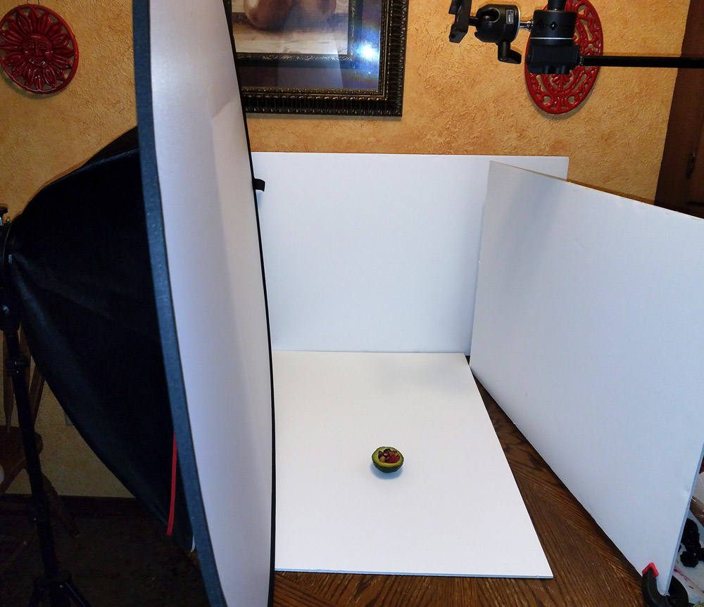
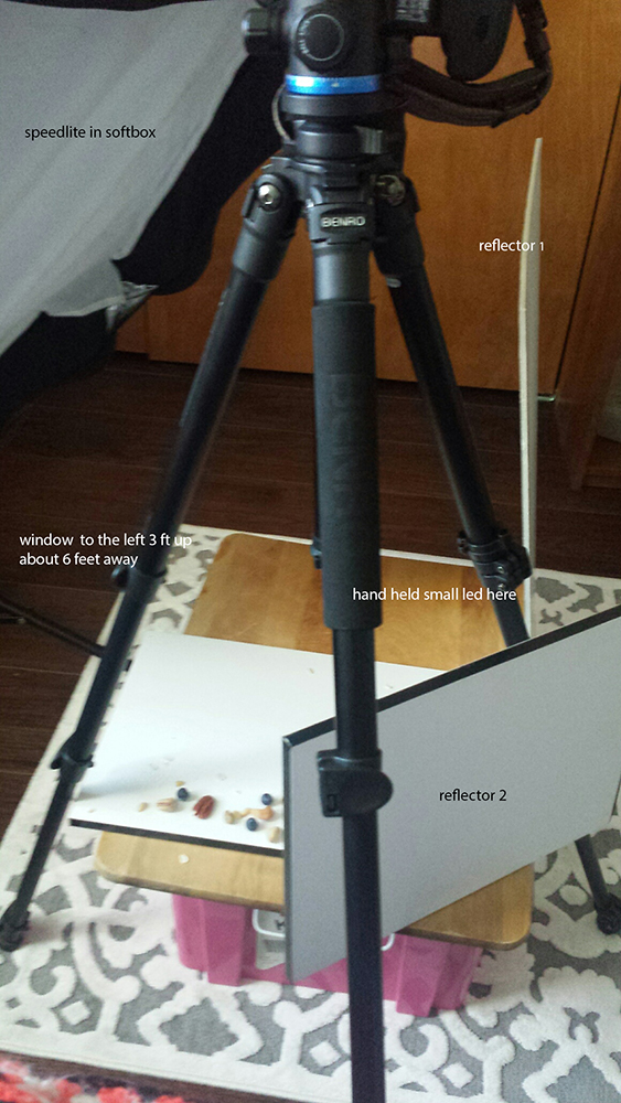
LIGHTING
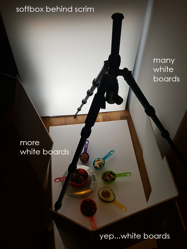
Be very careful with the lighting. Looking at what they like we can see an interest in soft light. Softboxes / scrims are probably the best place to start the lighting.
Adding in a special grid or spot should be very innocuous, and only used if you absolutely can justify it in the image.
PHOTOSHOP TUTORIAL: MASKING ESSENTIALS
LIGHTING TUTORIAL
https://www.youtube.com/watch?v=54vq4jiHhpQ
December 2023
https://youtu.be/jr1ihdLxhTM
OCTOBER 2021


-
- dav


https://youtu.be/0Klz78szoF0
PREVIOUS CLASS IMAGES AND REVIEWS
https://youtu.be/9RYJ_eHguDg