FINAL ASSIGNMENT: A PROMO PIECE WITH A NEW PHOTO ON THE COVER
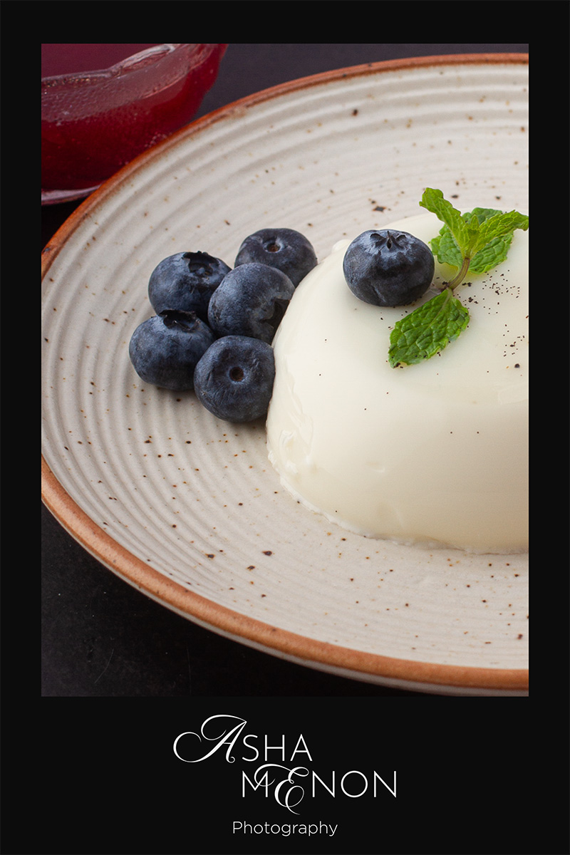
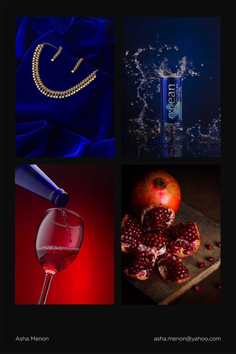
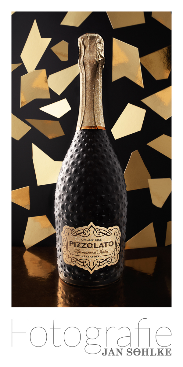
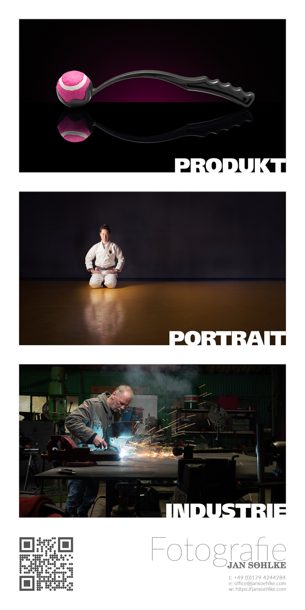
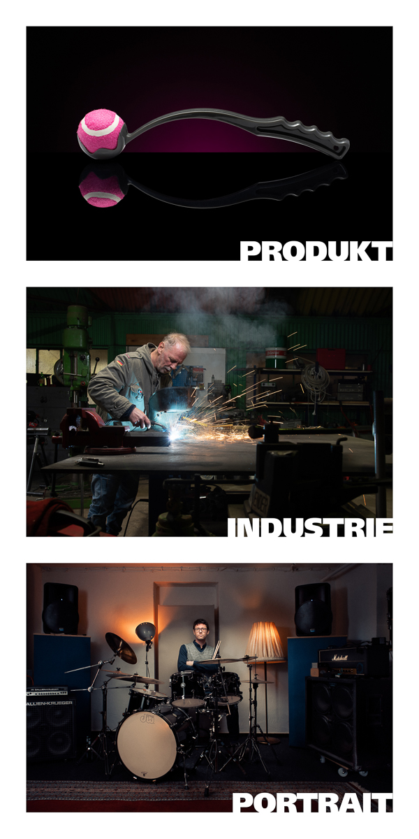
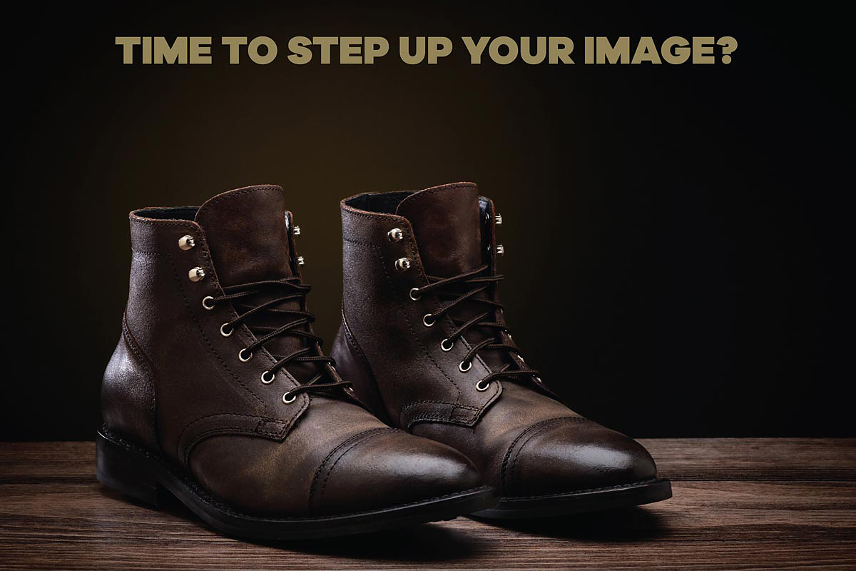
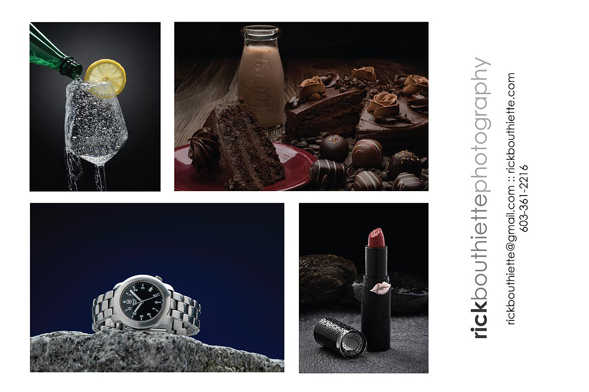
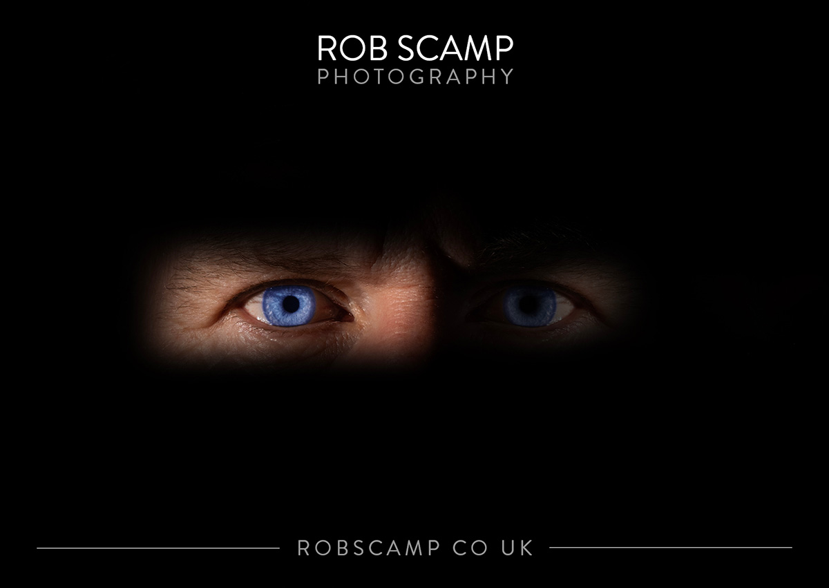
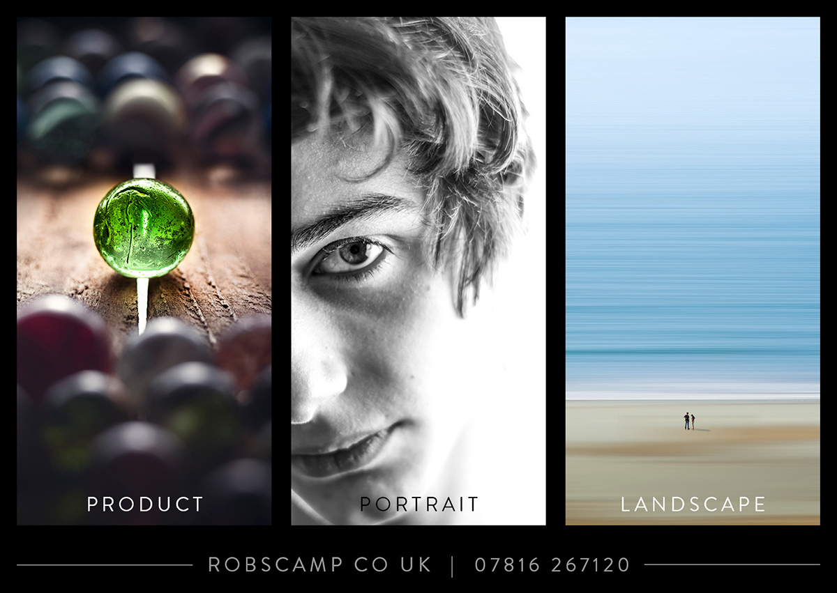
Your assignment is to make a 16×20 promo card with four images on one side, and one image on the front.
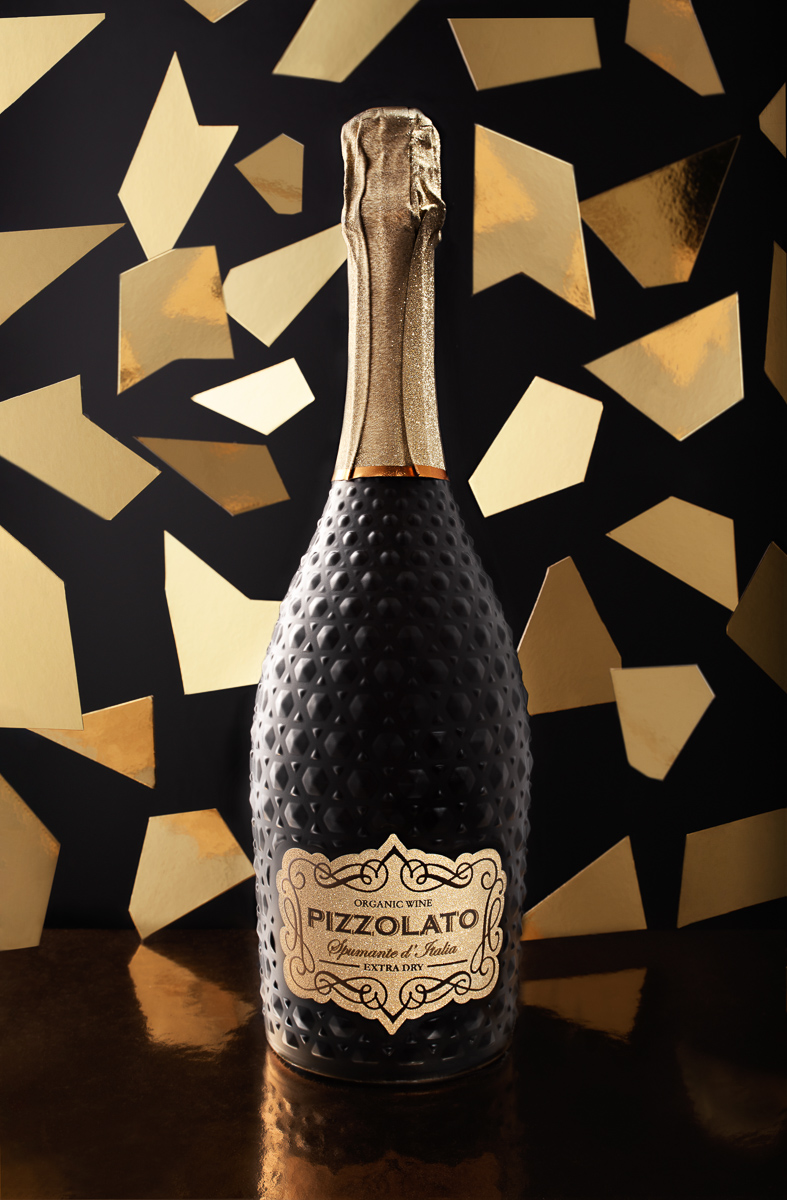
The front image is the image you are doing for this last assignment. Make it a killer image that introduces the viewer to your work, the style of work you like to do, and the type of images you like to make.
The card can be 6×9″ landscape or portrait.
I would suggest you design the card in 300 DPI using Photoshop. If you are familiar with InDesign, that would also be fine.
Once the card is made, make a copy as a jpeg and resize it for the class.
LOGO: If you do not have a logo, use just your name in type.
(I am not crazy about logo ‘bugs’ or little graphics, although some can be very effective.)
LOGOTYPE Alternatives:
Creative Market: Free Goods. Every Tuesday morning, they release 4 free items. Every time they do it they have at least one font in the bunch. Become a member (free) and download the fonts so you can possibly have something interesting.
Envato Elements. There are a million fonts here. Most are very affordable.
Pro Tip: Look for font pairs. This will be one display and a selected font to accompany it as a text font.
There are other resources for fonts, but these are two very good ones. See also Google Fonts for free alternatives.
HOW YOU DESIGN YOUR CARD IS UP TO YOU.
Here is my process:
Choose the images carefully. If I need predominantly portrait-oriented images or predominantly landscape-oriented images, I make folders for them.
I let the main image dictate the final orientation of the card. If my main image is a portrait, it may be easier to put four portrait images on the back. Same with a landscape.
I also look for cropping potential. Perhaps a portrait image could be cropped to a landscape and vice versa.
I make prints of the group of them using Contact Sheet II, cut them out, and start to sort them into hits and misses.
This video will explain the process I use:

