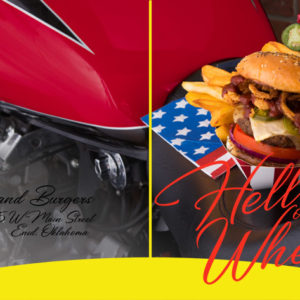
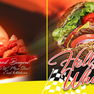
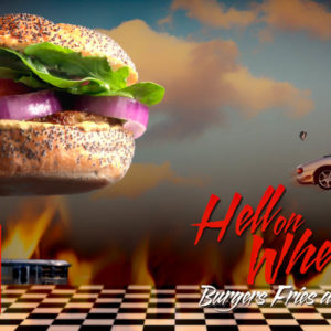
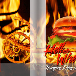
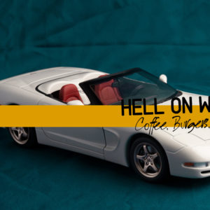
HELL ON WHEELS:
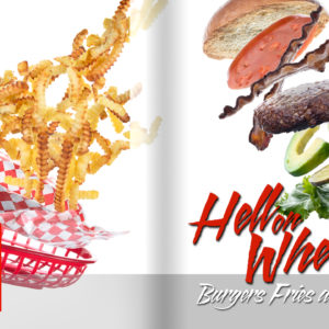
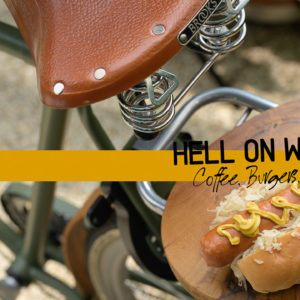
A Coffee, Burger, and Pie Restaurant needs a new Menu Cover
A local company is franchising a new burger store… retro design, servers on roller skates, old-time fun. And it is mostly for upscale people who like to dress downtown… $30,000 Harleys and Mint Condition 68 Corvettes.
The food is big and fun, and the feature is the old-time feeling of the place.
OR – it can be a local restaurant that is automobile-themed… ‘country-style food (either European or American) and a rustic feeling. But in both, the idea of the automobile/motorcycle is the theme.
Food and hot cars of food and hot bikes or food and upscale cars.
And pie. Don’t forget the pie.
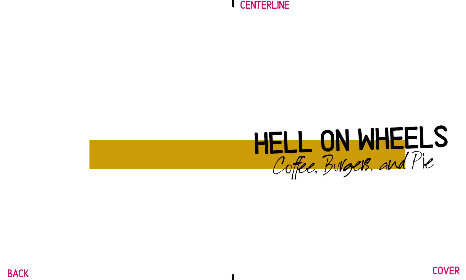
The image must fit the layout provided… and it is a landscape.
Print the image and have it close to you for reference.
PSD FILE (NOTE: New Layout) hellonwheels-main.psd
Note that there is a color scheme already attached, so make sure your colors will work with all that orange
The cover is on the right half and the left half is the backside.
Plan this shot with complete deliberateness.
If the front wraps too far around the back, we lose what you have done, but if the image doesn’t wrap neatly the backside may have no relationship to the front.
Other than the red type on the front, there are no other typographical issues to deal with.
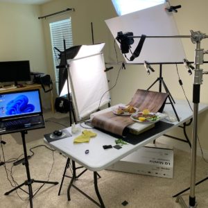
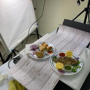
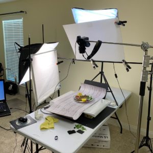
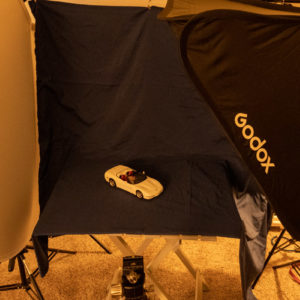
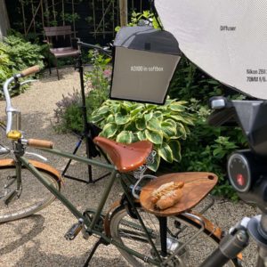
PHOTOGRAPHIC INFO
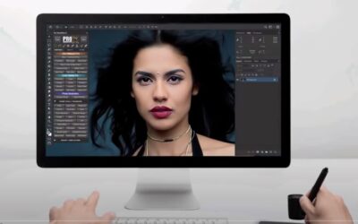
PHOTOSHOP INFO
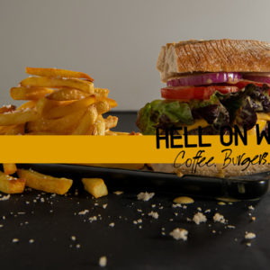
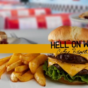
PREVIOUS STUDENT WORK FOR INSPIRATION
JUNE 2022
IMPORTANT PHOTOSHOP TOOL: LEARN TO USE IT APPROPRIATELY.
FREQUENCY SEPARATION FOR PRODUCT AND FOOD. https://youtu.be/YeTIcm4vQIw GET FREE ACTION TO MAKE THE SEPARATION HERE ANOTHER FREQUENCY SEPARATION VIDEO https://youtu.be/0WhmRqz6Fh8 THERE IS A DOWNLOADABLE LINK FOR YOU THERE AS WELL. NEW WAYS TO USE FREQUENCY SEPARATION...
USE A BLACK AND WHITE LAYER TO ADD CONTRAST GLOBALLY
https://youtu.be/RtxFE_wDwI4
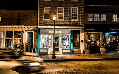
2022 SPRING: 36: ASSIGNMENT THIRTY SIX: CHAMBER OF COMMERCE POSTER
You have been called upon to create a poster for the local Chamber of Commerce, or whatever they call it where you live. A co-op of businesses that help drive interest in the community. The ‘Chamber’ needs your help. And an image… a really good image. The gig is a...
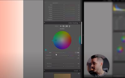
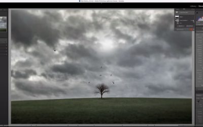
COLOR GRADING IN LIGHTROOM
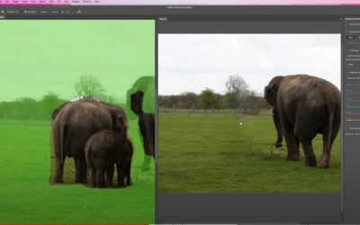
NEW TOOLS FOR CONTENT AWARE FILL
https://youtu.be/iIzn94Qfb00
ADVANCED COMPOSITING WITH YANNIS TILKIS
A VERY COOL NEW FEATURE IN LIGHTROOM FOR EVEN MORE CONTROL
SPRING 2022: 30: ASSIGNMENT THIRTY: PEOPLE IN SPACES
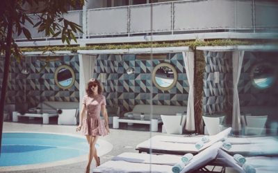
2022 SPRING: 30: ASSIGNMENT THIRTY: PEOPLE IN SPACES DUE SEPTEMBER 6, 2022 You have been contacted by "Interior Design" magazine. They want you to shoot a promo shot for an upcoming trade show in your town. They also want you to match their style with something...
SPRING 2022: 27, ASSIGNMENT TWENTY-SEVEN: FREE SHOOT WEEK
I am so late with this. But we were scheduled to have an "Open" week here abouts anyway, so here you go. Redo an assignment you know you could have done better. Catch up an assignment you wanted to do but missed. Or simply impress us with some absolutely awesome photo...
SPRING 2022: 26: ASSIGNMENT TWENTY SIX: THE INCREDIBLY BEAUTIFUL SANDWICH
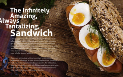
SPRING 2022: 26: ASSIGNMENT TWENTY-SIX: THE INCREDIBLY BEAUTIFUL SANDWICH The Most Incredible Sandwich… EVER! DUE AUGUST 9, 2022 The client, a small regional restaurant/catering chain, has introduced a new sandwich line to complement their other prepared foods. But...
THREE INTERESTING POST PROCESSING VIDEOS FOR YOU
THREE INTERESTING POST PROCESSING VIDEOS FOR YOU
2022 SPRING: 23: ASSIGNMENT TWENTY THREE: A NEW COKE CAMPAIGN
https://project52pro2016.com/location-product-lighting-exercises/ This will be fun. And challenging. Really challenging. WATCH: https://youtu.be/UvYuQ4Qyiqc The details. Read them. Twice or more. You have just been contacted by a local Coke ad agency for a set...

