This will be fun.
And challenging.
Really challenging.
WATCH:
The details. Read them. Twice or more.
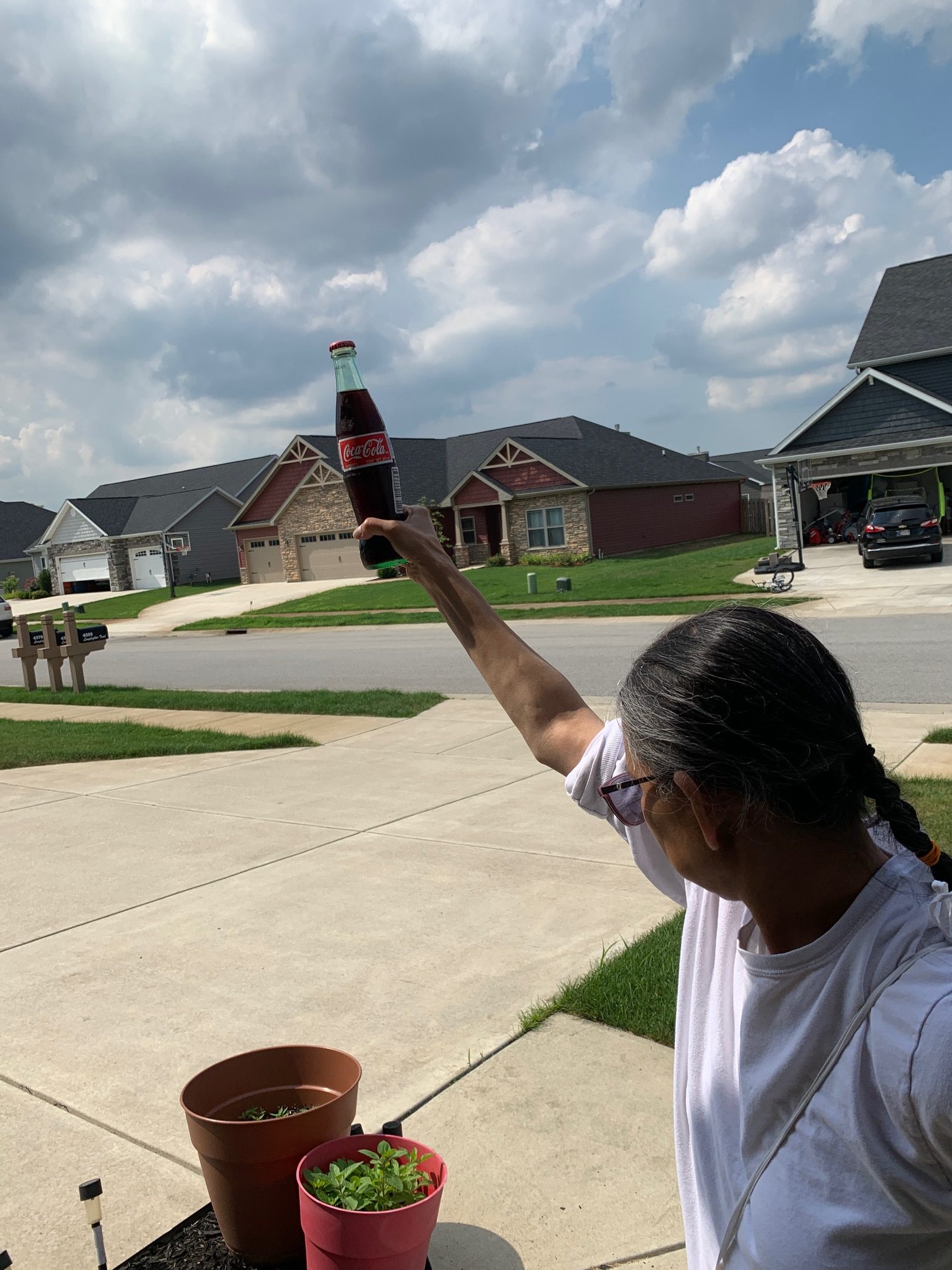
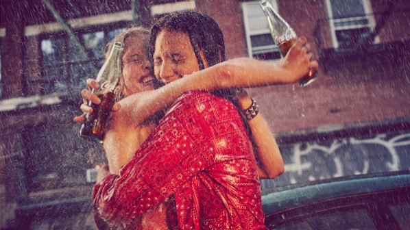
You have just been contacted by a local Coke ad agency for a set of promotions and they want two images LOCALLY to add to the collateral/ad work they are doing for the local event. They have sent you the brief (see above) and need you to create the images ASAP within your own style, BUT staying true to their concepts.
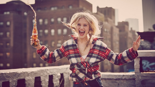
However, they are wanting a more ‘real people’ look to the images. Not models – real folks in older demographics if that is what you have access to.
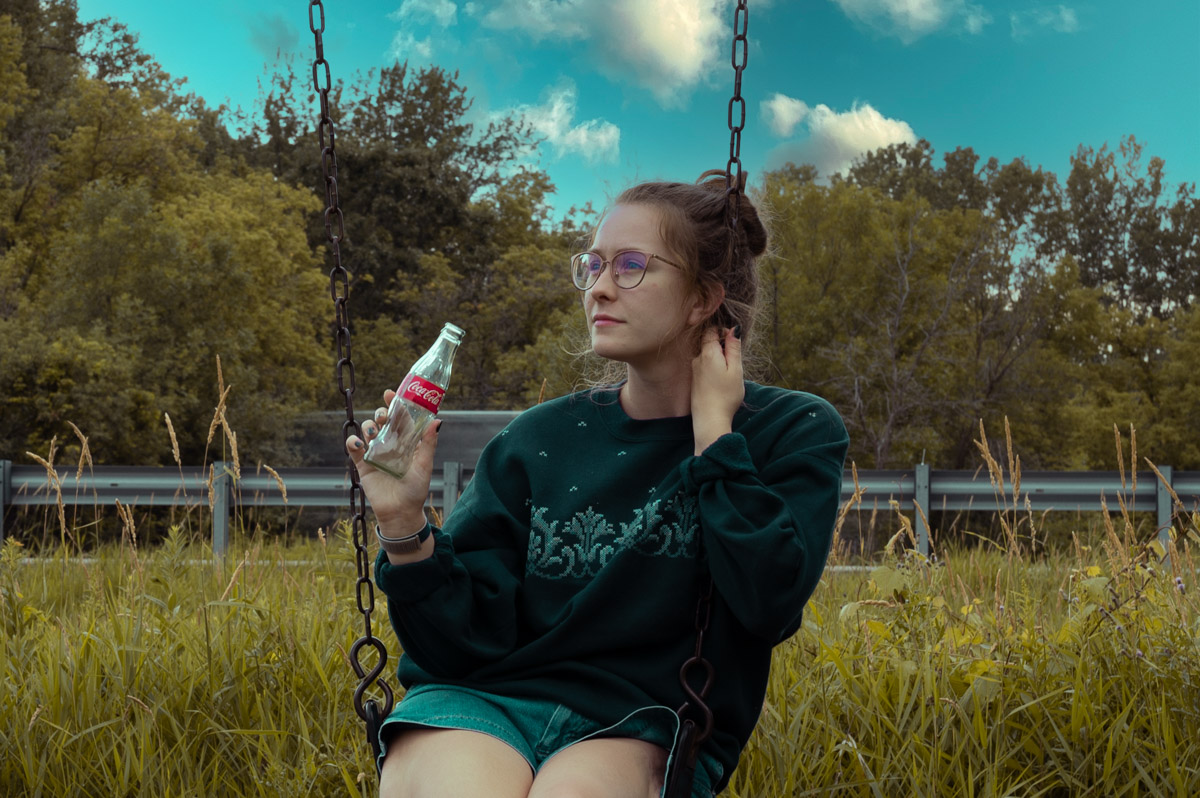
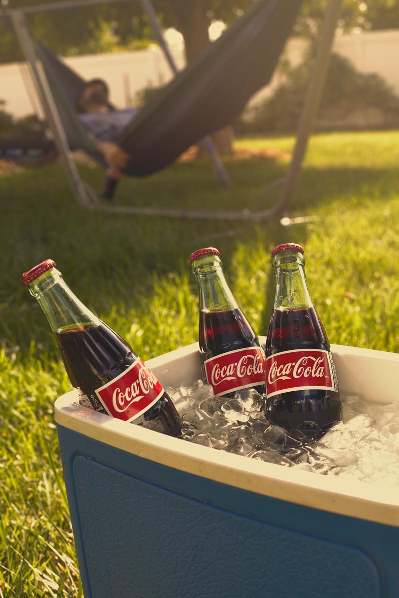
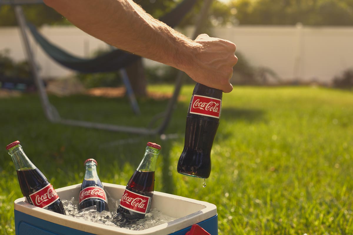
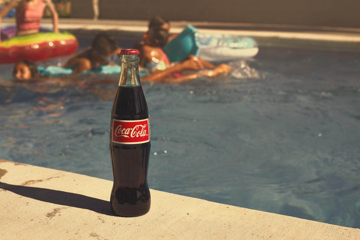
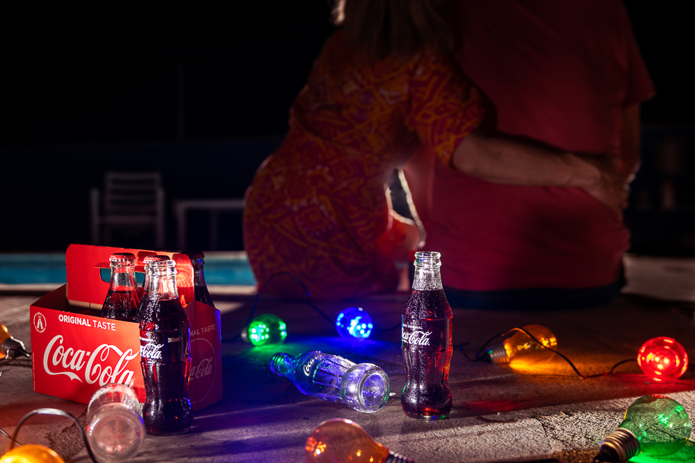
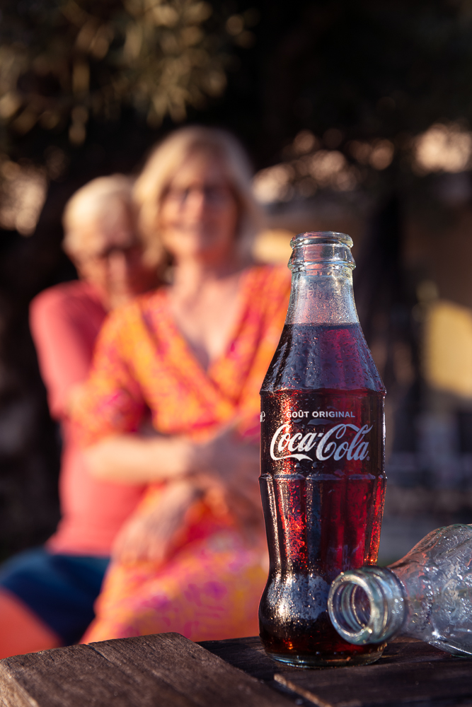
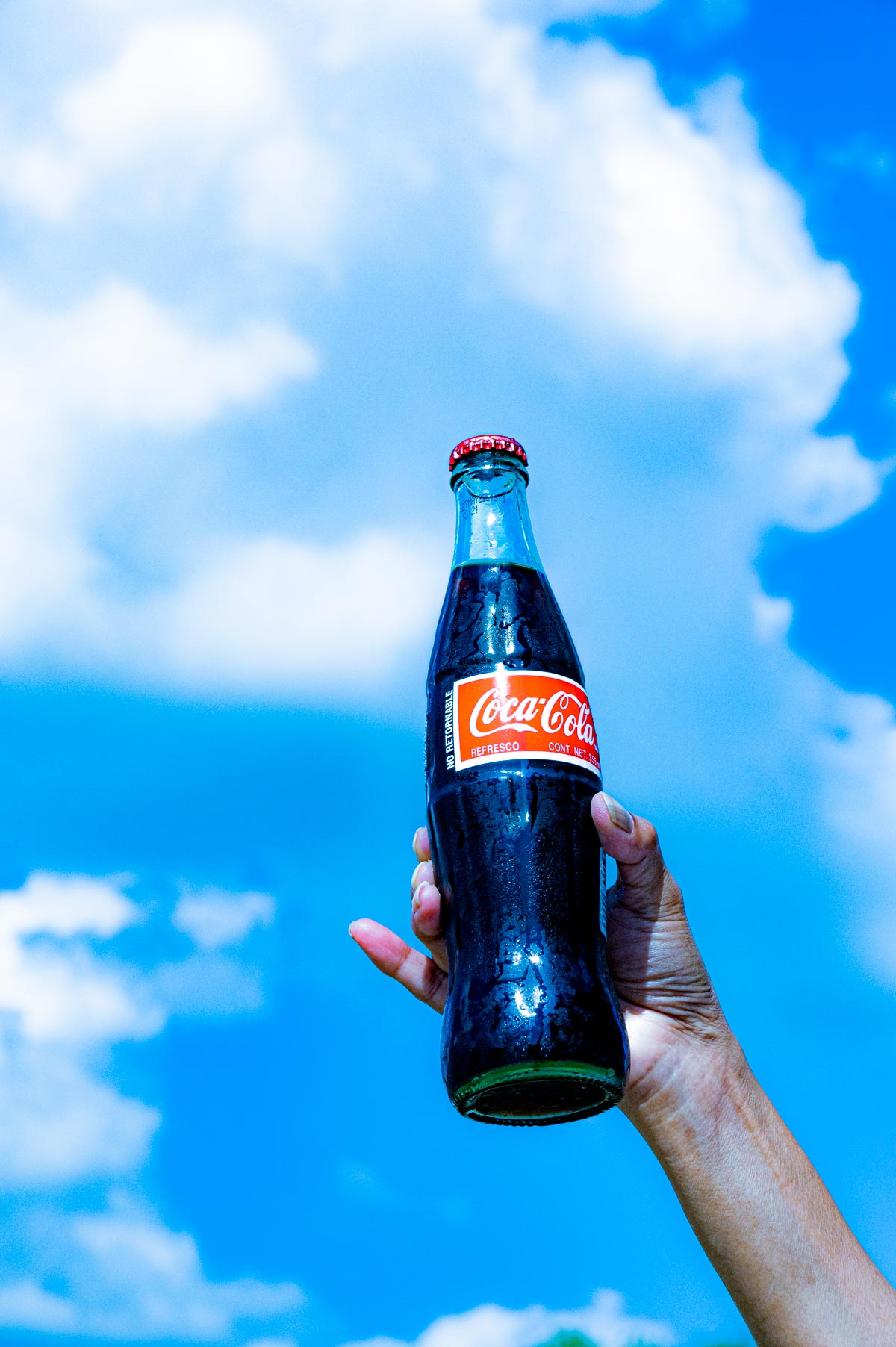
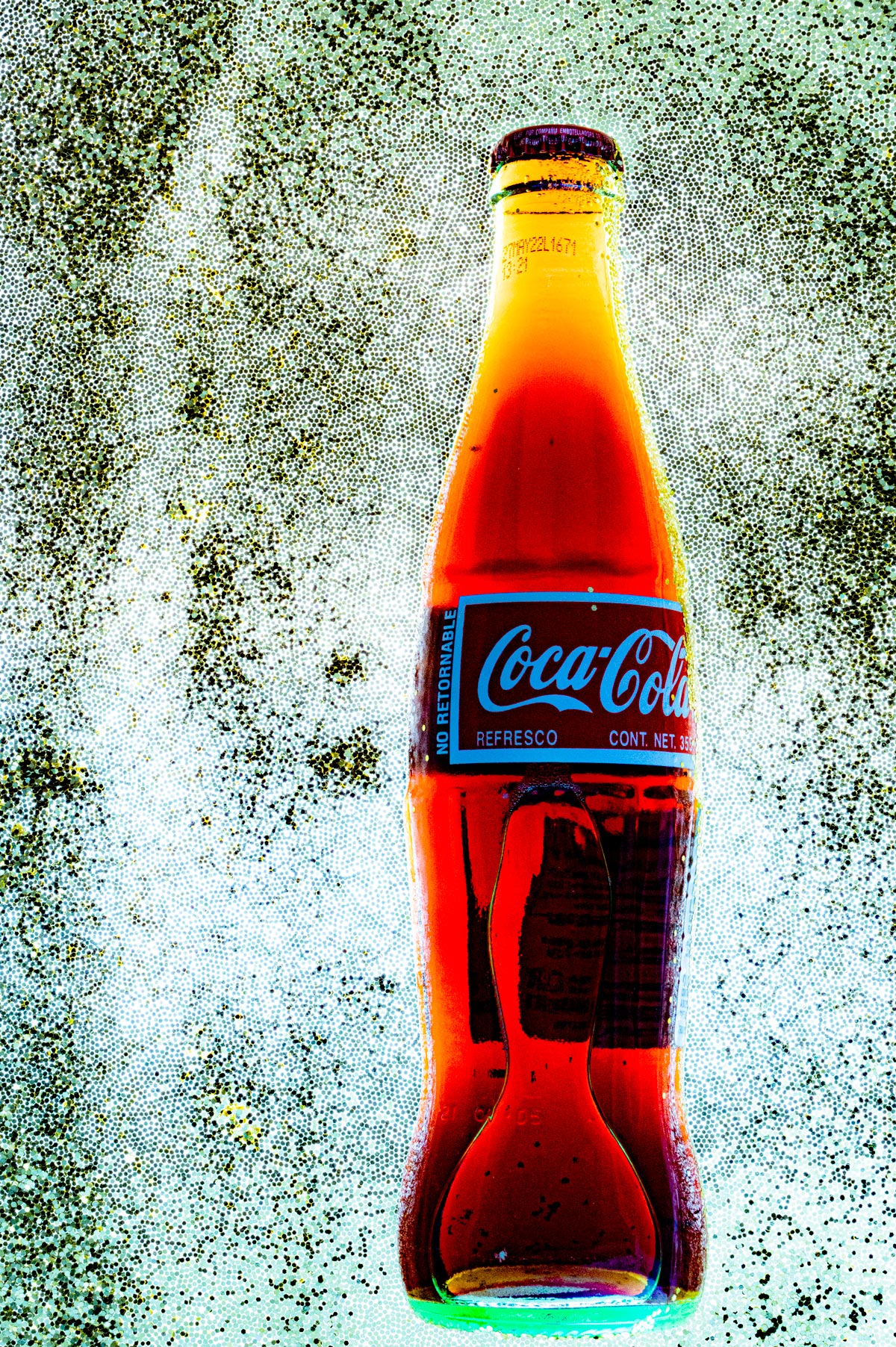
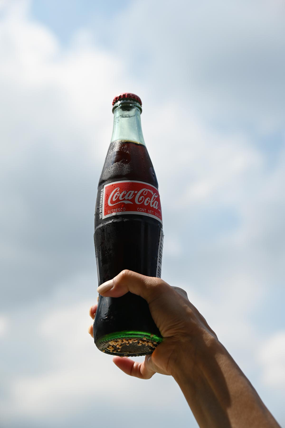
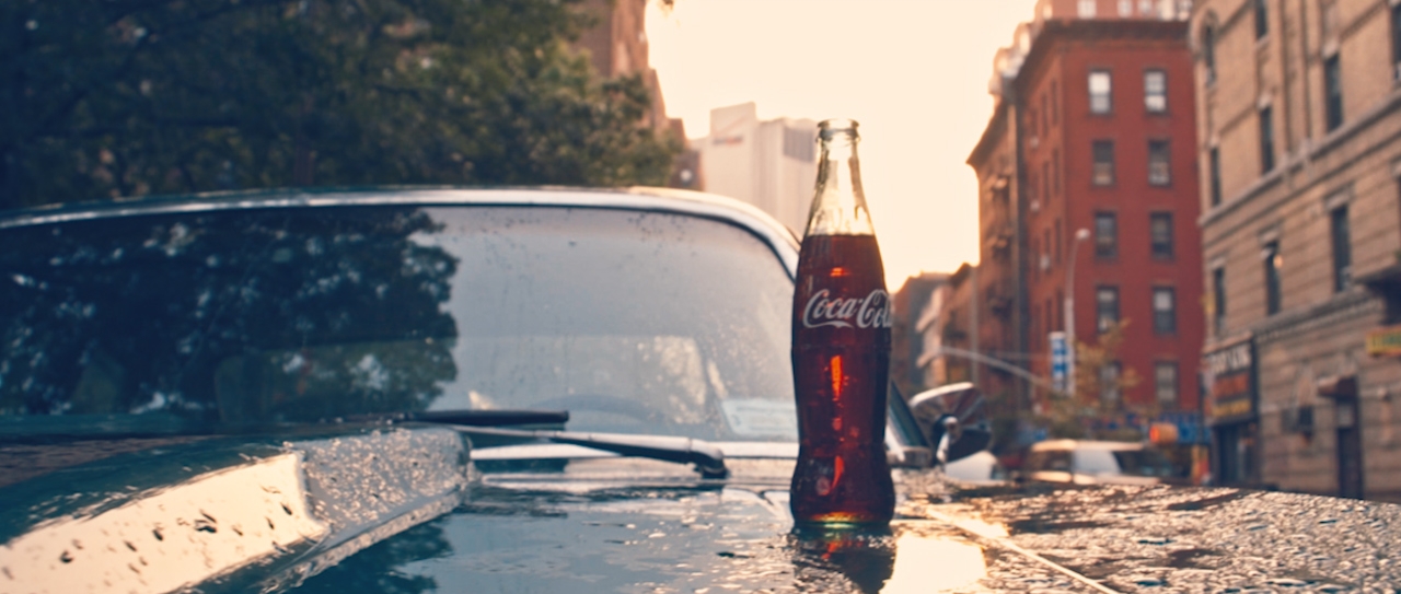
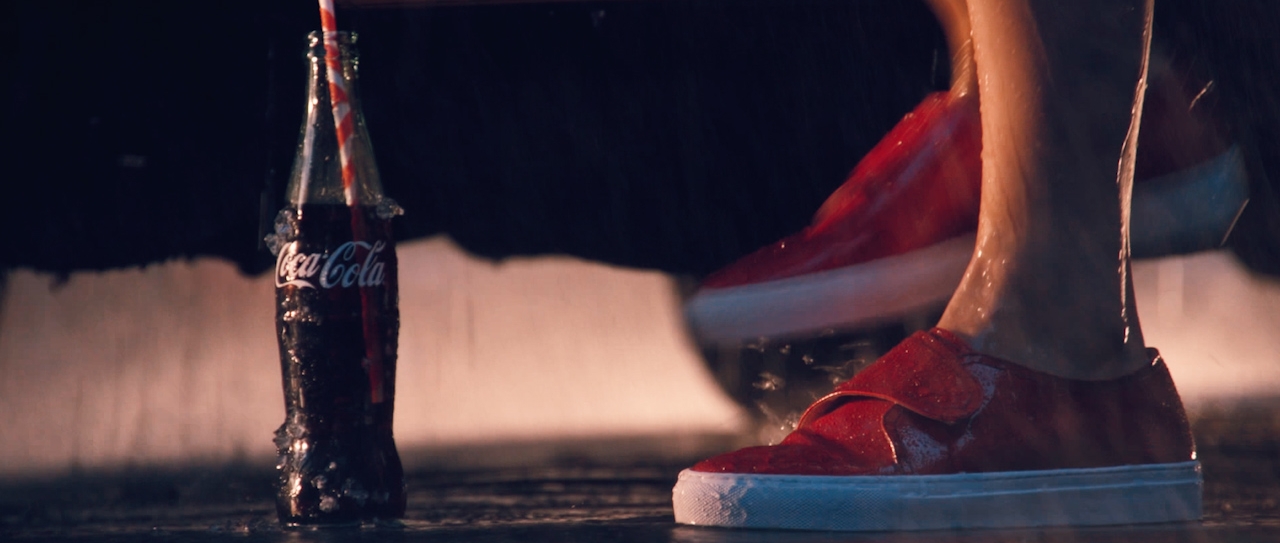
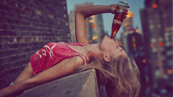
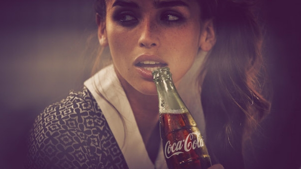
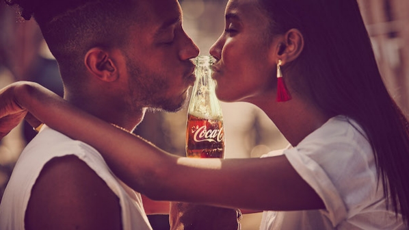
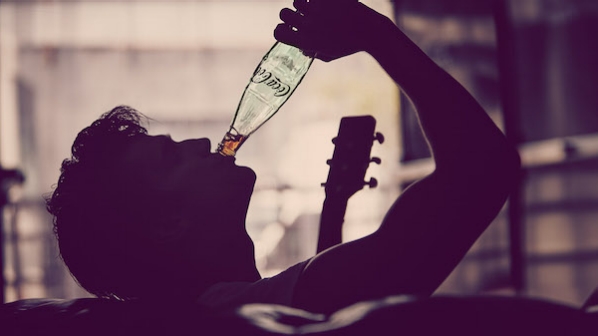
Note the bottle of coke.
Note the position of the label in all shots.
Note how the bottle is always a feature.
IN ADDITION: They have stipulated that the images may be location ‘product’ images (or styled to look like location). These should be a bit of an urban feel if you are in an urban location, and a ‘country feel’ if you are in a more rural type area.
You can use the images above to match your color grading and stylistic approach.
IT IS IMPORTANT FOR YOU TO MAKE SURE YOUR COLOR AND LOOK ARE WHAT THEY WANT.
It is VITAL that your images dovetail directly into their current branding.
Color.
Grain.
Look and feel.
Composition.
Style.
And there ya go.
Assignment: Two images to fit in the current COKE campaign from your locality.
Age of talent can be anything you have available.
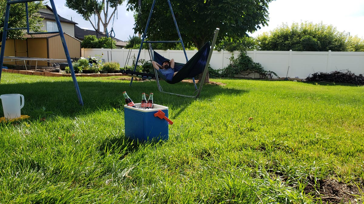
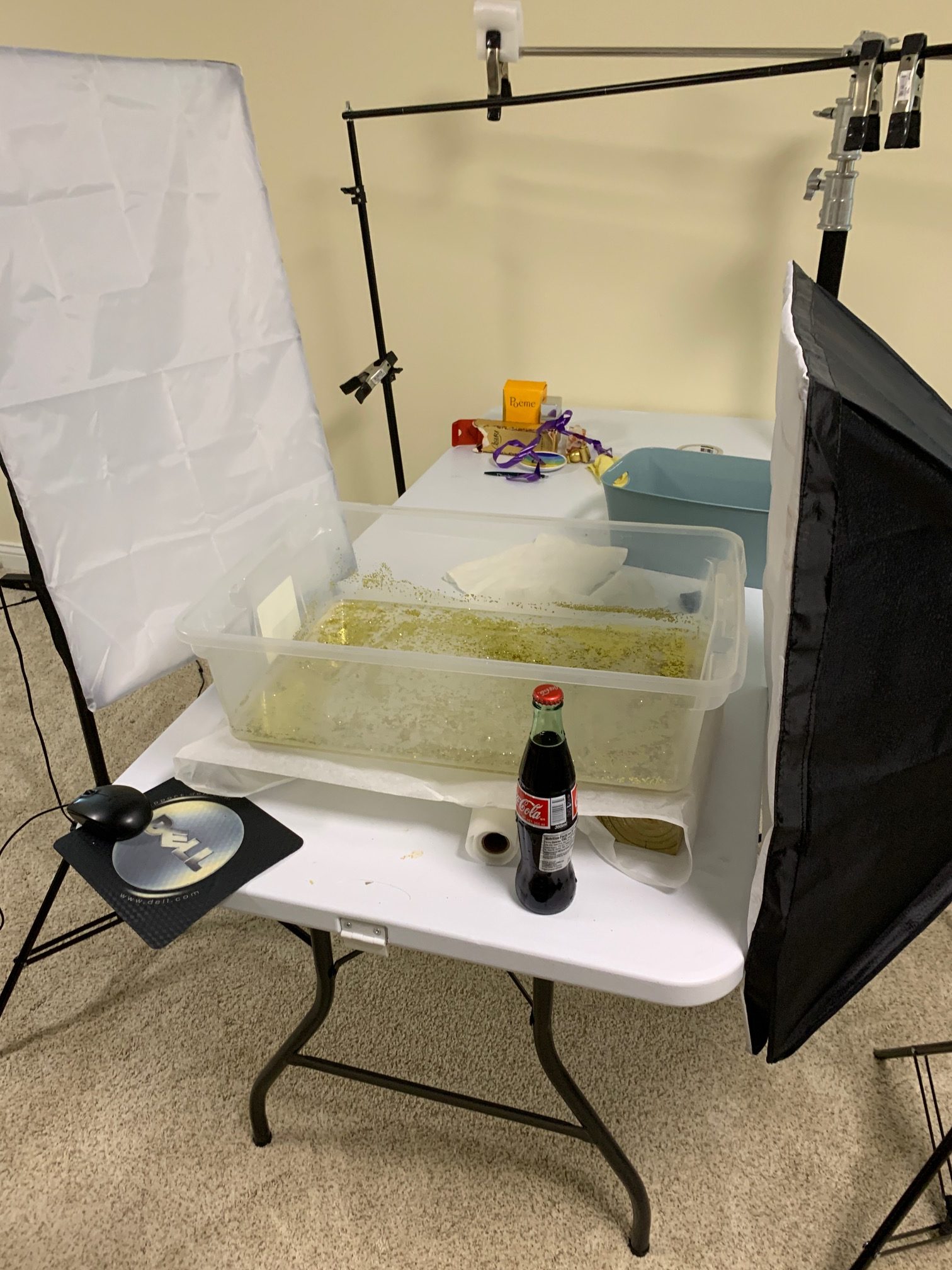
Remember the BTS shot for at least one of the images.
Start a discussion on FB if you want to kick the ideas around a bit before shooting.
YOU MAY LIKE THIS TUTORIAL ON STEALING THE COLOR GRADING OF AN EXISTING IMAGE.
This will allow you to color grade your images to the colors they want to use. This is a technique you will use a lot.
SELECTED IMAGERY:
You can use these for stylistic hints and color correction (color grading).
[rl_gallery id=”23649″]