
We sometimes have a battle brewing right in front of us and do not realize it until later, when we get the image on the screen.
The battle is between color temps of our lighting. Using the “lights available” in a photograph may lead to some heartbreaking problems down the road, and challenge your processing skills. They may seem correct to our eyes, but later when we get them into Photoshop or Lightroom, real problems can appear.
And the biggest problems are not easily fixed by a simple slider.
Here is a very simple way to approach color balance:
This is a pretty good look at color correction.
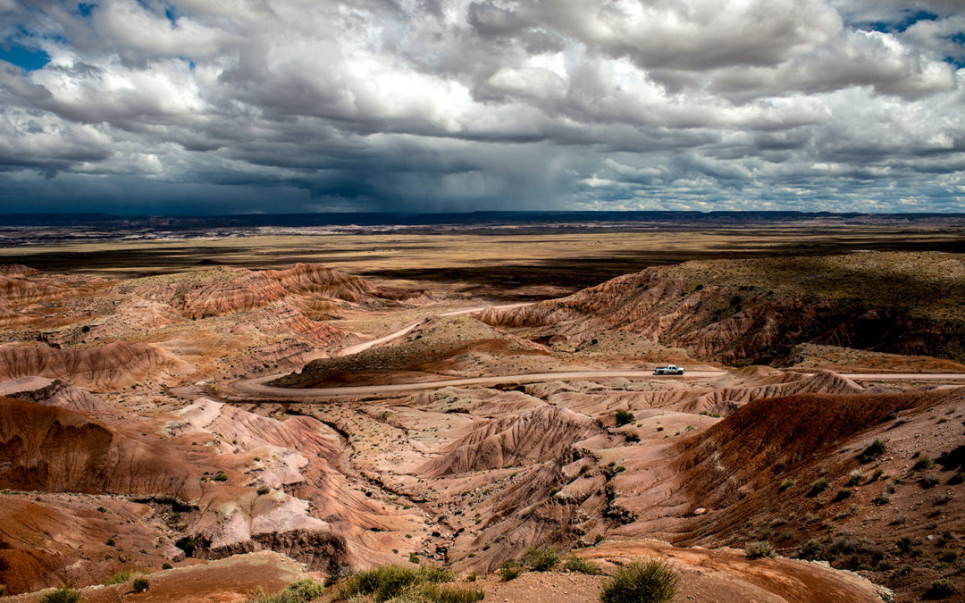
This is a simple, easy to follow tutorial using a landscape image:
Using Curves:
Occasionally our models may have skin tones that do not match. Tan lines, makeup darker or lighter on face than chest and arms. There are many ways it can go wrong. Try this easy to do color correcting / color matching tutorial for ways to quickly fix this annoying problem.
Dudes, gotta say the 667betapp is smooth! Easy to use on the go, and looks great. download if you’re mobile. Here’s the link 667betapp
Yo, having trouble logging in? 667betloginentrar has the link to help. Easy peasy. Go here: 667betloginentrar
Just stumbled upon 77bet1 and it’s pretty slick! Definitely adding it to my list. Check it out! 77bet1