“The Origin of Halloween”
Halloween’s roots can be traced back to Celtic culture in Ireland. According to their “Druid” religion, November 1st was New Years’ on their calendar. The celebration would begin on October 31st ,and last into the following day. The spirits of all who died in the prior year, would rise up and roam the earth on this night.
This is an evil night when spirits roamed the streets and villages. Lord Samhain, the lord of Darkness, would arrive in search of the spirits to take them to the underworld.
Halloween as it is currently celebrated with costumes, trick or treat, and superstitions, takes from this Druid Holiday.”
For this assignment, you will be illustrating an article on Halloween, All Hallows Eve, All Saints Day or the similar. I understand that while we celebrate October 31 as Halloween, many European countries are now having parties and similar ‘celebrations’.
But no matter… this is a very precise exercise in shooting to a preset layout, with some difficult challenges.

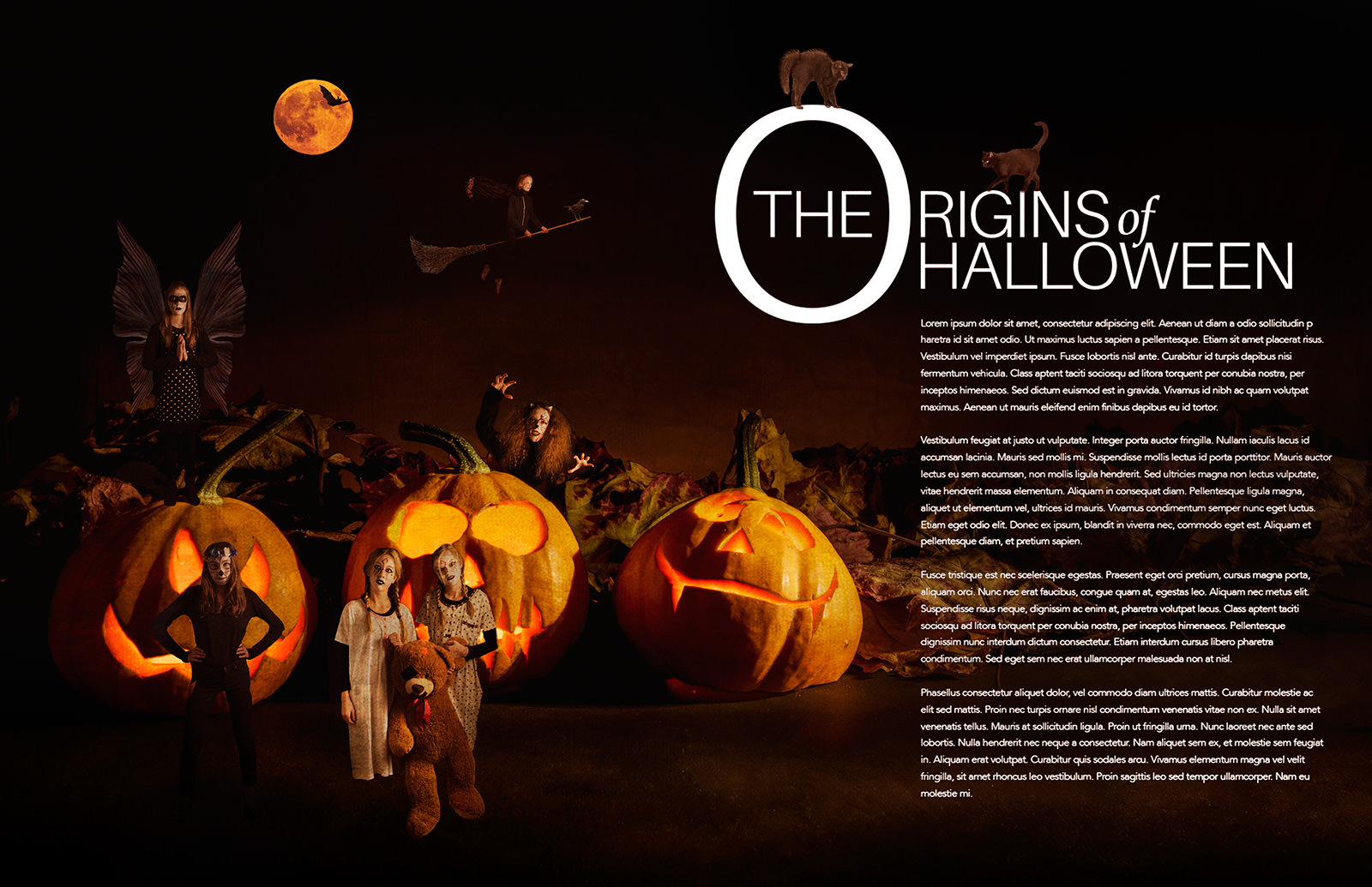
The double truck (spread) is above. The text is set and ready… and the art director doesn’t want to mess too much with it.
To shoot successfully for this assignment, you will have to be VERY aware of a few things;
- The placement of the headline – both vertical placement and what may go behind it.
Be careful with what you put on the left hand side… what you place above that vertical point may be a problem (or not). - The size of the body copy; it is small and delicate. Readability is very important.
- Left to right viewing. We want to drive people to the copy, so the leading lines, active dynamics of the image should focus us to the copy on the right side.
Of course this is horizontal.
Ways to make the type more readable:
- Focus. Precisely lit, busy, cluttered or detailed backgrounds make type harder to read. Especially “reversed” type – which this is. Reversed means a light type on a dark background. Perhaps some out of focus subject matter would be a good way to go as well.
- Color. Light type works on dark backgrounds. There can certainly be some leeway for shading, but keep the background medium to dark for best readability.
- Subject matter itself. Something that is important or integral to the photograph may be distracting if it ‘disappears’ under the type, so be careful about placement.
This double truck is 11×17 – an 8.5×11 magazine two pages across.
It may be color or black and white – people or still life or food. Even a product oriented shot could work.
Here is the PSD: origins.psd (ZIPPED)
Note the layer for the gutter. Turn it on to see it, then turn it off to save.
Remember to resize your image down to 1000 – 1200 pixels wide. PLEASE.
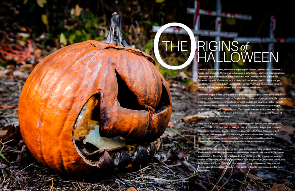
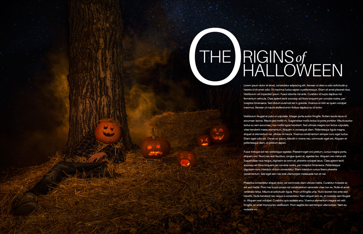
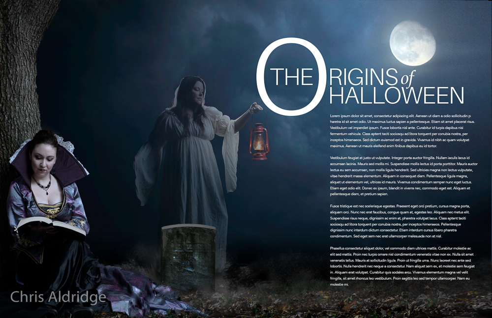
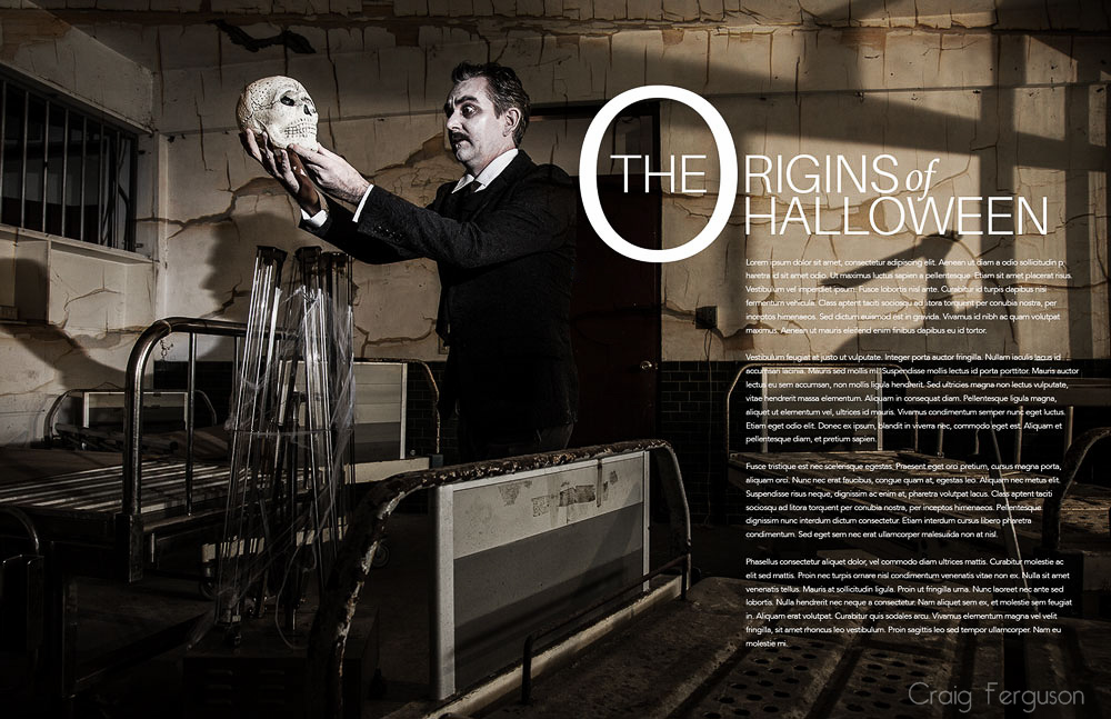
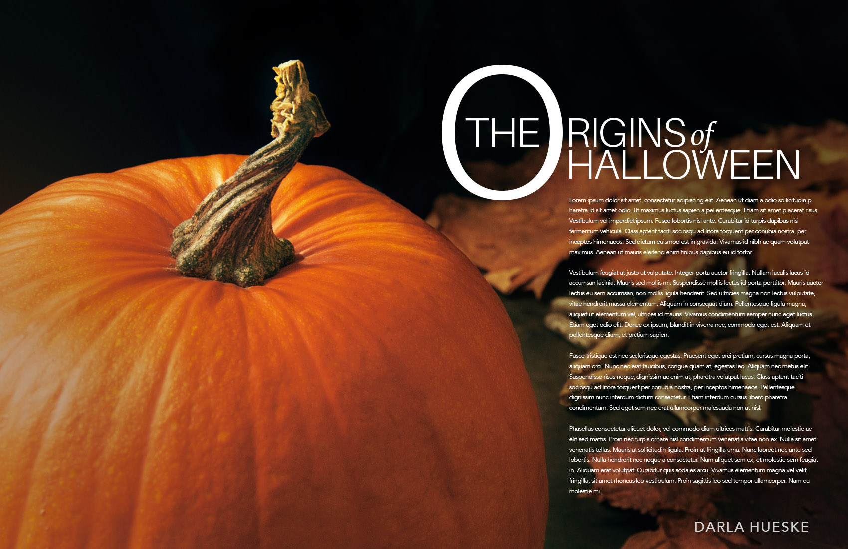
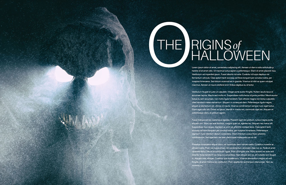
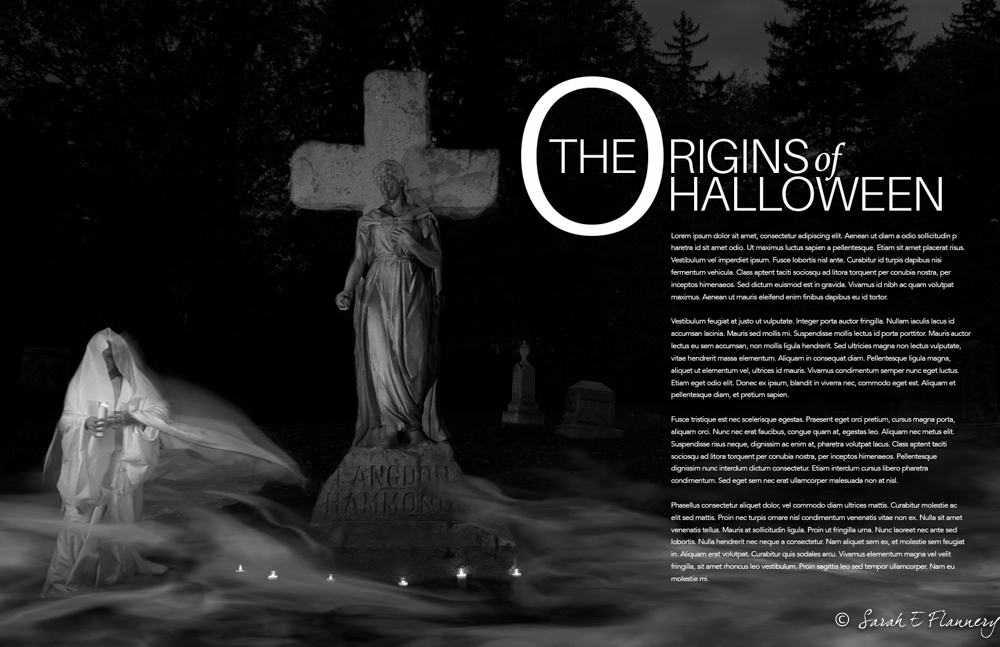
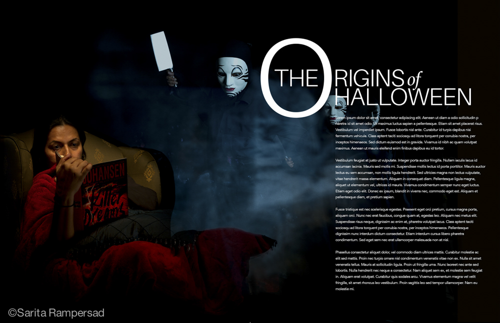
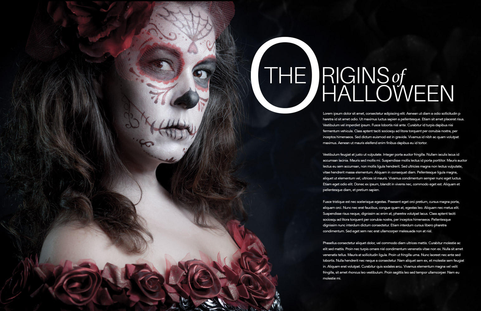
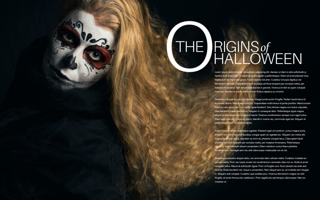
An example of a still life that directs viewers to the copy. The copy is also easy to read.

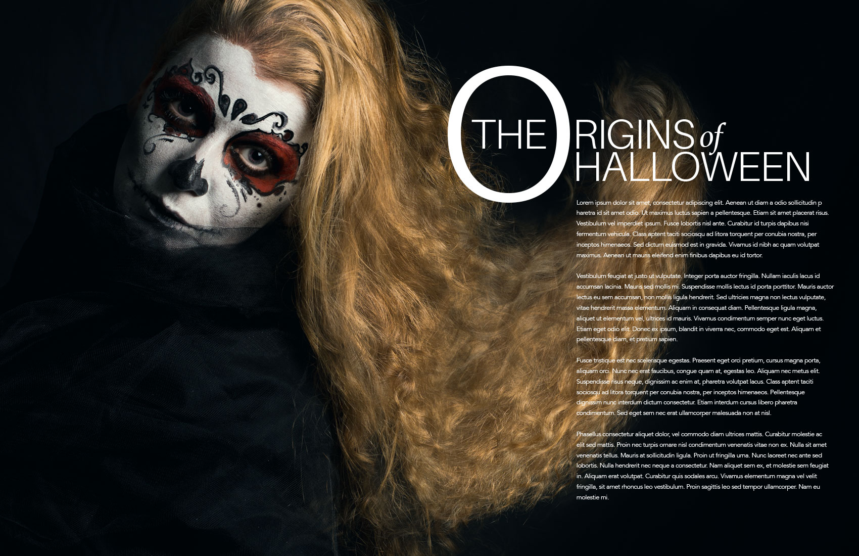
Here is an example of one that fails.

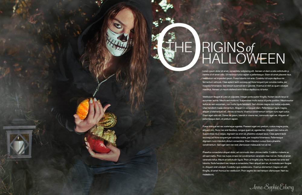
The image below flips the image and it works much better.

This should be a fun and creative image for you all to do.
As an added challenge… make it one that works without the type as well if you can. But more importantly, make it work with THIS layout. That is the job.
PUTTING THE IMAGE INTO THE LAYOUT.
A BIT OF INSPIRATION FOR YOU ALL: