What a terrific video above. Make sure you watch it at least once.
AN EDITORIAL PORTRAIT
THE BRIEF:
This is an editorial portrait. It is specifically for a regional magazine and it is all yours creatively.
This is far more of a challenge than it may seem at the first moment of excitement when the Art Director tells you that the advertorial will be running three pages in four different magazines, and your shot will be opening up the three pages… and they want you to do something creative.
“Hello, this is Don.”
“Hey Don, this is Art D’Recteur from Eezy-Peezy Advertising. We have been getting your emails and direct mail consistently for the last year and we think we may have a shot for you.”
“Cool, Art. Nice to talk to you. What is the timeframe for the assignment?” Might as well find out if it fits in your schedule now.
“We have nearly a two-week window, and we need you to handle it there locally since we do not have an office in your town.”
“Yeah, I can do it in the next two weeks… what are the deets?”
All the details of what they need and where to send the images and of course the fee structure is worked out and then this bombshell…
“Don, we need for you to do something really cool with this shot. It is very important to our client, but honestly not being there makes doing the creative a bit more challenging. We know you can do the creative.”
So it is up to you.
The article is about a charity that chooses a spokesperson once per year for their promotional work. This time they chose someone from your town because they did something so amazing. Whether philanthropic or entrepreneurial, the subject is chosen for the impact they have produced.
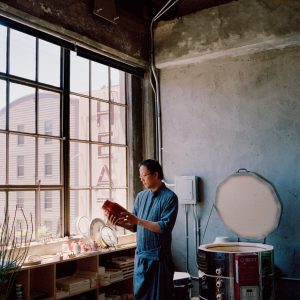
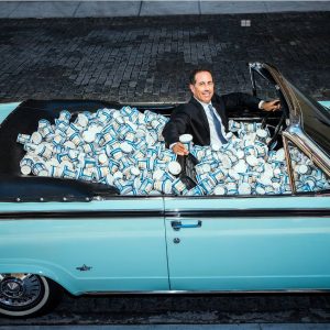
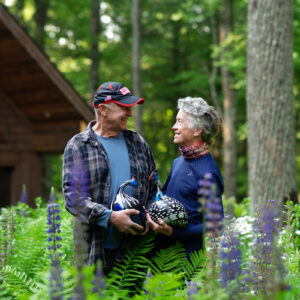
Who that is and what they did is your call… you explain to us what they did and why they are a hero by SHOWING us in the image. This is an image that is all about context. Context is what else is in the photograph to tell us what and who we are seeing in the image.
So we need to think about visual clues, props, body language, lighting, and composition. We use those cues to develop the context of the work.
Some GOOGLE images to review… not all are representative, but many are.
Brad Trent Example of an Editorial Portrait on Location.
NOTE… see his blog for lots more editorial work well explained.
Here are a few points that I want you to consider:
- Understand exactly what you want to say about the person you are photographing. Meet them beforehand if you can. If you cannot, then make sure you research as much as you possibly can before the shoot. This information will be instrumental in creating an image that shows context.
- Think about body language… Pride has a different body stance than contrition. Power is a set of poses that are not easily confused with submission. We KNOW this stuff in our minds, and we have got to get that knowledge into the photograph.
- Shadows. They can be a metaphorical tool or simply something to set a highlight against. Think of how people use the words and ideas of shadow when you are planning your photo.
- Light… the use of light is a metaphor that reaches all the way back to early Renaissance art. Flare “means” something. Light shafts can make the image represent a context that may not have been present in the natural space. And if you choose to use light shafts, do you do them “in camera” or do them later in post?
- Context will show us exactly who that person in the photograph is, and it will help explain the text that accompanies it. It can exist within the location, or simply be a prop or wardrobe choice that helps the viewer make connections.
THEY LIKE THESE:
The Power of Composition
https://www.youtube.com/watch?v=CvLQJReDhic
The Power of Color
https://www.youtube.com/watch?v=aXgFcNUWqX0
Photoshop: Color Grading
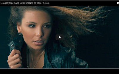
Cinematic color grading is one way you can help your images be consistent, or add some drama to an image that needs a little more. Color grading can also help sell the emotion of the image. Here are some good Color Grading tutorials for you to check out....
Photoshop Videos on Color Correction
We sometimes have a battle brewing right in front of us and do not realize it until later, when we get the image on the screen. The battle is between color temps of our lighting. Using the "lights available" in a photograph may lead to some heartbreaking problems down...
The Creative Process
https://www.youtube.com/watch?v=4_IpQokGlwA
A Discussion on Product Photography
https://www.youtube.com/watch?v=LUmwhbnURTI
Project Worksheets: Let’s Get Organized
(NOTE: Please use these worksheets on the Chocolate Assignment and going forward.) In order to have the answers to the questions we all have, it is very helpful to have a sheet of info in front of us. Please print this PDF (one sided or two sided) to keep along with...
Lighting Tip: Scrim vs Softbox for Highly Reflective Subjects
For shooting shiny products, we usually grab one of two types of modifiers - a softbox or a scrim. Umbrellas leave unwanted reflections of themselves on shiny surfaces, and unmodified light can create small, bright speculars that may not be welcome in our image....
OFFICE HOURS 01: WEBINAR
https://www.youtube.com/watch?v=o7z3aQIrnR4
How to Make the Most of the Project 52 Experience
PROJECT 52 requires a lot of commitment, but it offers a lot of ROI as well. Working on images that can be used in real portfolios can be hard and require lots of time. But PROJECT 52 can also provide many other opportunities as well. Yes, we make images for...
PHOTOSHOP: An Industrial Shot for a Student
https://www.youtube.com/watch?v=sN8cGO9RVRQ
File Saving / Upload Sizing / Naming Conventions for Class Assignments
NAMING CONVENTION: firstname-lastname-assign-# If you have more than one file to upload, append it with a number in sequence like this: don-giannatti-assign-03-1, don-giannatti-assign-03-2 SIZING AND EXPORTING FROM LIGHTROOM https://www.youtube.com/watch?v=VQnj2R1cbuM...

